We don’t just create brands, we make them impossible to ignore.
At Makeovers Digital, we craft identities, build narratives, and execute strategies that don’t just make noise but give your brand a voice that resonates, engages, and dominates.
We don’t just create brands; we make them impossible to ignore.
At Makeovers Digital, we craft identities, build narratives and execute strategies that don’t just make noise but give your brand a voice that resonates, engages and dominates.
We partner with clients for the long term, delivering creative support at every stage of you brand journey. From concepts to campaigns, we make brands shine.


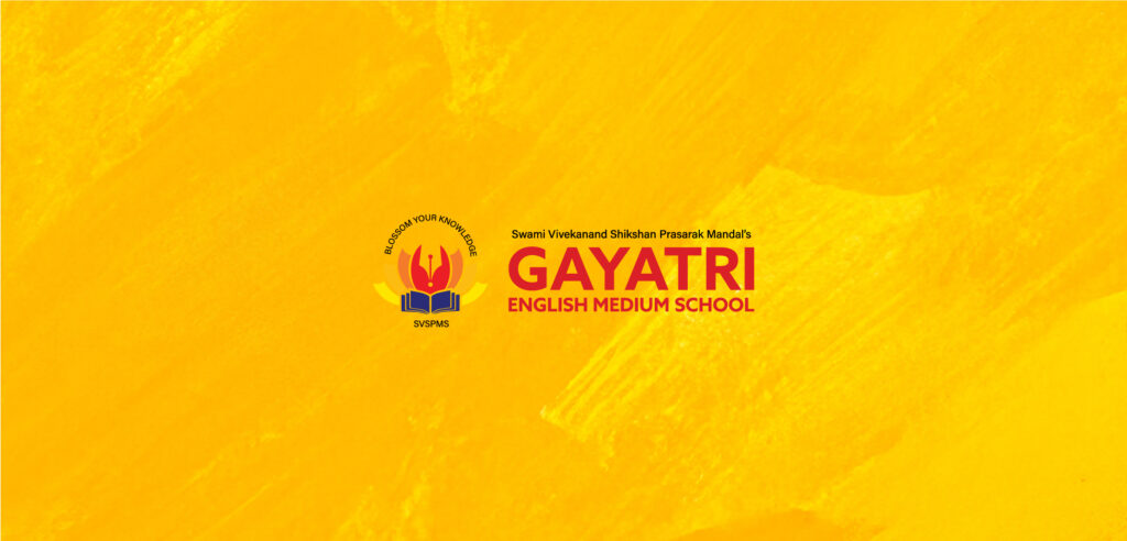
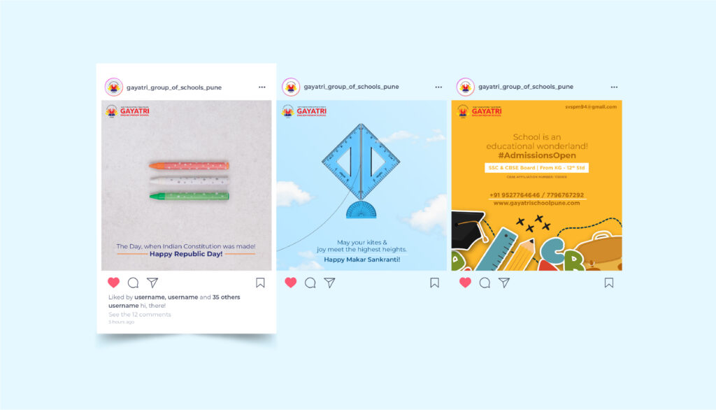
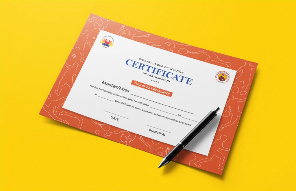
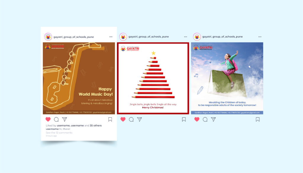
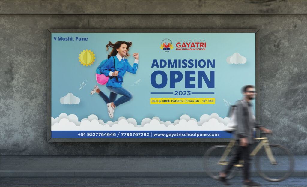
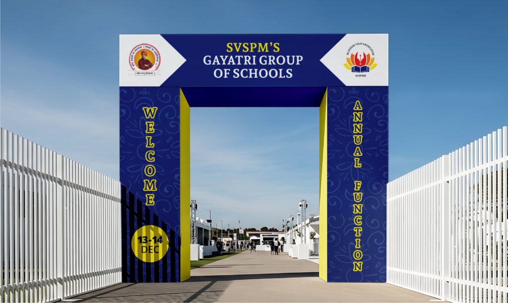
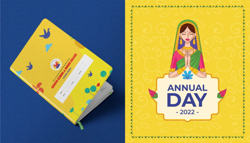
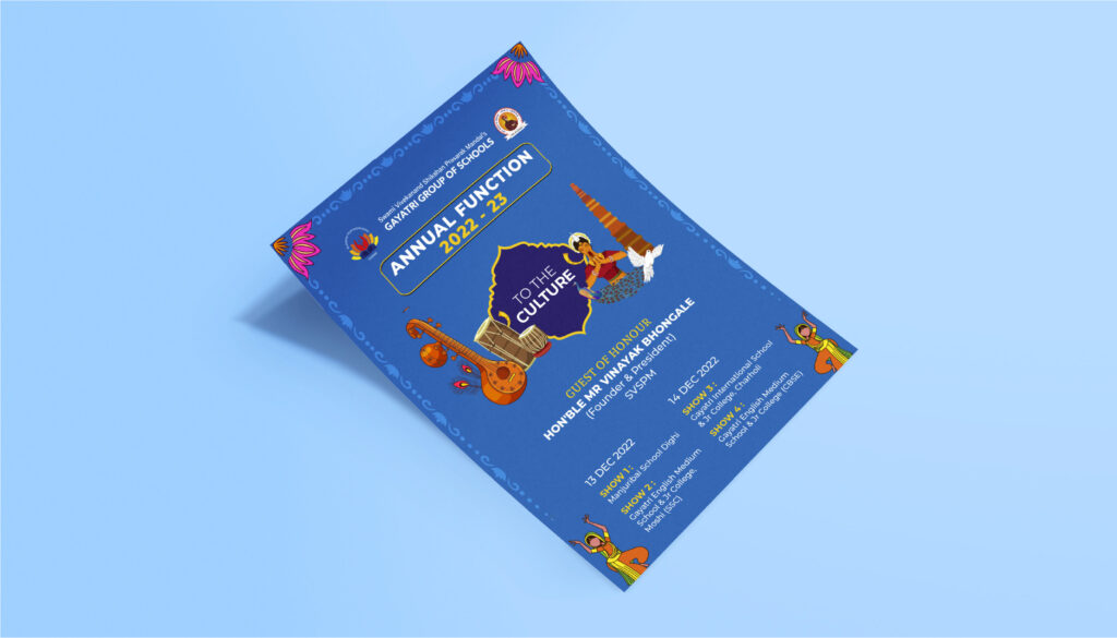
A Pune school shaping young minds — given a brand presence that grows alongside its students.
Schools used to live entirely on word-of-mouth. Today, they live on every parent’s phone screen first. Gayatri English Medium School has spent years building the kind of campus a parent feels good sending a child to — strong academics, real values, a culture that prepares kids for life and not just exams. What the brand needed was a presence that brought all of that into the everyday feed of every family in the neighbourhood.
So the work spread across the school’s entire experience. A social presence that turned classroom moments, achievements and events into stories parents look forward to seeing. Stationery that gives the school a consistent face across every notebook and circular. Hoardings that show up confidently across the city around admissions season. Event design and invites that make every annual day, sports day and parents’ meet feel like the occasion it actually is.
A school brand that finally feels as warm, considered and present as the campus behind it.
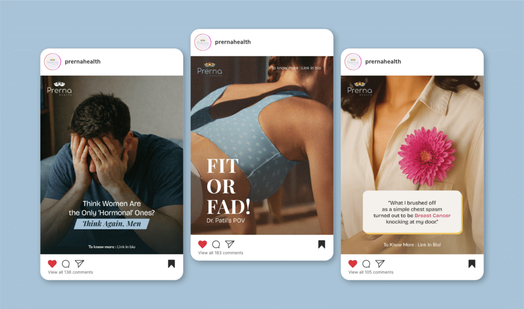
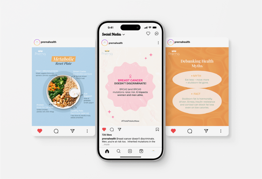
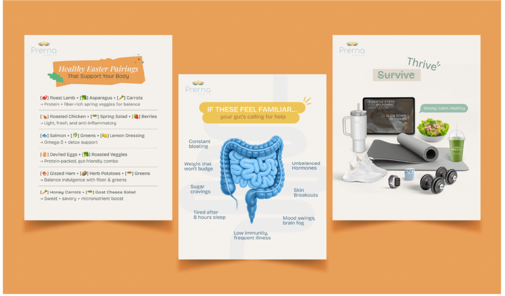
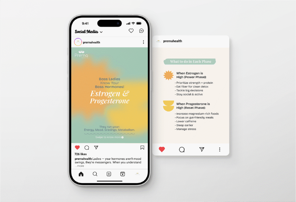
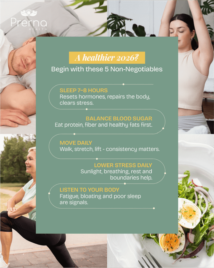
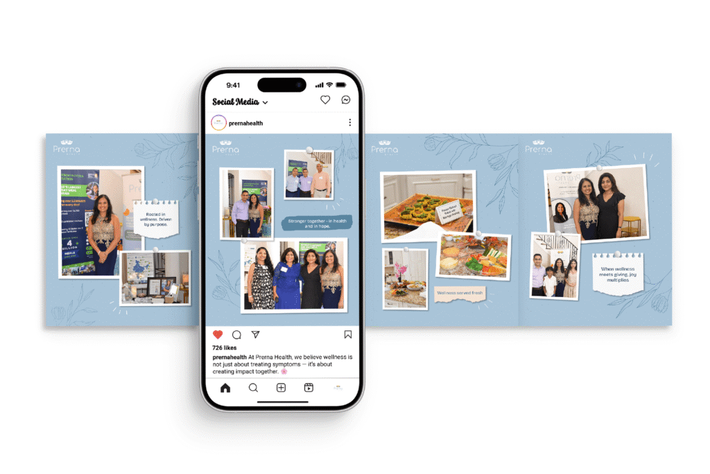
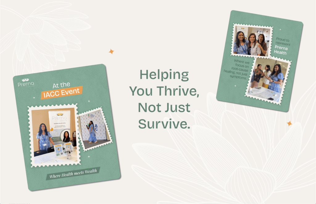
An Orlando concierge healthcare practice led by Dr. Mrunal Patil — given a digital presence as personal as the care itself.
Prerna Health isn’t a clinic. It’s a different way of practising medicine. Concierge primary care, lifestyle medicine, holistic wellness — built around the belief that the body heals when it’s actually listened to. Led by Dr. Mrunal Patil, named Orlando’s Doctor of the Year 2025, the practice has spent years turning patients into people who feel seen long before they feel better.
The work made sure that warmth showed up online too. A social presence built around awareness, education, and gentle reminders to put your health first — written, designed and posted with the same care a doctor brings to a consult. The numbers followed naturally. From around 400 followers to 766, organically — no shortcuts, no inflated metrics, just real people choosing to stick around. Layered alongside it, paid ads and performance marketing built to bring the right patients through the door, and content writing that lets the practice speak in its own voice across every platform.
Marketing run with the same intent the clinic runs on — and the proud first international chapter of Makeovers’ story.


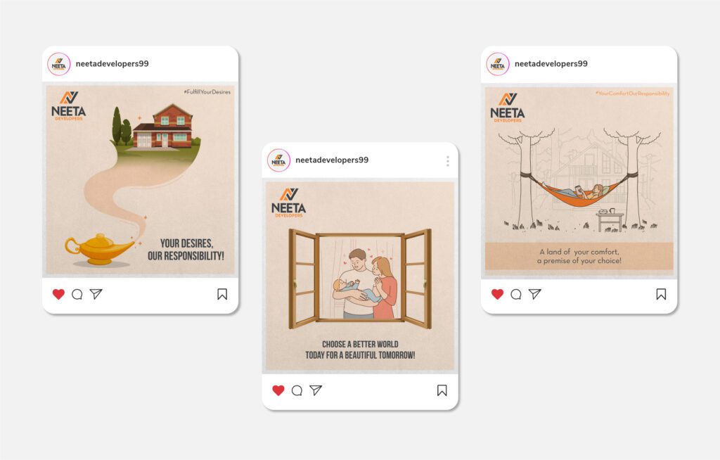
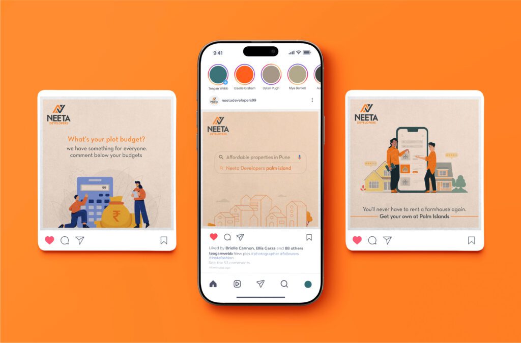
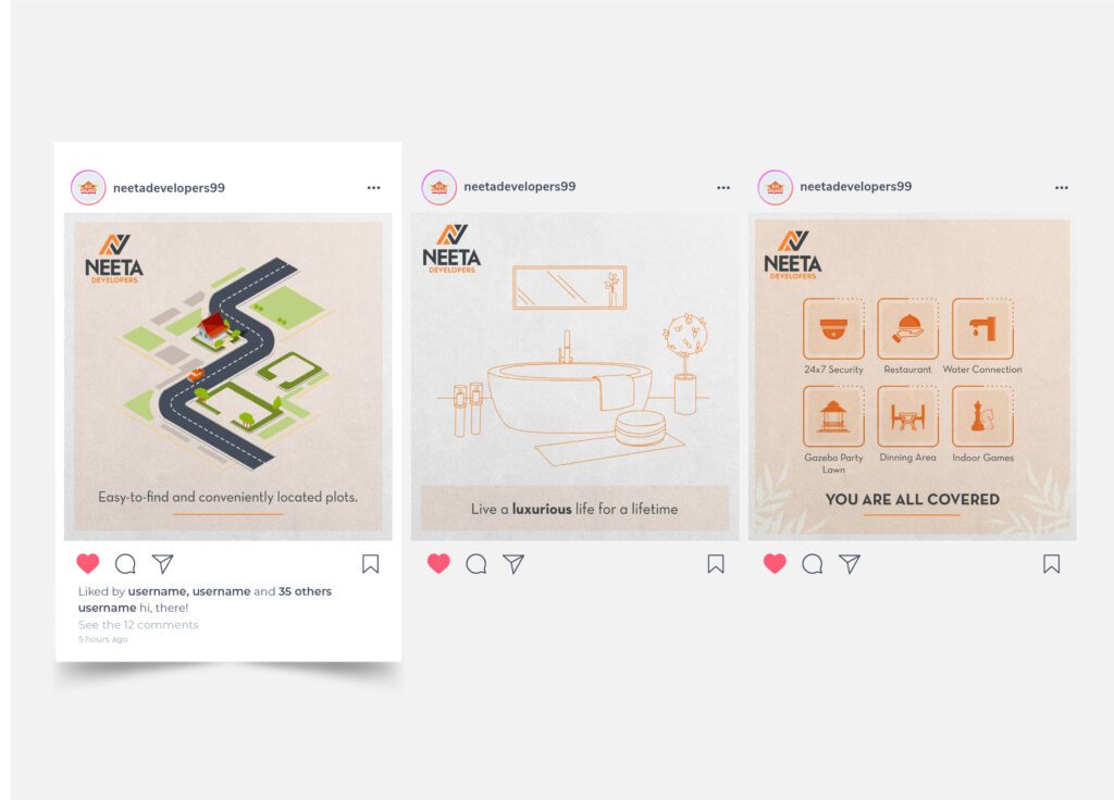
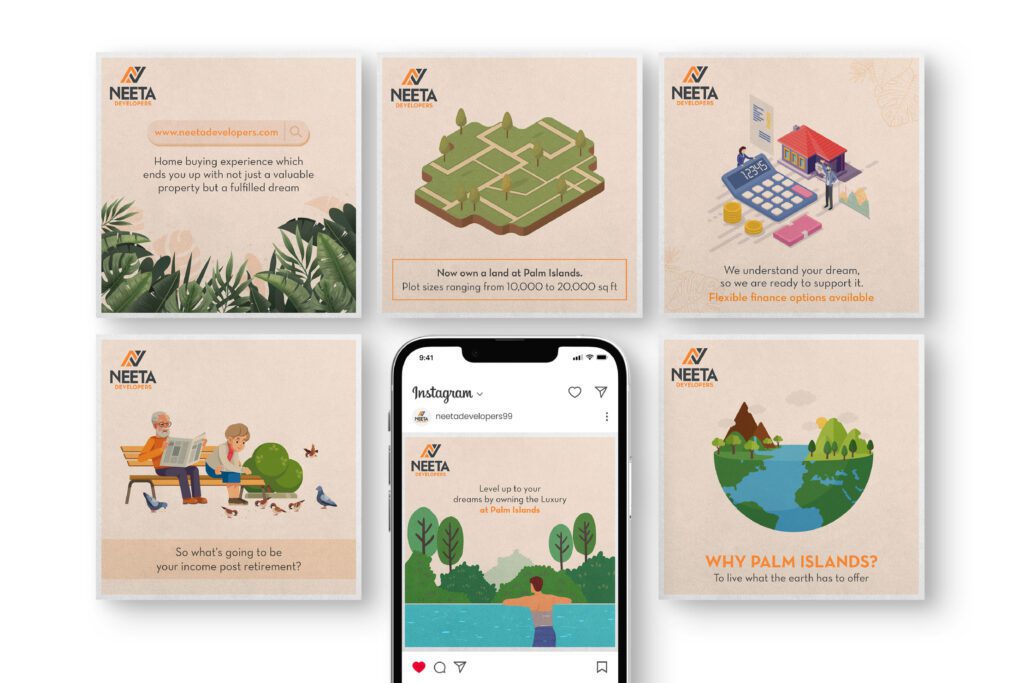
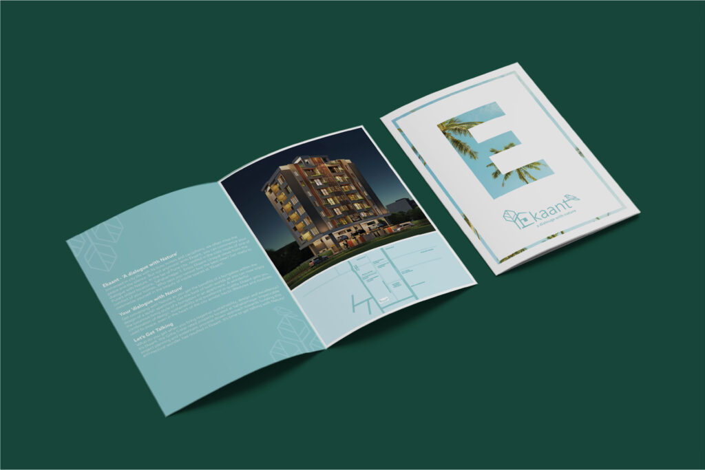
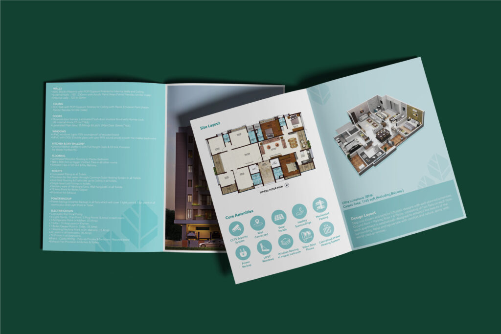
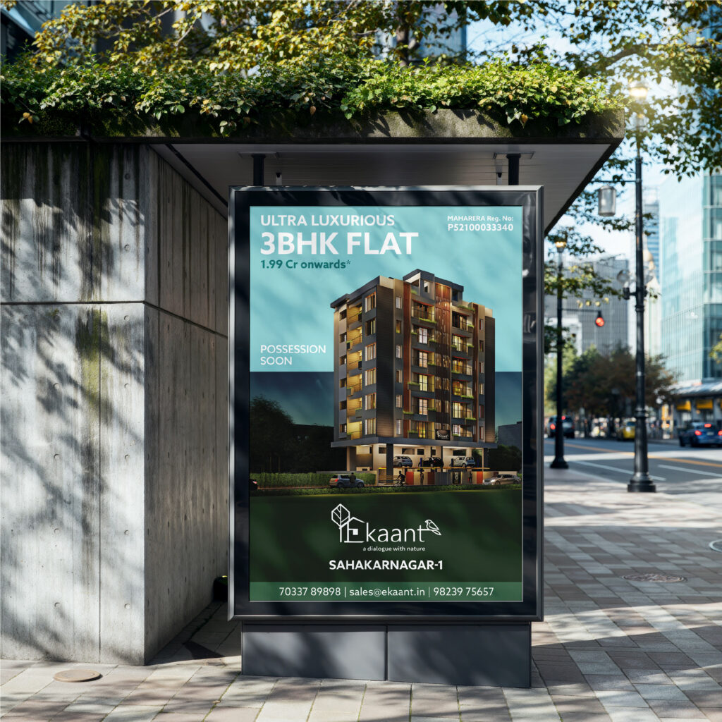
A luxury residential project, given a brochure that walks visitors through it before they ever walk in.
Ekant is the kind of project where the brochure isn’t an afterthought — it’s the first room a buyer steps into. Premium homes, considered architecture, the calm that comes with truly luxurious living. Selling a project like that asks for collateral that doesn’t oversell. It just shows.
So the brochure was crafted with the same patience the project asks of its homeowners. Generous typography, elegant white space, photography that lets the architecture do the talking. Page after page, the document walks a buyer through Ekant the way a good host walks them through a home — unhurried, considered, letting the place speak for itself.
Print collateral that doesn’t introduce the project. It introduces the lifestyle.

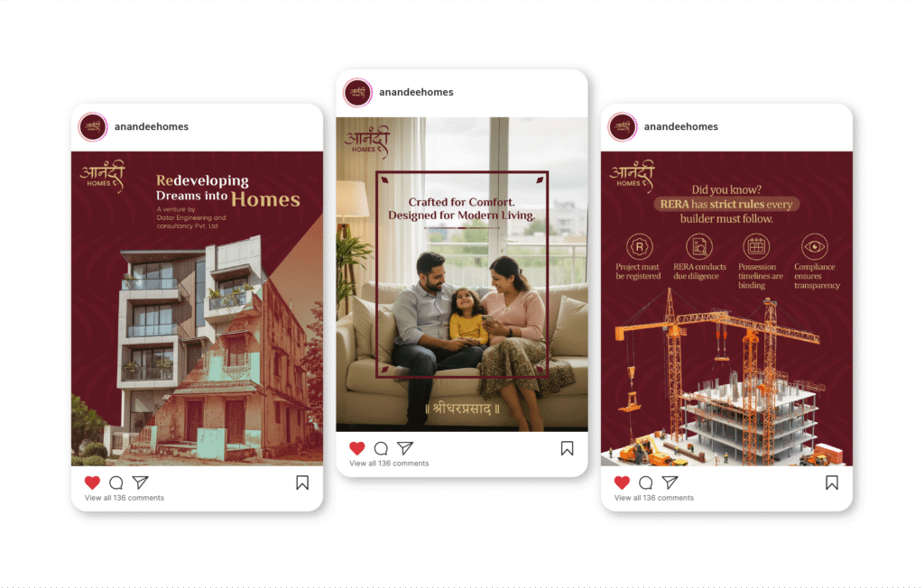
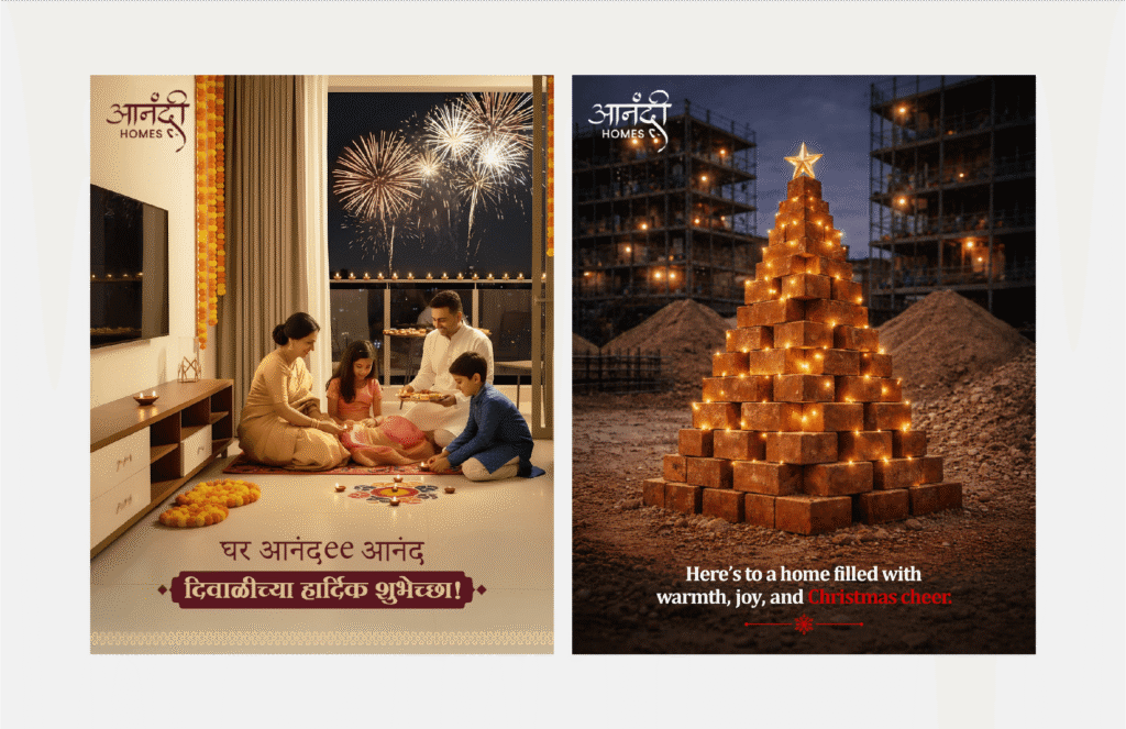
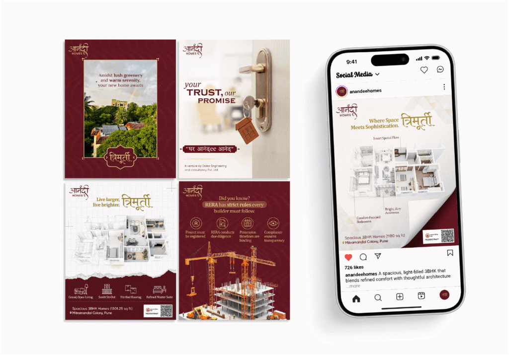
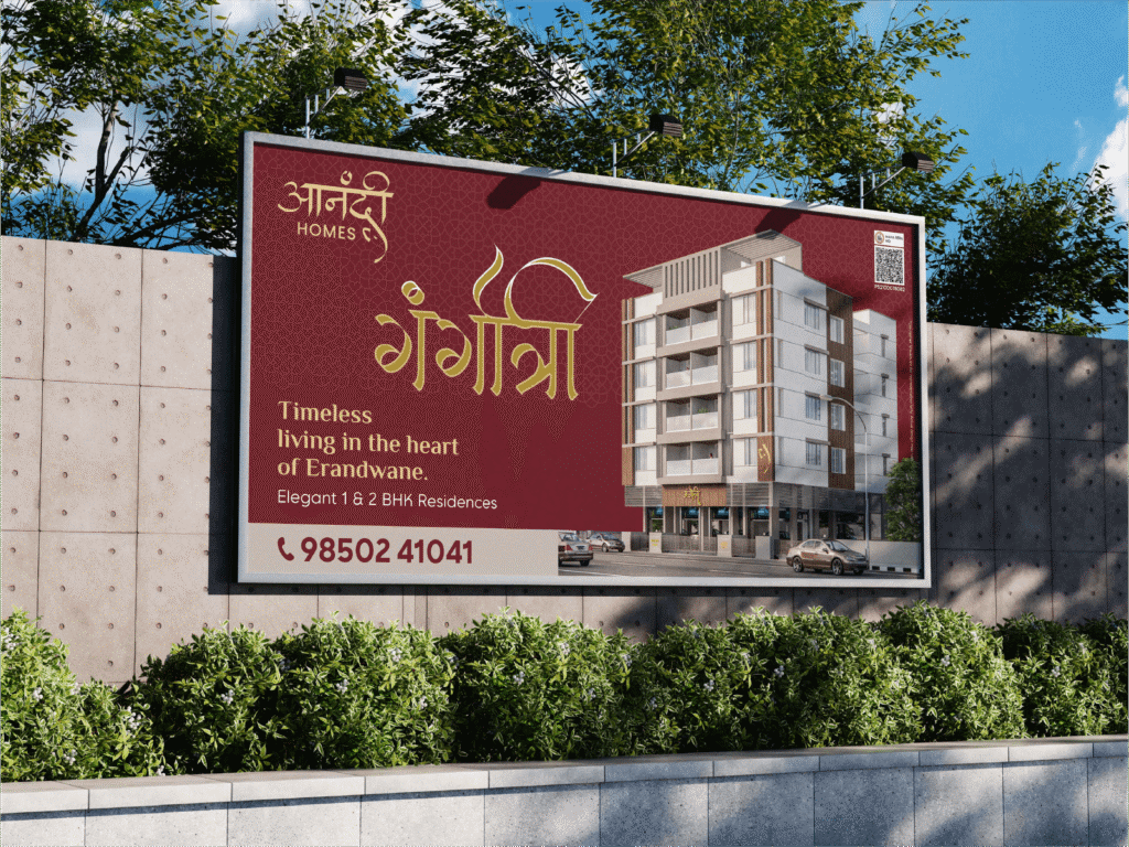
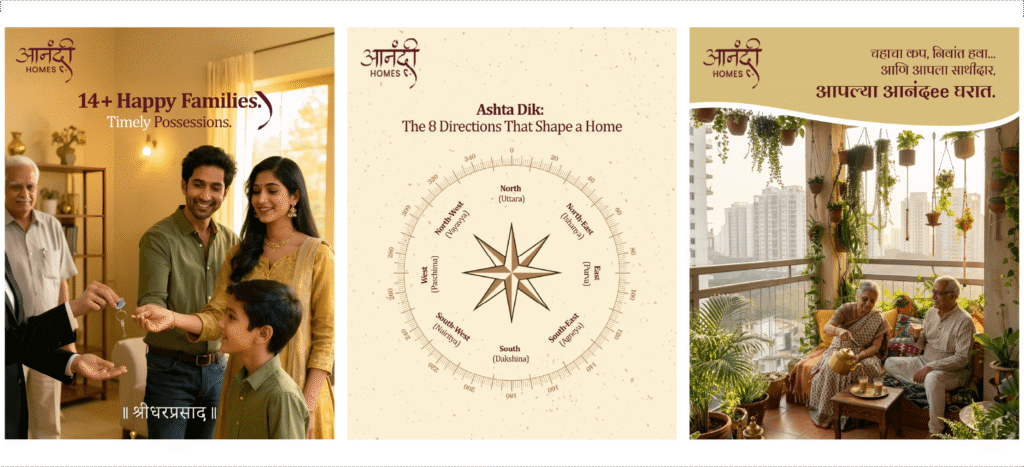
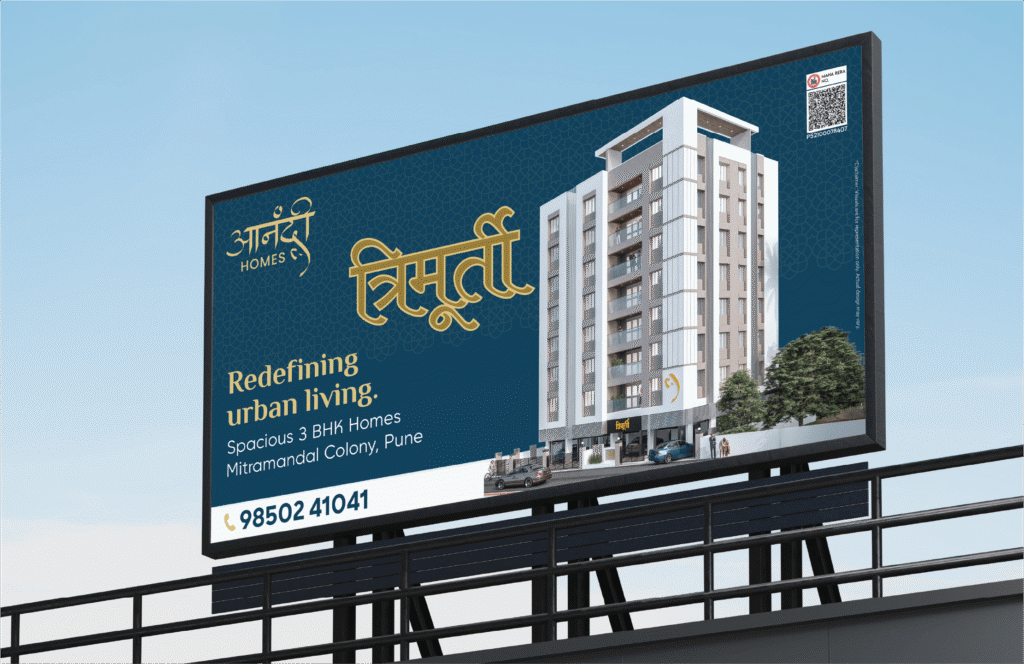
Pune’s redevelopment specialists — given a brand built with the same care as the homes they hand over.
Anandee Homes does what every old Pune society quietly hopes for — they walk in, take on the redevelopment, and walk out, leaving behind a home families actually want to live in. It’s a category built almost entirely on trust. And trust, in real estate, is something you can’t fake.
So the brand was built to do the talking before the first meeting. A website that walks visitors through projects, processes, and promises with the calm of a developer who’s done this enough times not to need to oversell. A social presence that brings the work — and the people behind it — into the daily feed of every society chairman thinking about their next move. And hoardings designed to do what hoardings should — earn a second look on a busy Pune flyover and stay in the head long enough to prompt a phone call.
A brand that opens the door long before the keys are ever handed over.
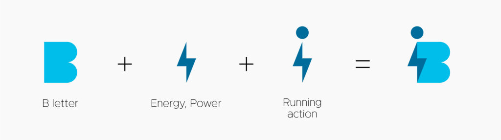
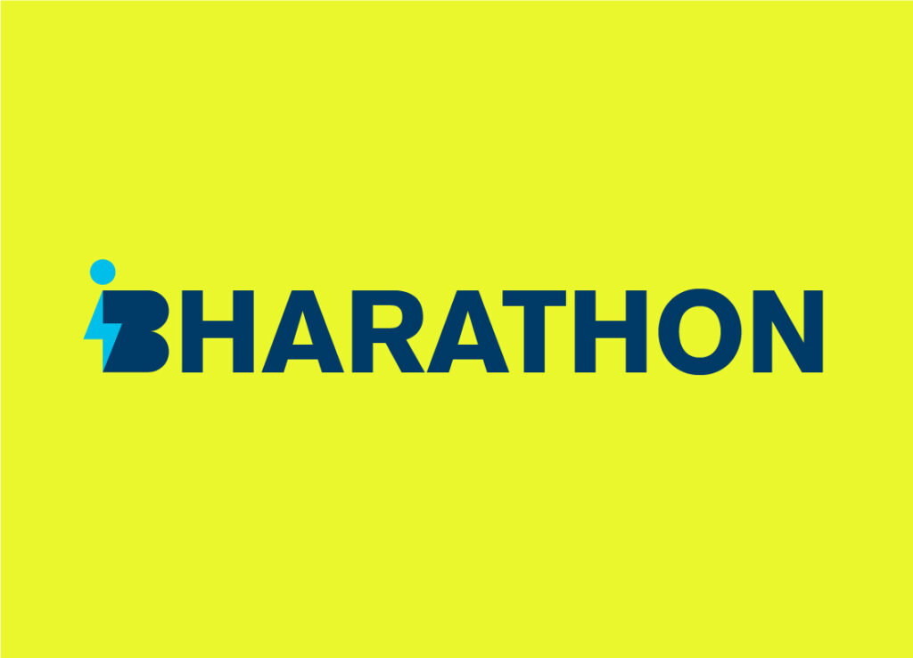
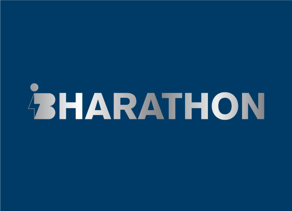
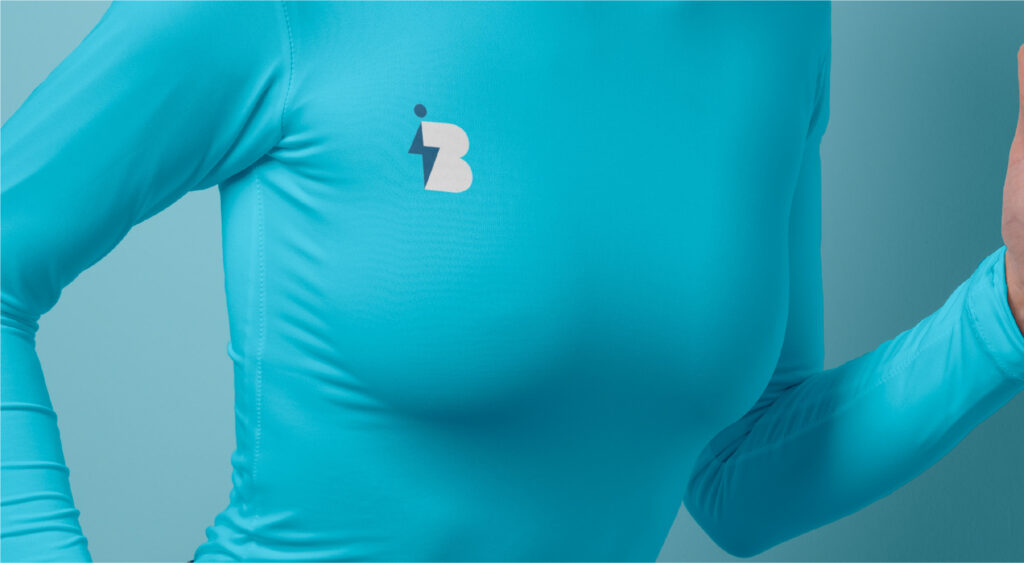
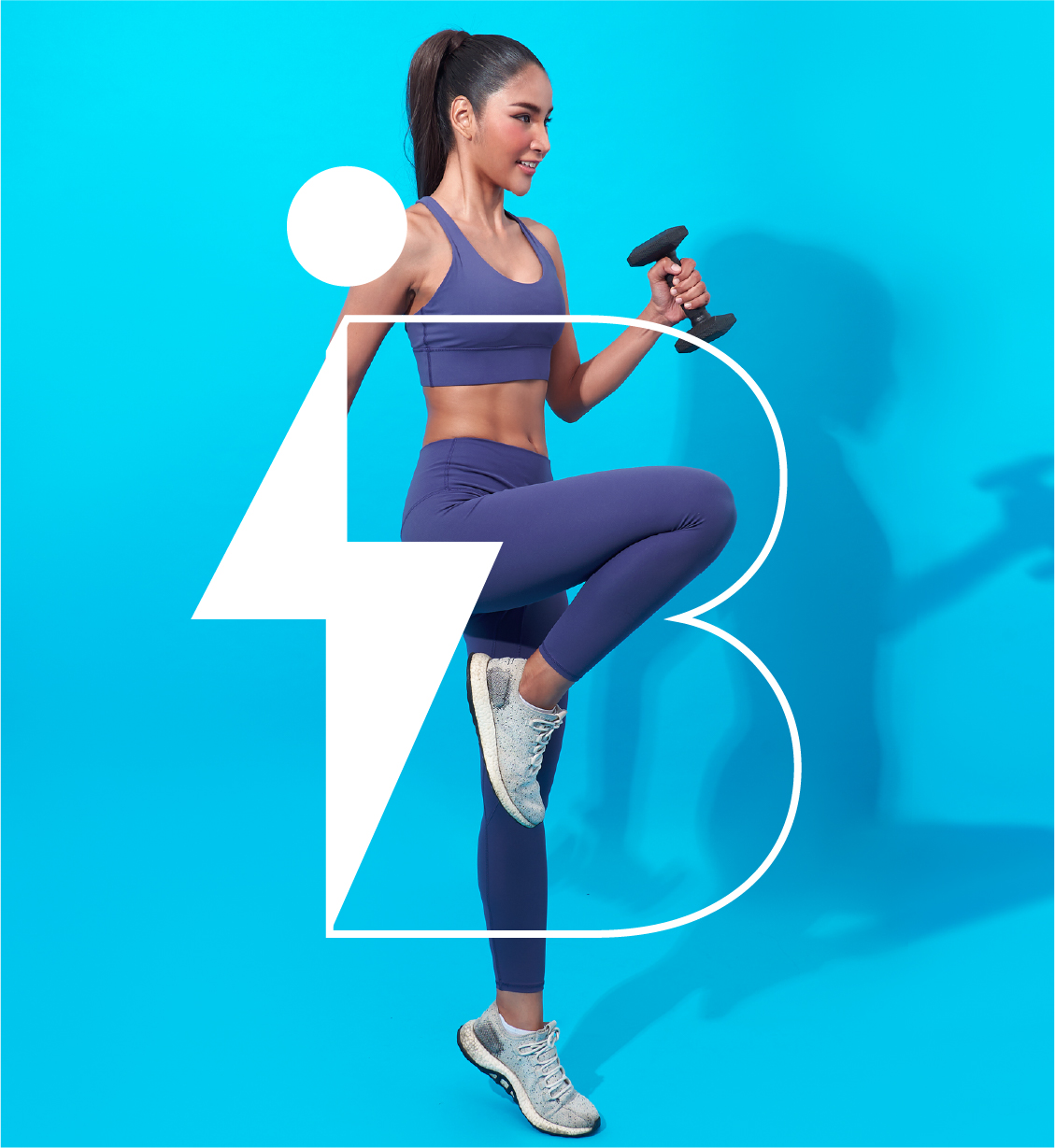
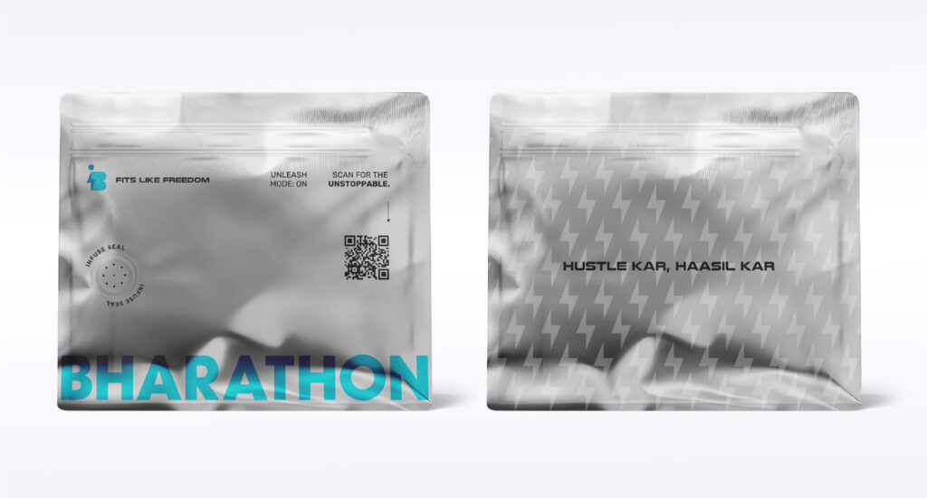
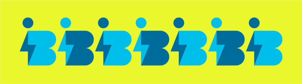
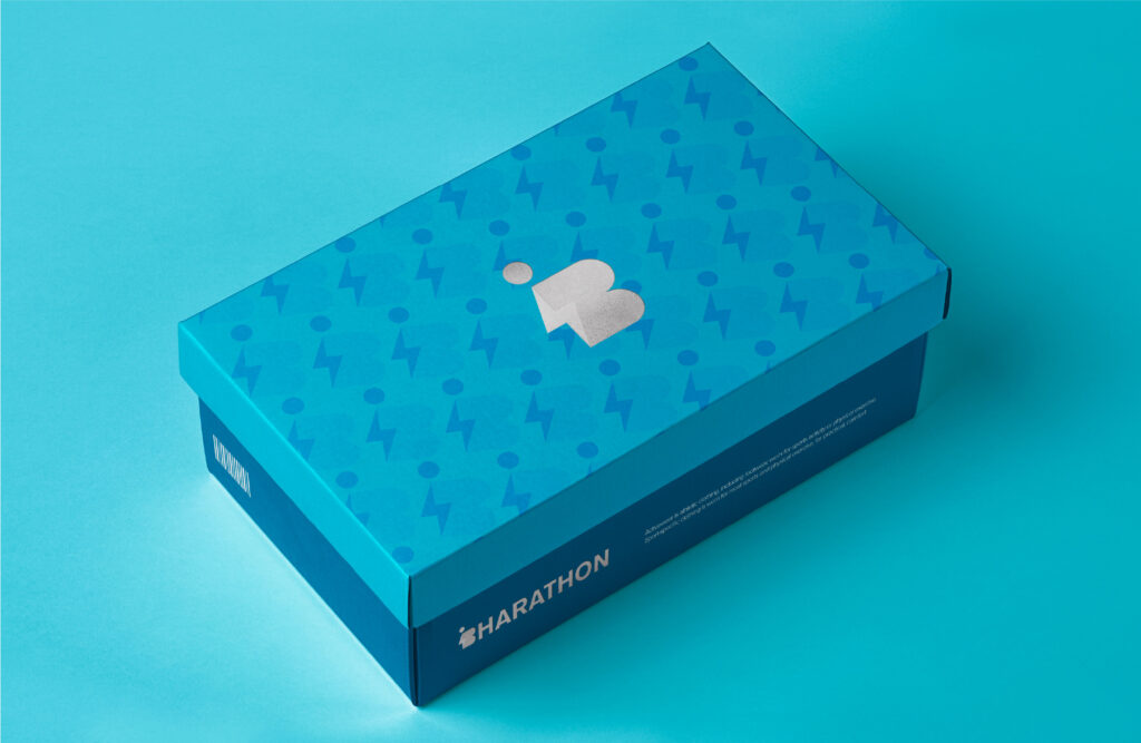
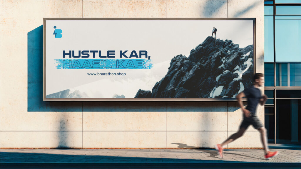
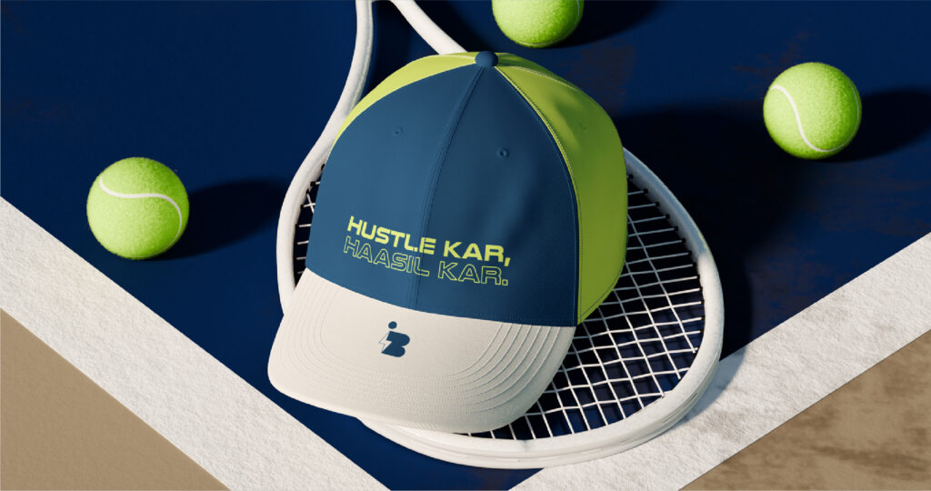
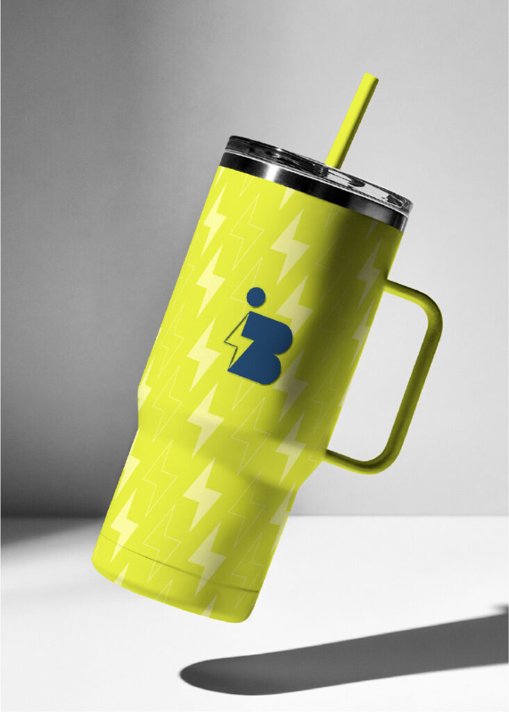
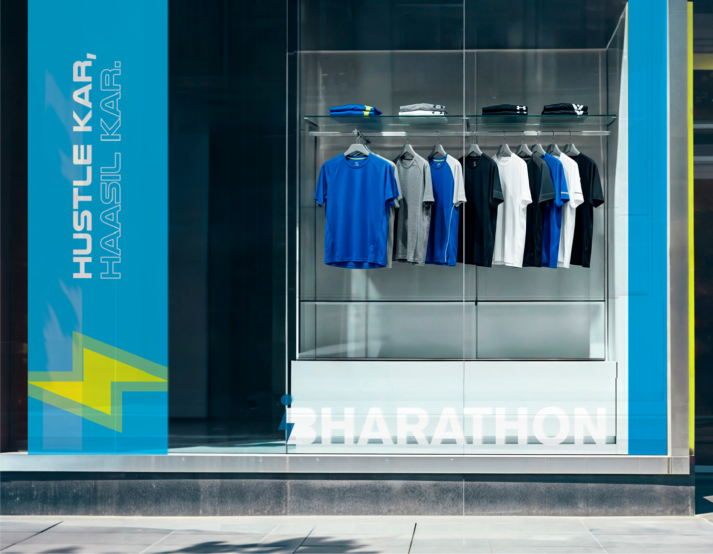
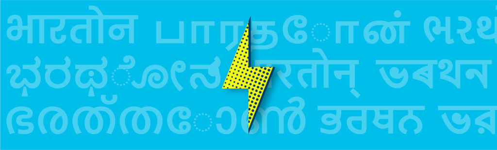
Athleisure built on the philosophy of hustle — made for the ones already moving — packaged into a brand that moves with them.
Bharathon isn’t just selling athleisure. It’s selling a mindset — Hustle Kar, Haasil Kar — to a generation that runs on six AM gym sessions, 9-to-9 grinds, and the quiet belief that the work always pays off. The clothes were ready. What it needed was a world that matched the philosophy.
So the brand was built from the ground up. A logo and identity system that carries the weight of the hustle without ever needing to shout. Packaging that feels less like a parcel and more like a small win every time a customer opens it. And a website built to be the meeting ground — part shop, part community, part rallying point for everyone showing up for themselves every single day.
A label for the ones who don’t just dream the goal — they show up for it.


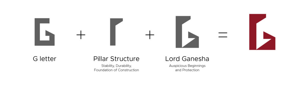
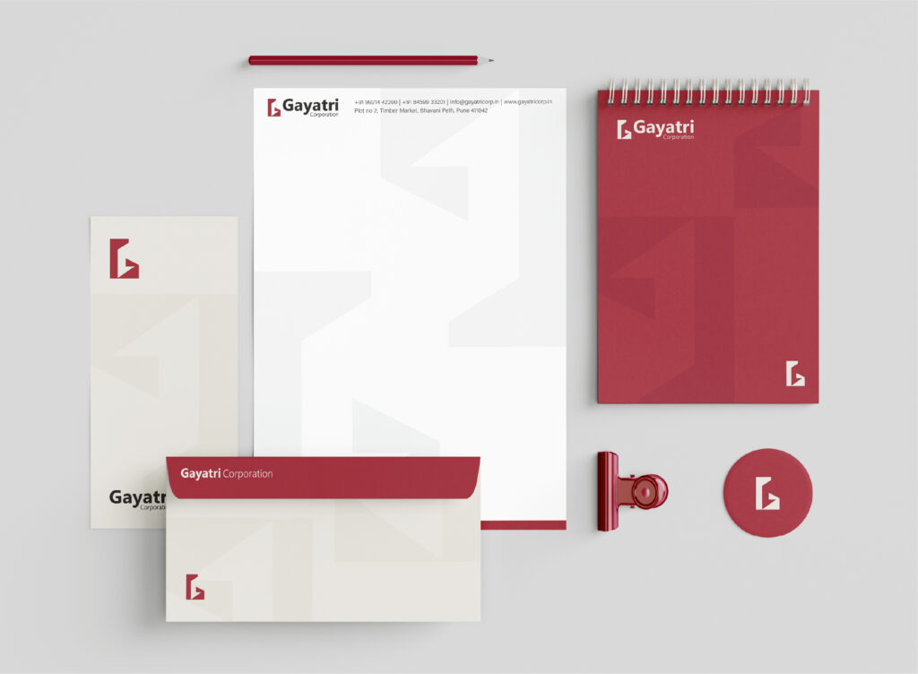
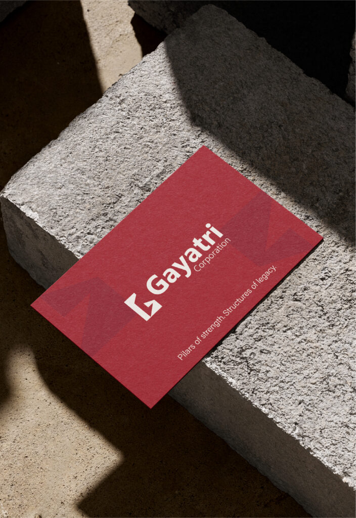
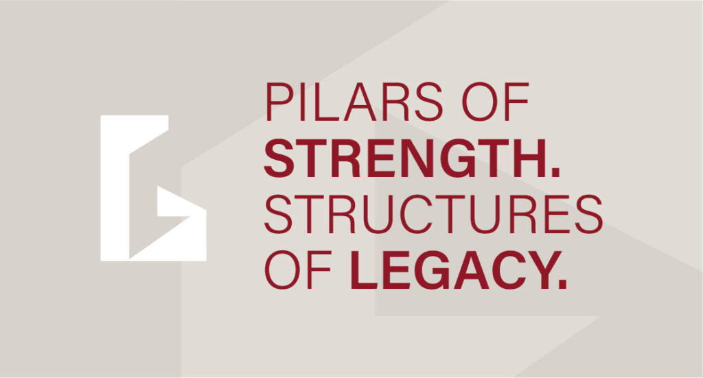
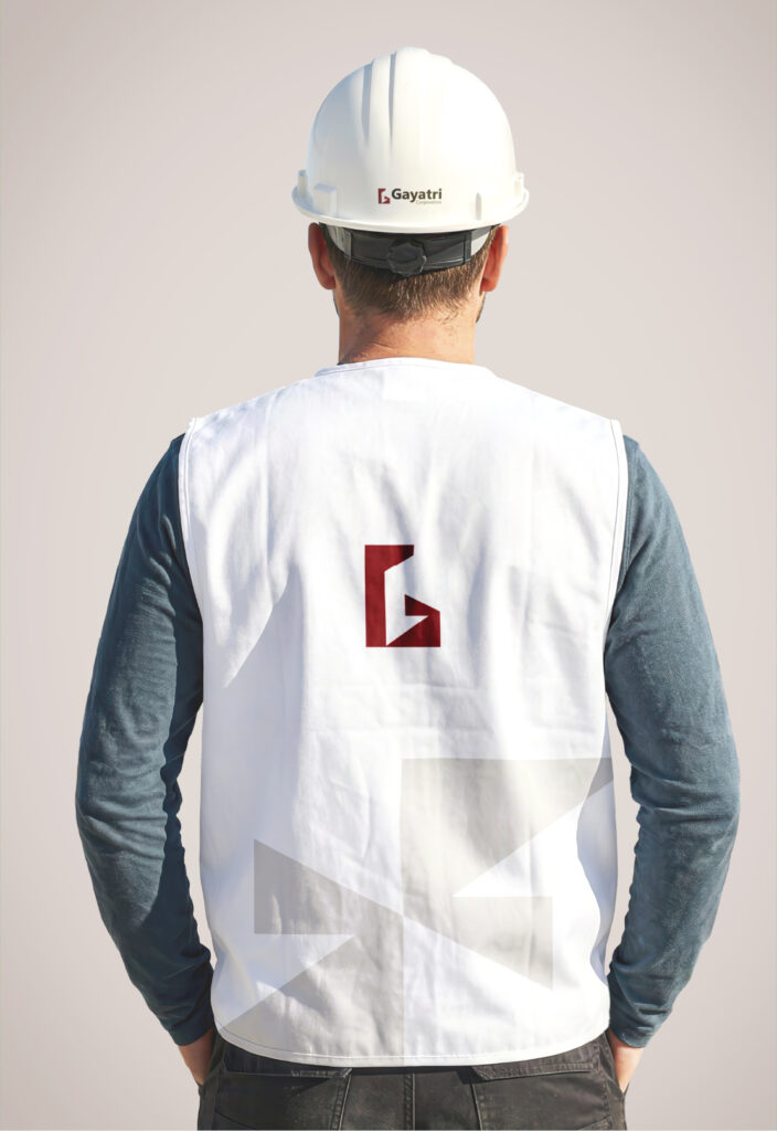
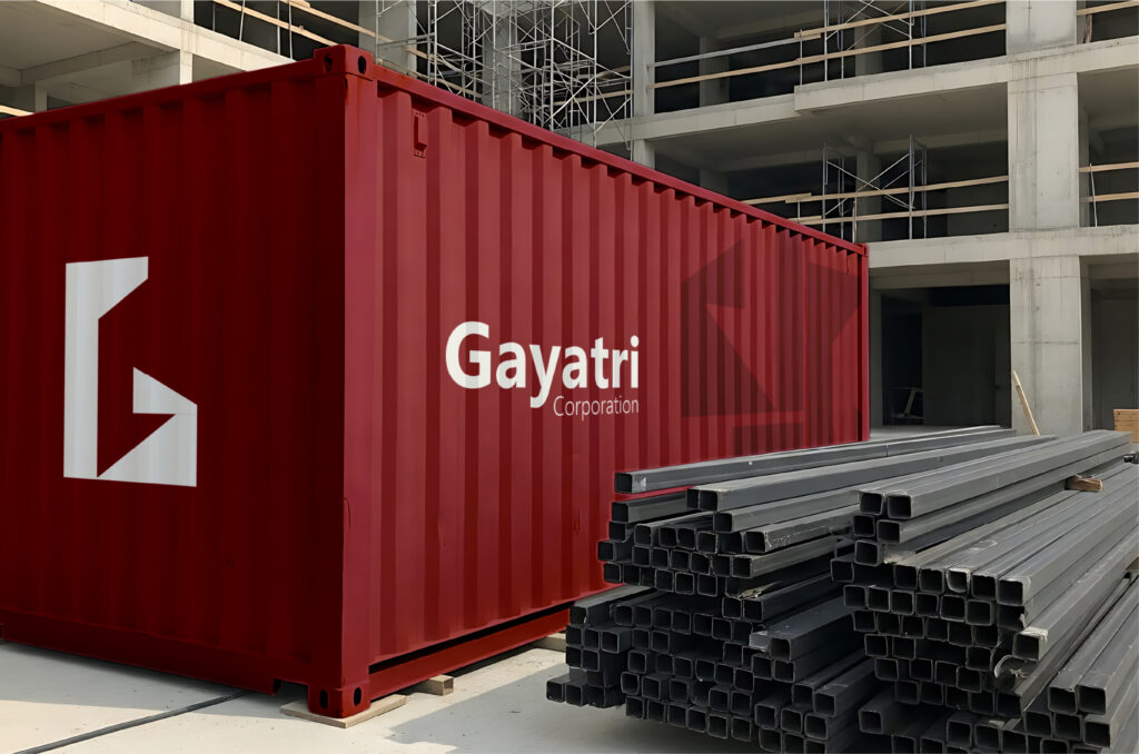
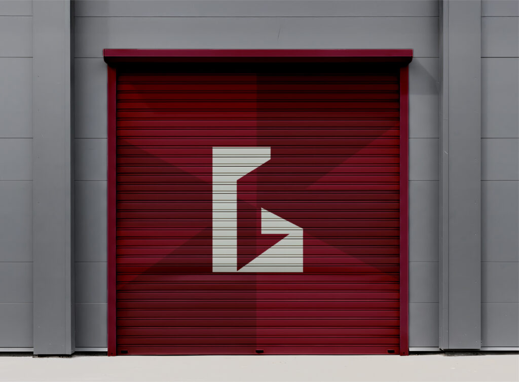
Six decades of trust, distilled into a single emblem.
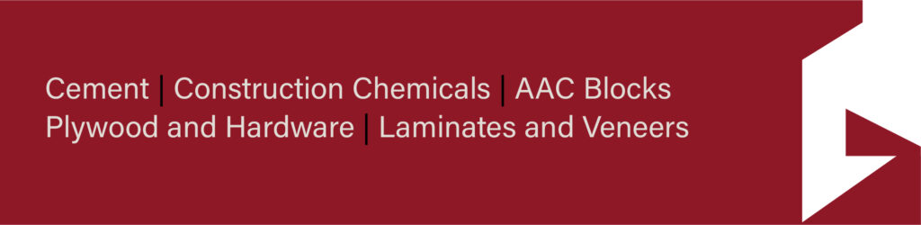
Sixty years is a long time to build a name on word-of-mouth alone. But that’s exactly how Gayatri Corporation got here — Pune’s go-to for tile adhesives, waterproofing chemicals, AAC blocks, hardware, laminates and construction chemicals, passed from one builder to the next through nothing but reputation. What was missing was An emblem to carry it forward was the missing piece.
So the logo was built from the ground up. The “G” became a load-bearing pillar — strength, structure, six decades of standing tall. And tucked inside it, the silhouette of Lord Ganesha — the family’s blessing, the auspicious nod every Indian construction begins with. One emblem. Three layers of meaning. Rolled out across a stationery suite that finally lets sixty years of legacy show up in the room before the conversation does.
A name that’s always been trusted, now with a mark that says it out loud.


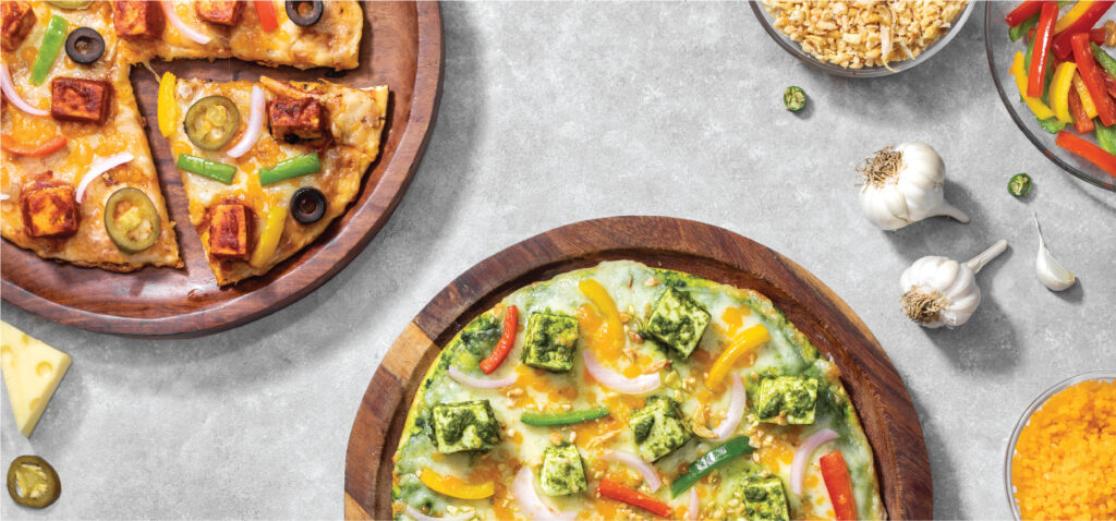
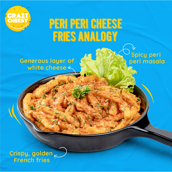
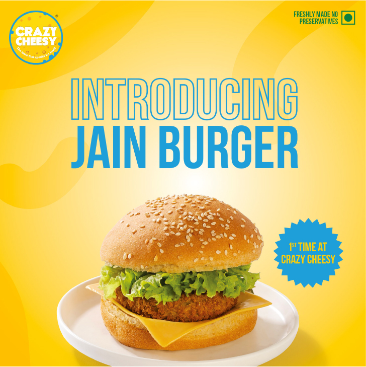
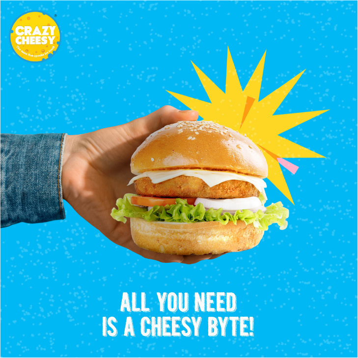
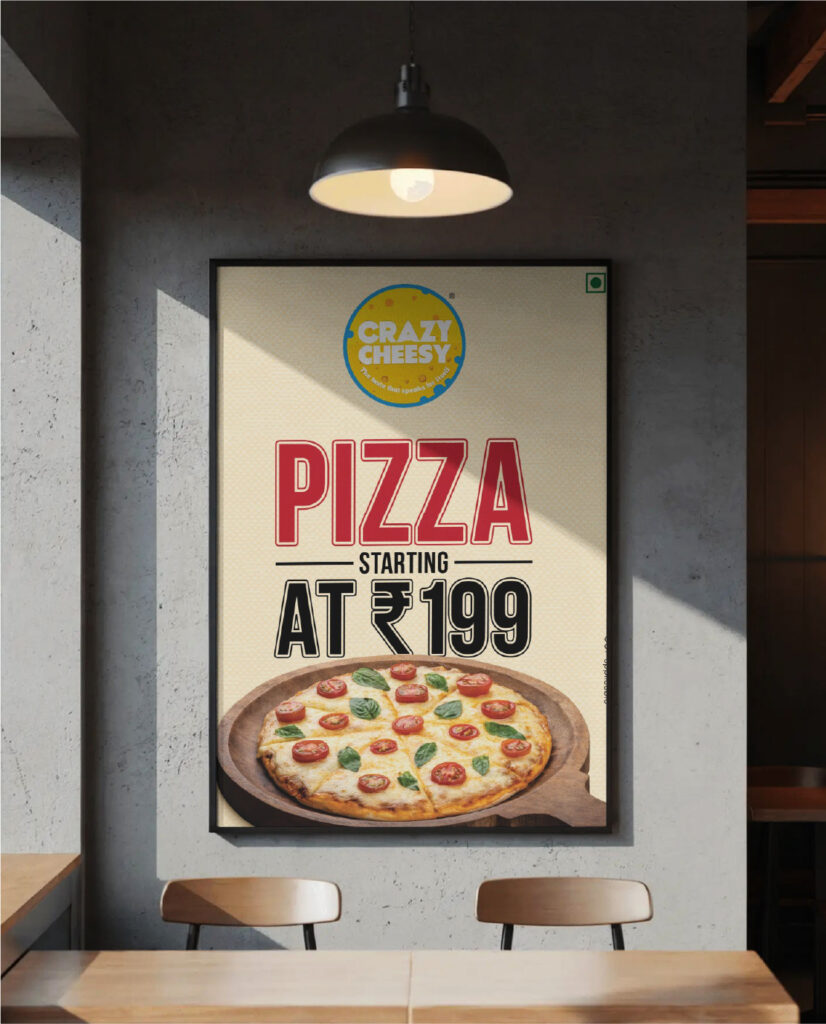
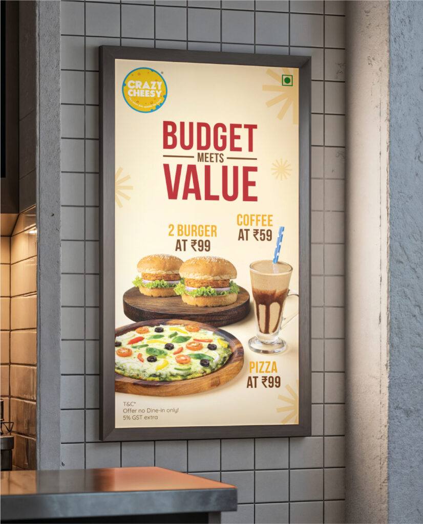
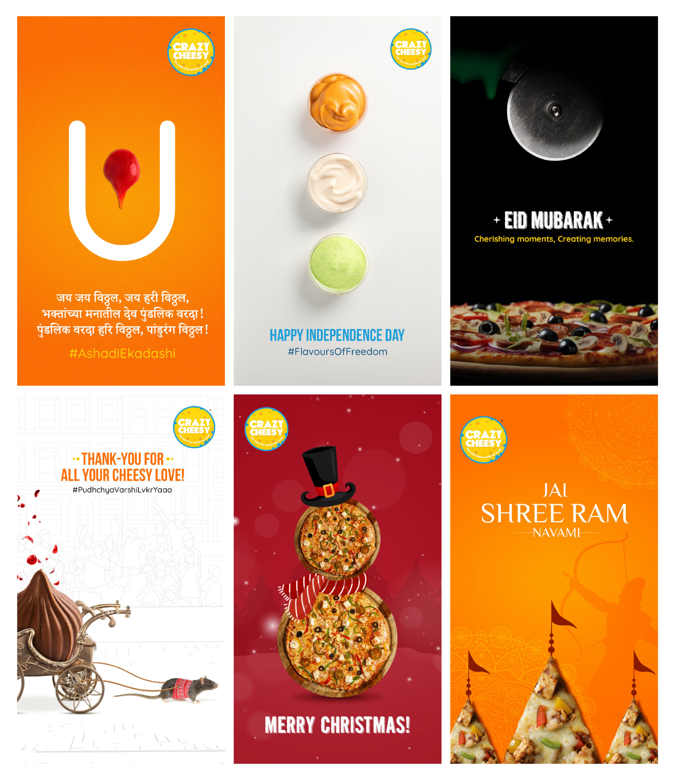
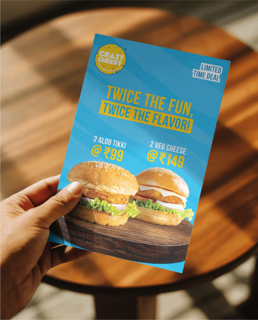
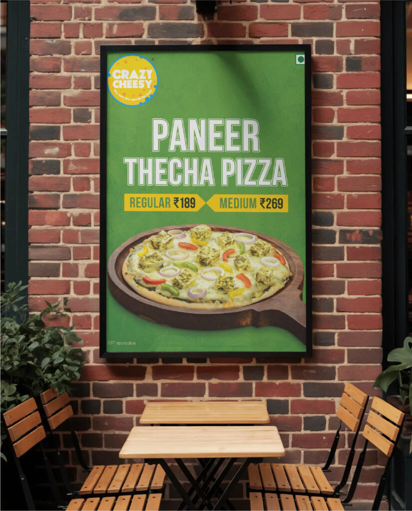
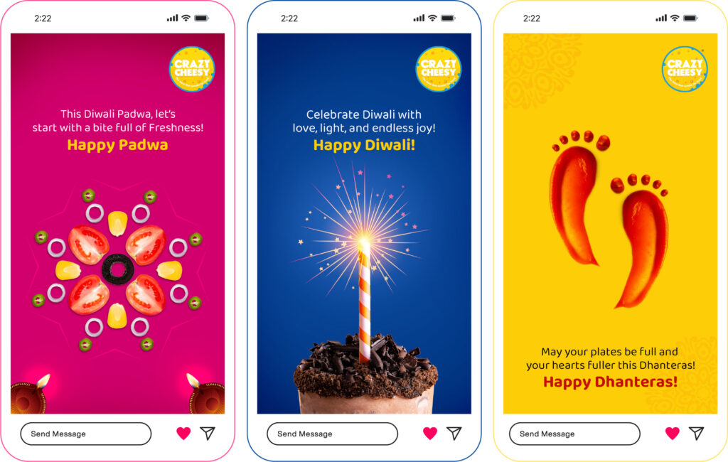
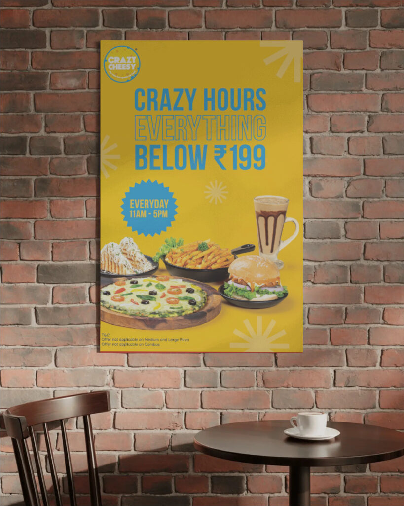
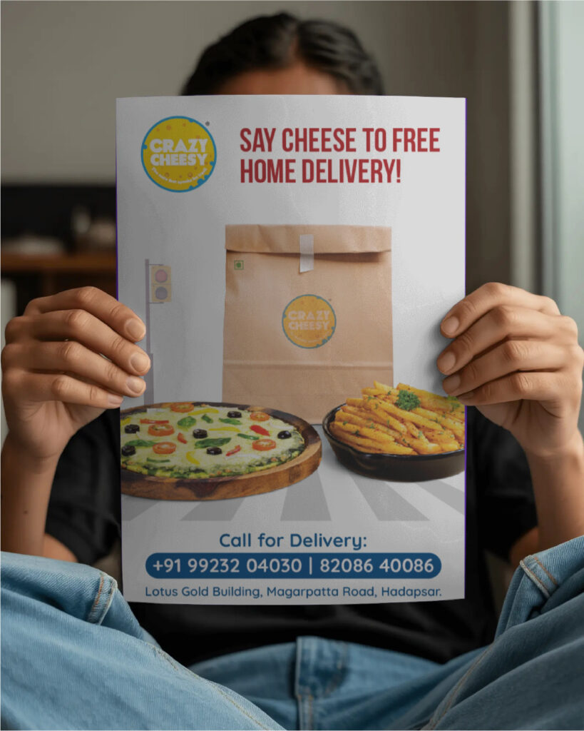
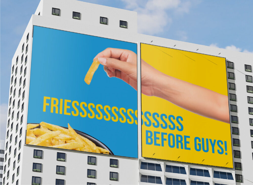
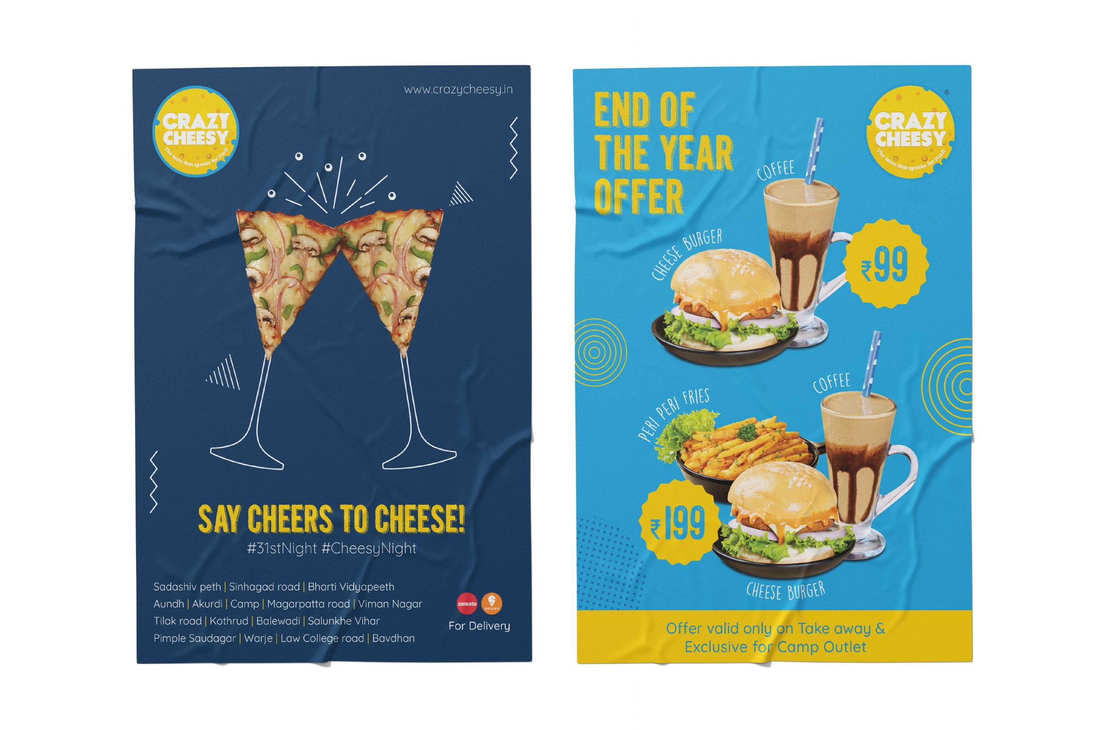
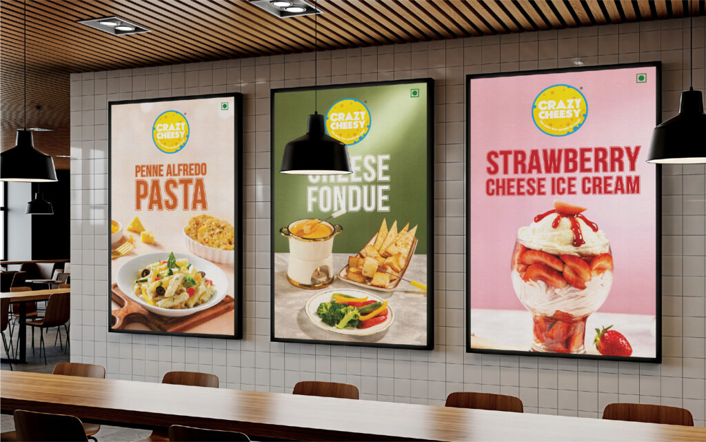
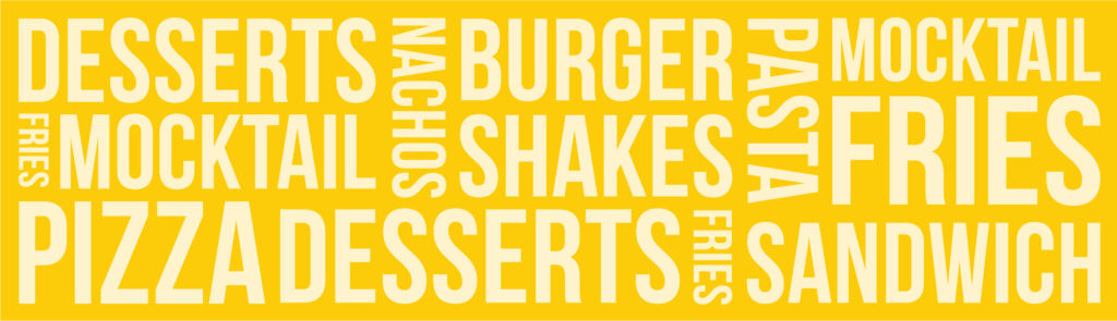
Continental food with a desi tadka, served across Pune — given a brand as crave-worthy as the menu itself.
Crazy Cheesy isn’t a cafe. It’s a craving. The kind that hits at 9 PM on a weekday when nothing but extra cheese on a tandoori paneer pizza will do. Across multiple outlets in Pune, they’ve spent years perfecting the small art of taking a continental classic and giving it just enough Indian attitude to feel like home — burgers with bite, pizzas with tadka, and shakes thick enough to be a meal of their own.
A menu like that needed a brand that could keep up with the appetite. So everything got the full treatment. A logo that walks in already grinning. Packaging built for the photo before the first bite. Social media that doesn’t just sell food — it builds the appetite, frame by frame, with cheeky writing, drool-worthy product shots, and the kind of festive content that turns scrollers into walk-ins. End-to-end marketing, end-to-end mood.
A brand as warm, indulgent, and impossible to resist as the food it’s wrapped around.
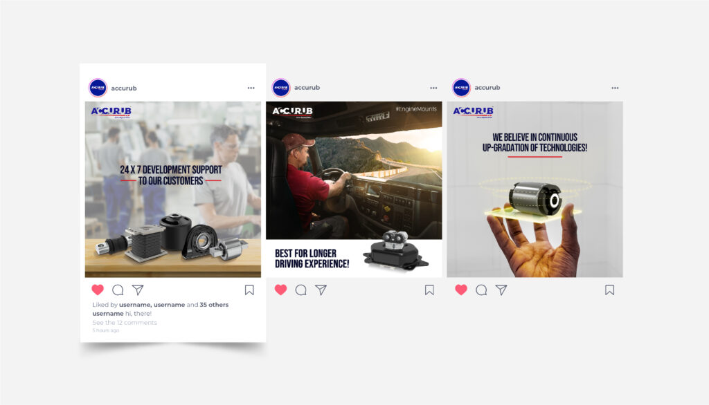
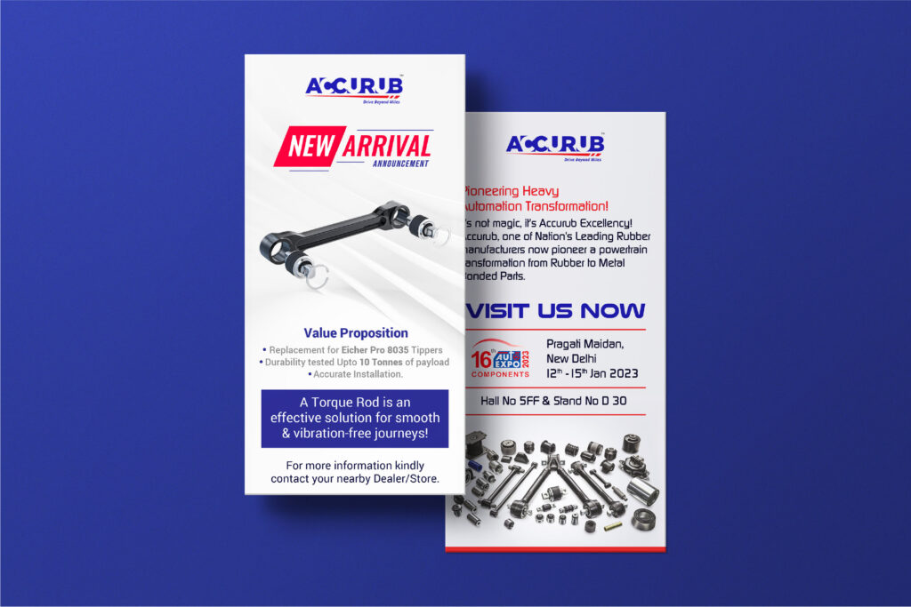
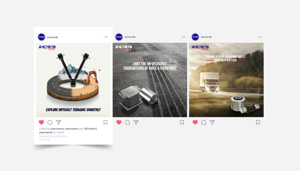
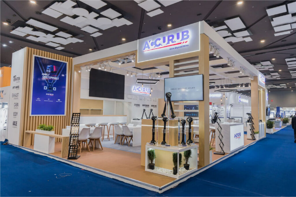
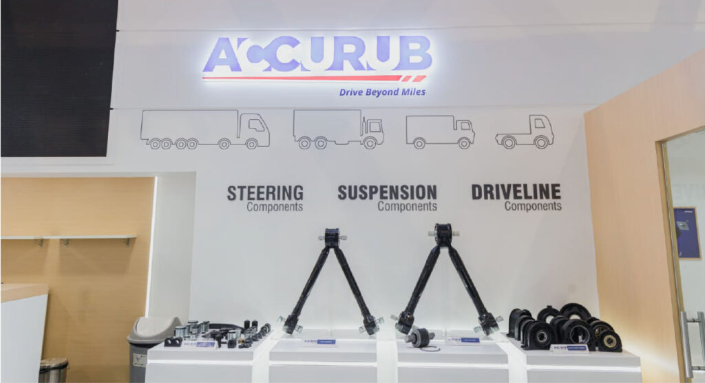
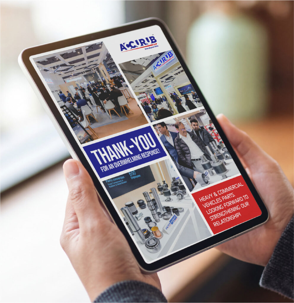
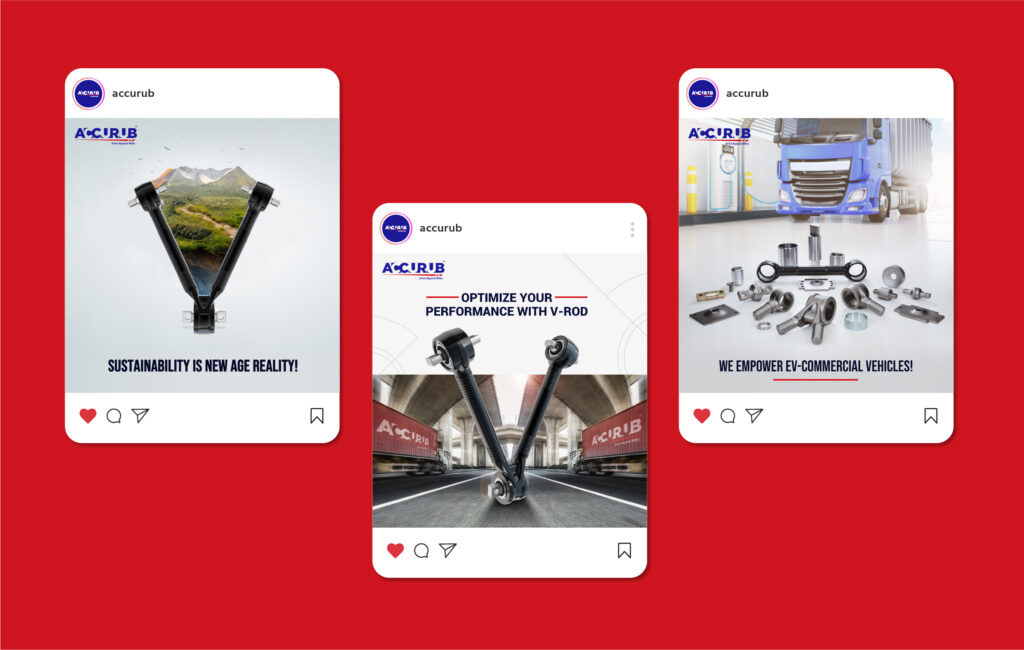
The quiet force behind heavy commercial vehicles across 11 countries — given the brand voice to finally be heard.
If you’ve ever wondered why a 40-tonne truck doesn’t feel like a 40-tonne truck — that’s engineering like Accurub’s at work. Their rubber and rubber-to-metal bonded components are the bit between the road and the driver, soaking up every bump and jolt the highway can throw. Eleven countries depend on it. Most of them have no idea who to thank.
Which made the brief a fun one — give a brand that lives behind the scenes a presence worth showing up for. The social feed found a voice that B2B usually forgets it’s allowed to have. The Automechanika stall pulled buyers in mid-stride and gave them a reason to stay. The brochure carried the conversation long after the handshake had moved on.
Same engineering standard. Just translated into design.

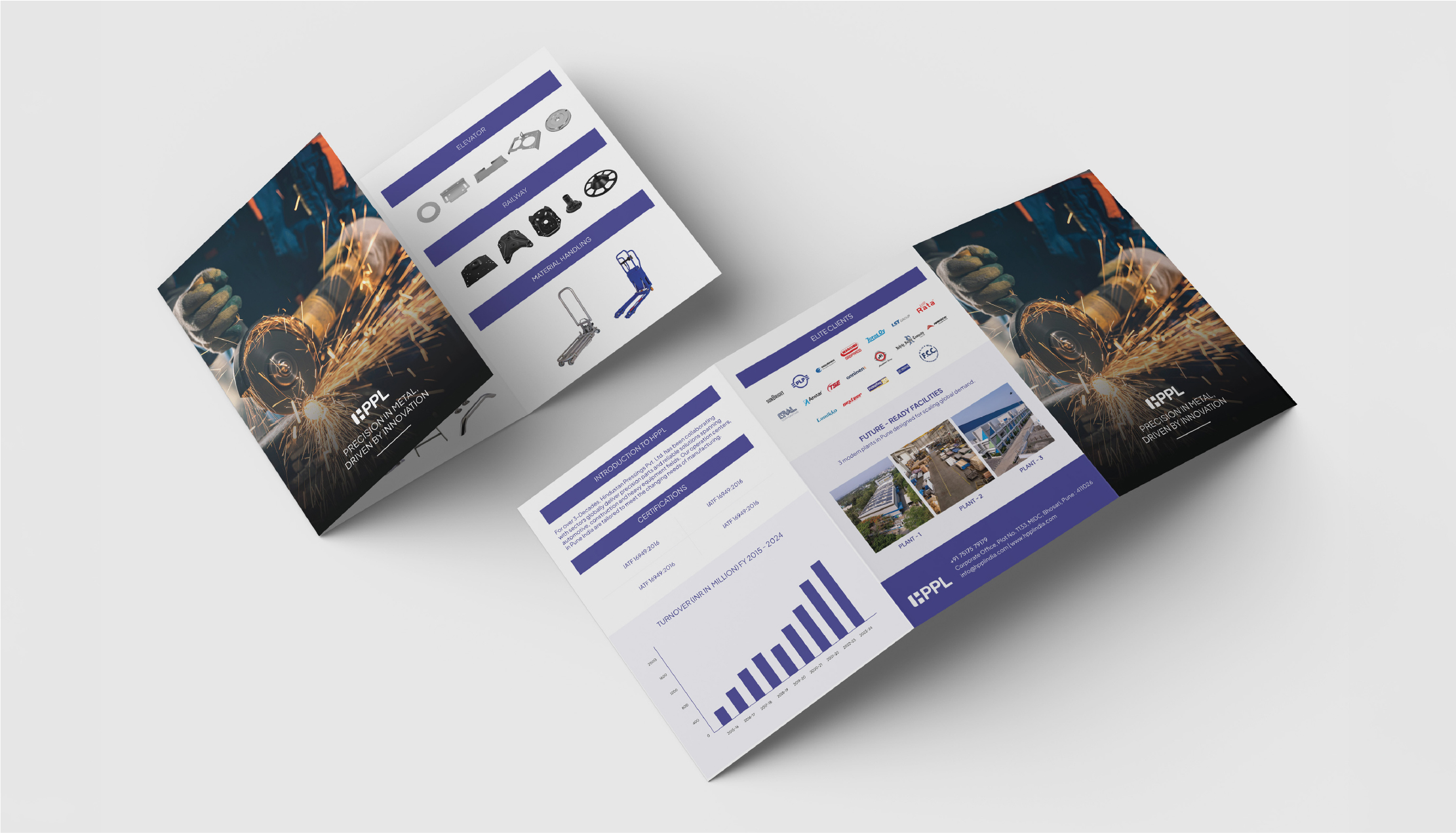
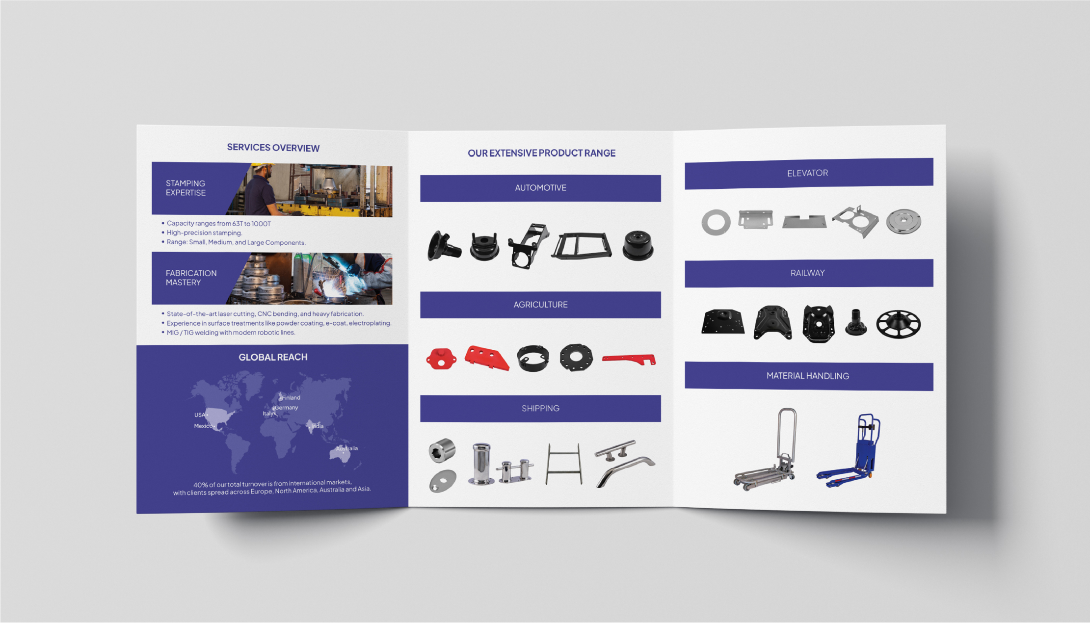
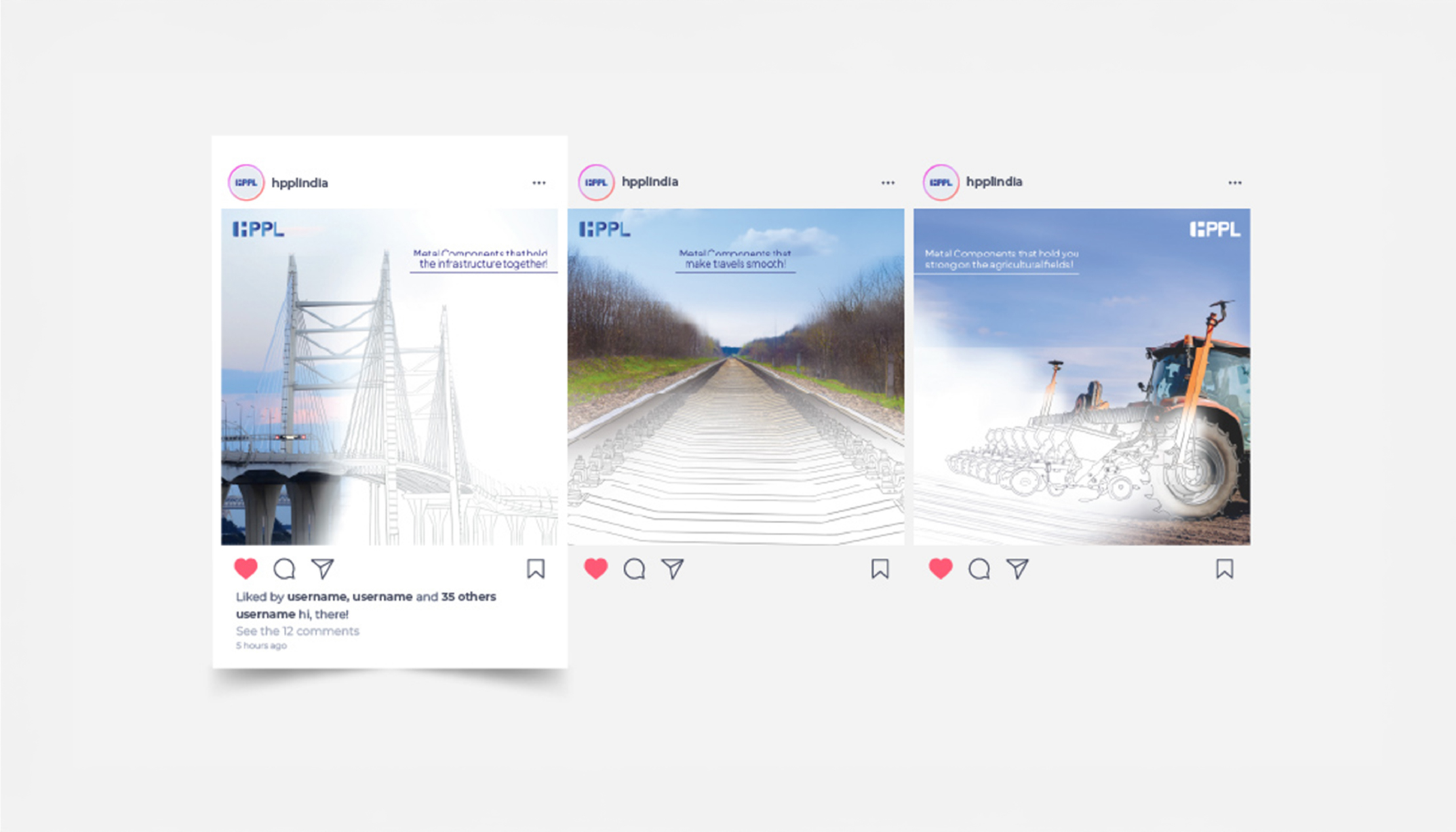
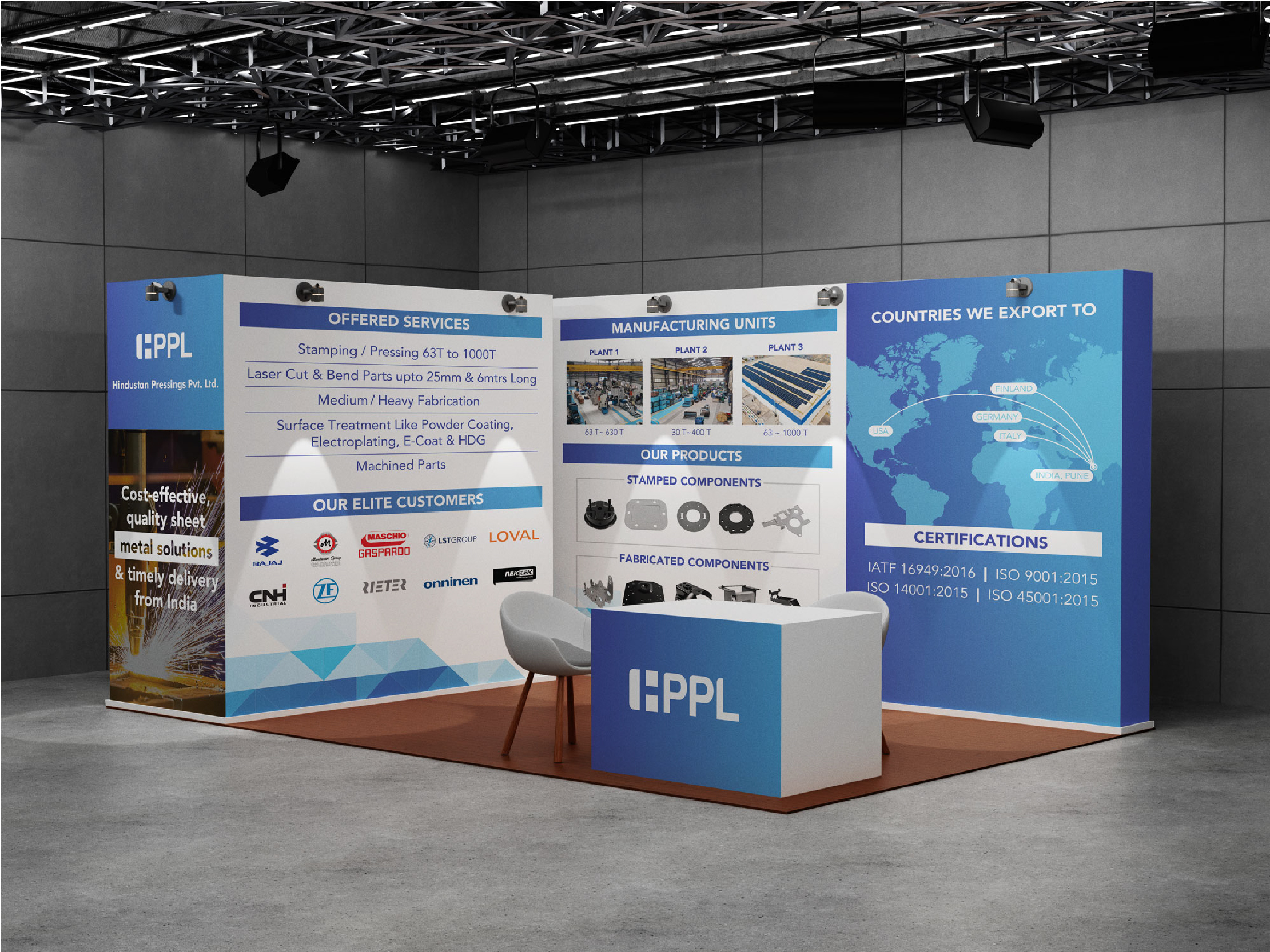
Engineering sheet metal for the world’s industries since 1992 — now with the visual presence of the global manufacturer, it has always been.
There’s a good chance you’ve ridden in something HPPL helped build.
A car, a lift, a train, maybe a solar panel mount you walked past this morning. Since 1992, they’ve been pressing, cutting, and welding sheet metal into the parts that hold modern industry together — three IATF-certified plants quietly shipping to the US, Germany, Italy, Finland, and Australia.
So the work was about turning the volume up — without ever turning the integrity down. A social media presence that finally looks the part of a global manufacturer. Brochures that feel less like leaflets and more like showroom collateral. Visiting cards engineered to open the right rooms. And a stall built to do what HPPL’s components have always done — earn attention, then hold it.
A brand finally as well-engineered as everything that rolls out of its plants.
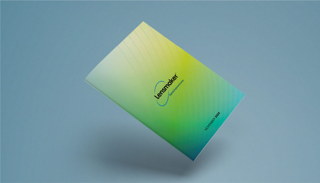
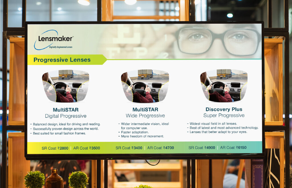
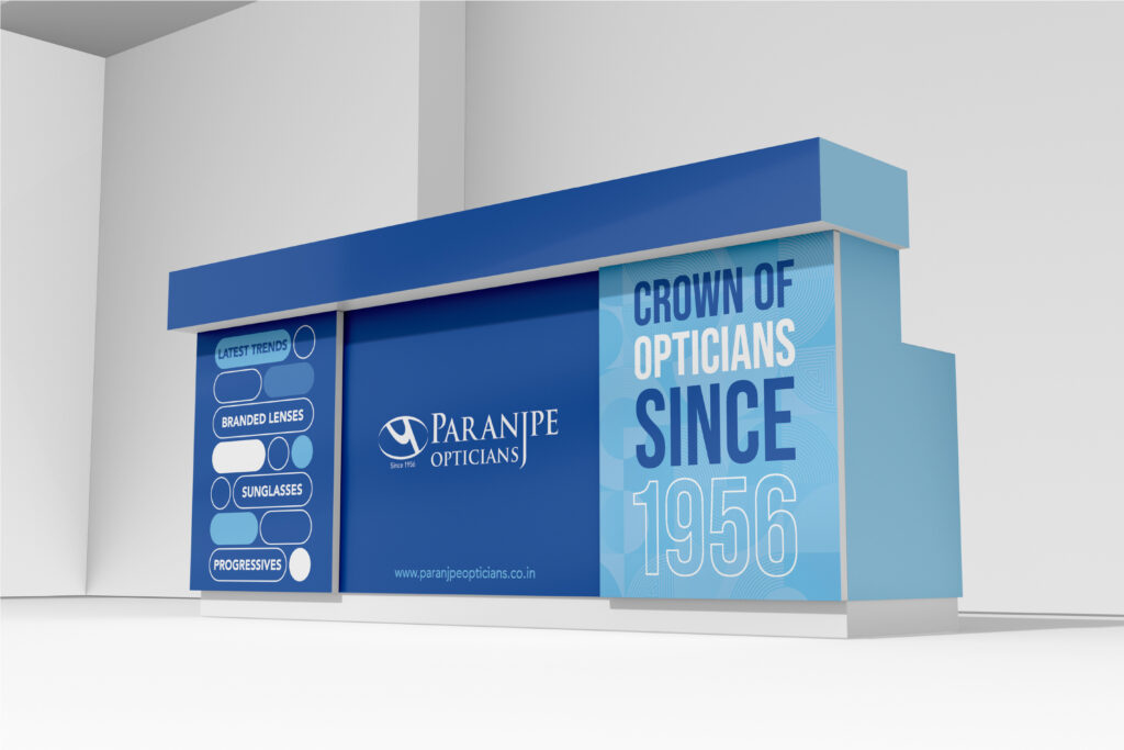
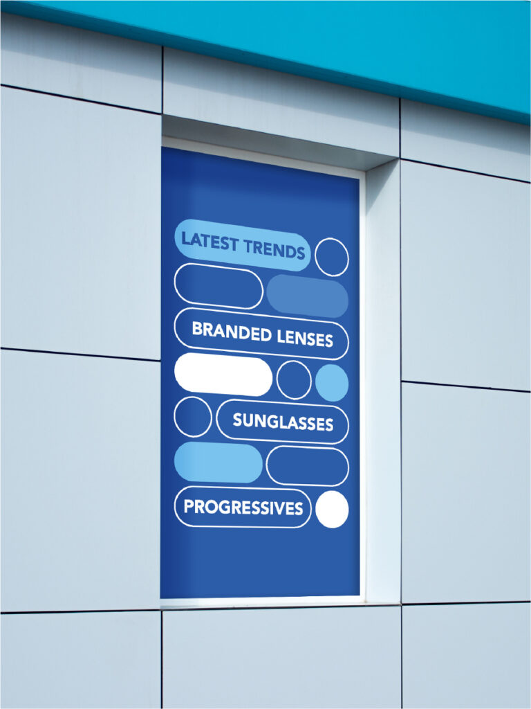
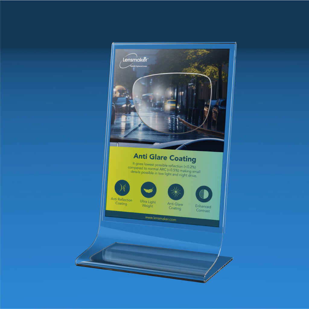
Digitally engineered lenses from a house Pune has trusted since 1956 — given the packaging and print to match the precision inside.
Lensmaker is the digitally engineered lens label born out of Paranjpe Opticians — a Pune optical institution since 1956, now in its fourth generation. The product runs on tight tolerances. The brand had to carry the same discipline.
A product this precise can’t be wrapped in anything ordinary. So the packaging was built to do the introductions on the shelf — clean hierarchy, a palette that knows when to stop, structural details that hint at the engineering tucked inside. The brochure picked up the same tone. Technical, but never clinical. The kind of print an optician keeps on their counter, not in a drawer.
A 70-year legacy, finally with the look of something built for the next 70.
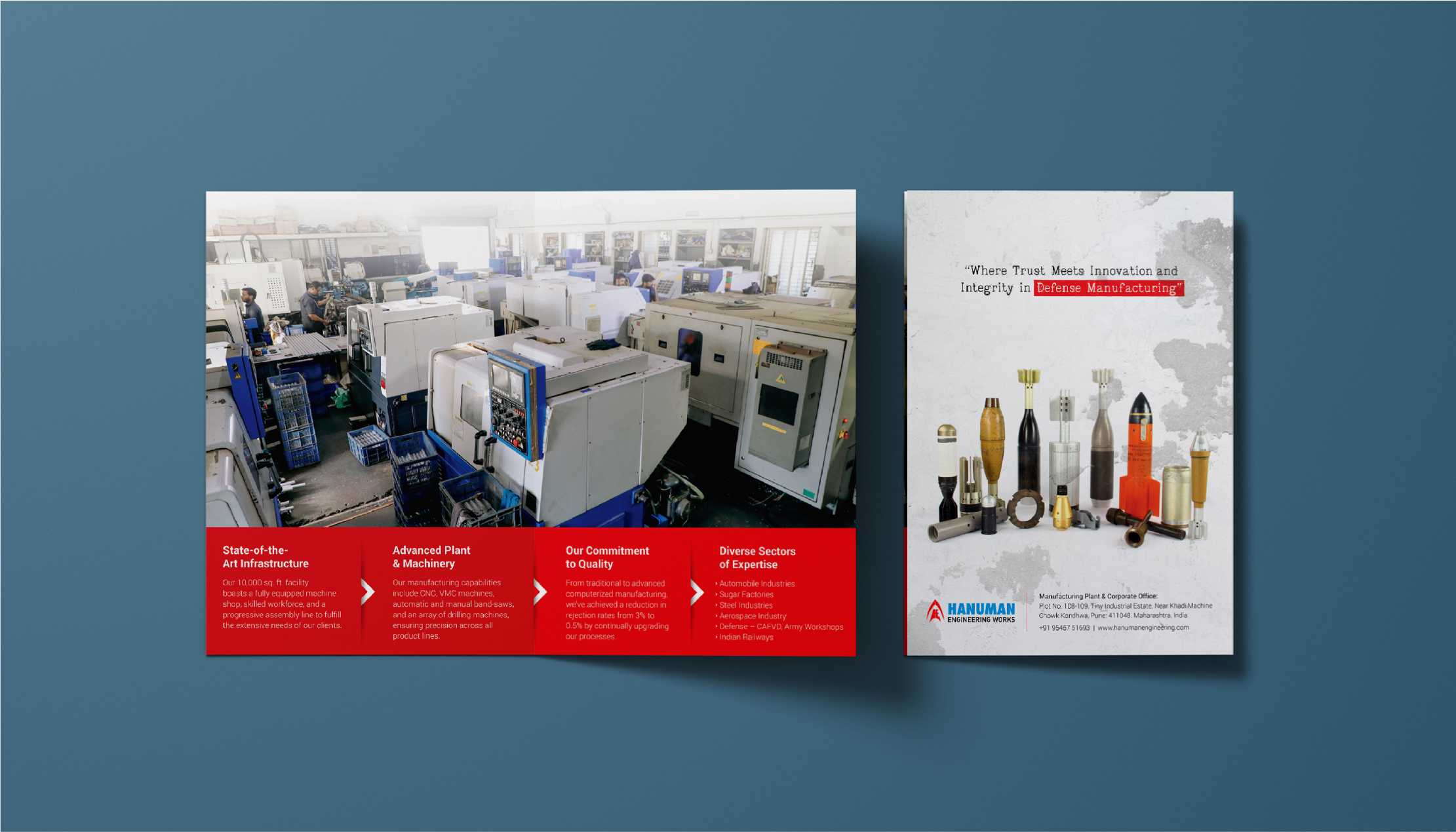
Defending the nation since 1964. A digital presence built with the same precision.
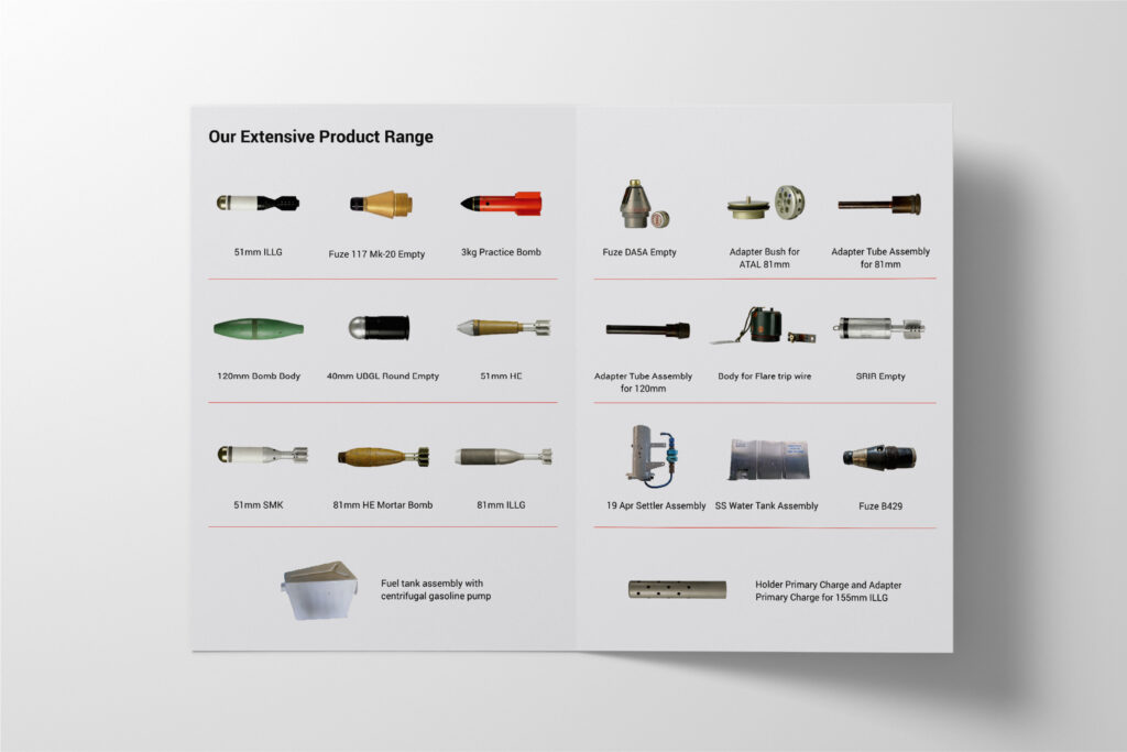
There’s a category of company you’ll never see advertised on a billboard — and Hanuman Engineering is one of them. Since 1964, they’ve been making armour fighting vehicle spares, bomb shells ranging from 51mm to 155mm, PINAKA rocket components, and tank spares for the Indian Ordnance Factories, Aerospace, and Indian Railways. The kind of work that doesn’t ask for applause. It just asks to keep going.
The job was to bring that gravity online without dressing it up. A website that walks visitors through products, infrastructure and clientele with the calm of someone who has nothing to prove. A social presence that finally let a 60 year legacy be seen. And a brochure system sharp enough to sit on any government or OEM table without flinching.
Built for a brand that has spent six decades being depended on — and never once needing to brag about it.


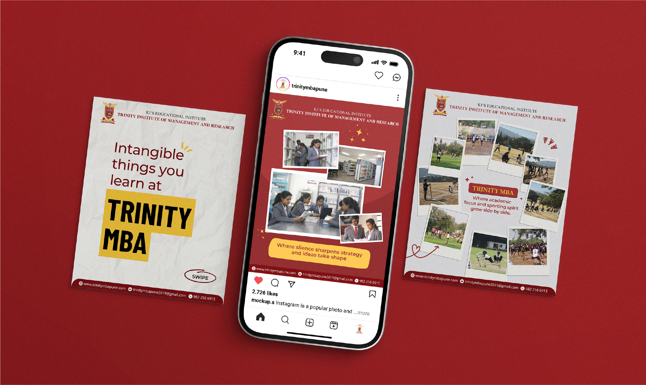
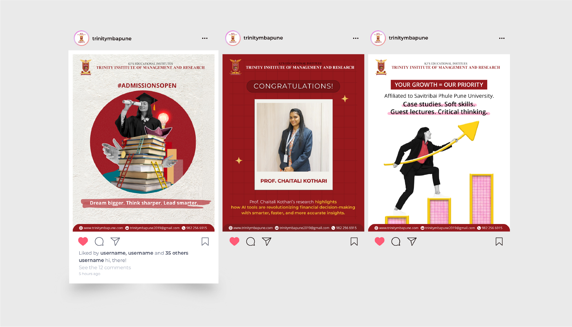
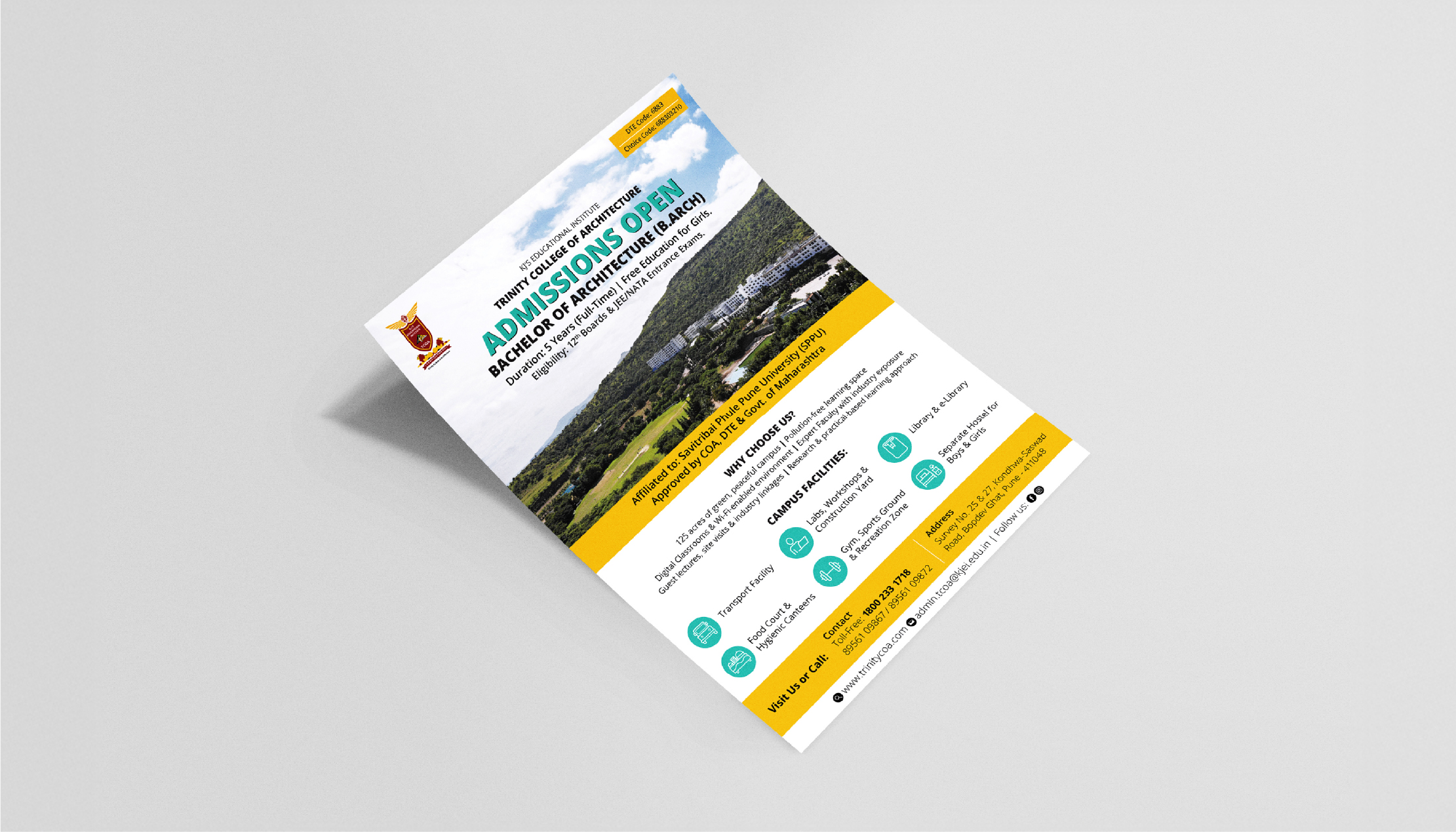
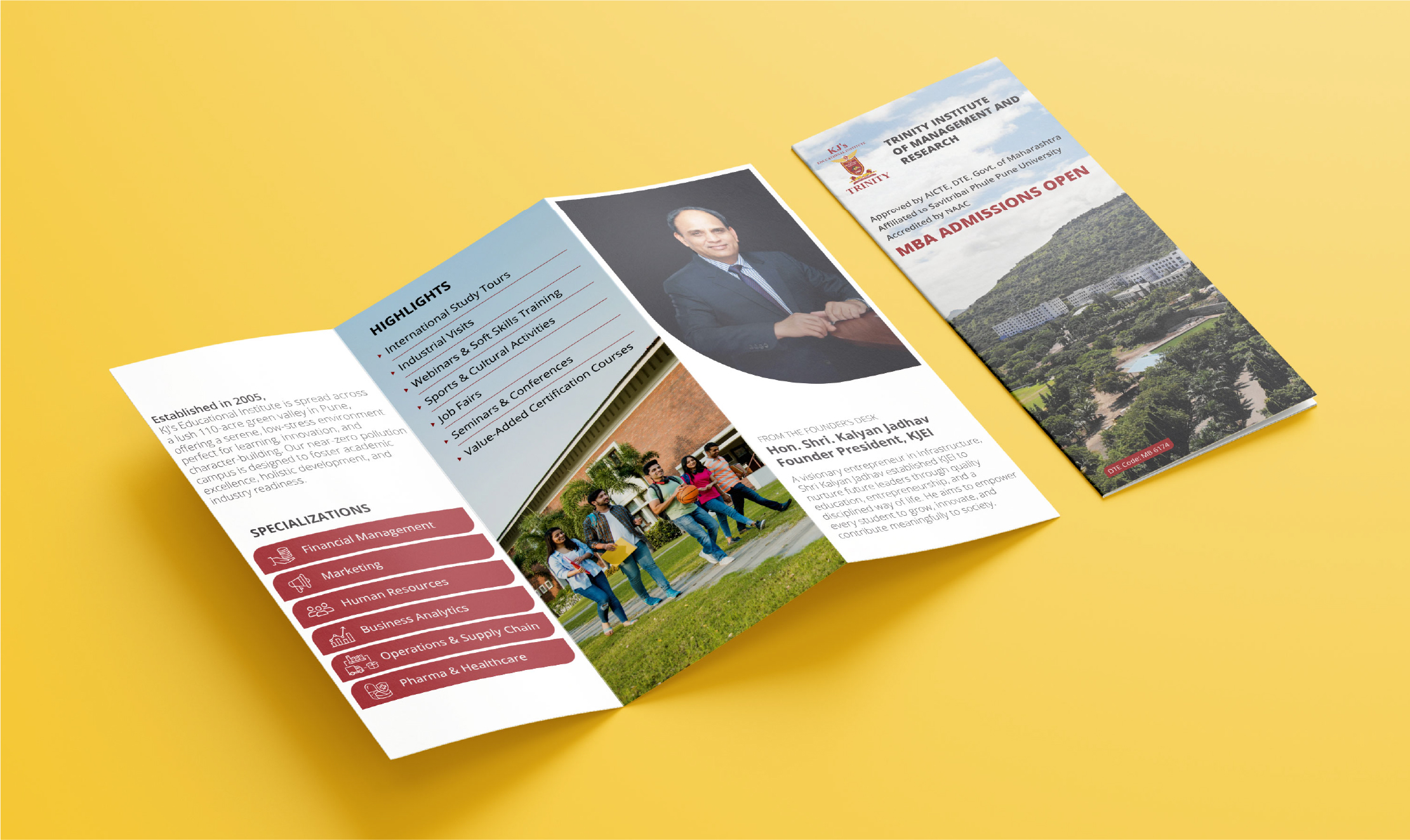
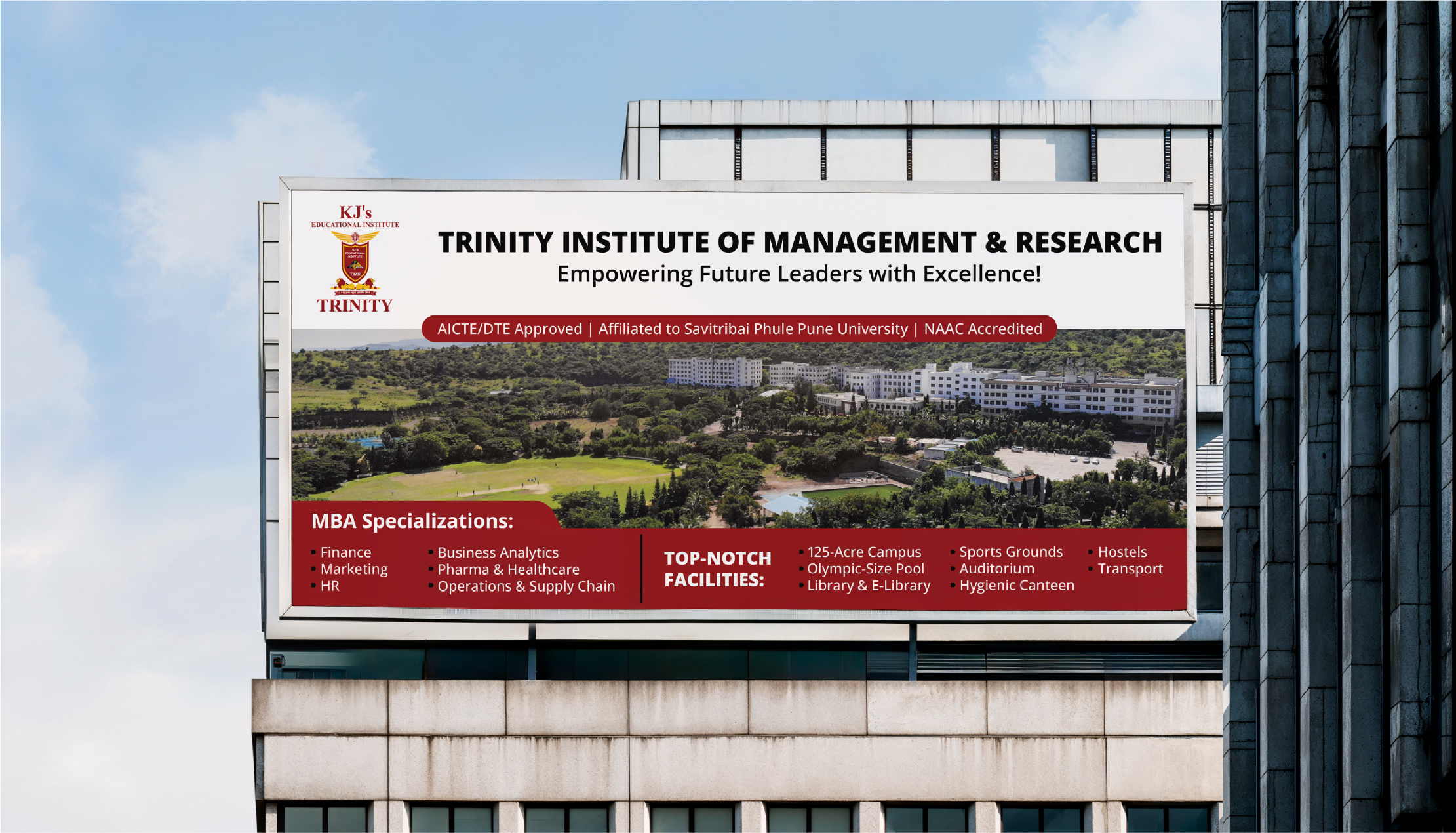
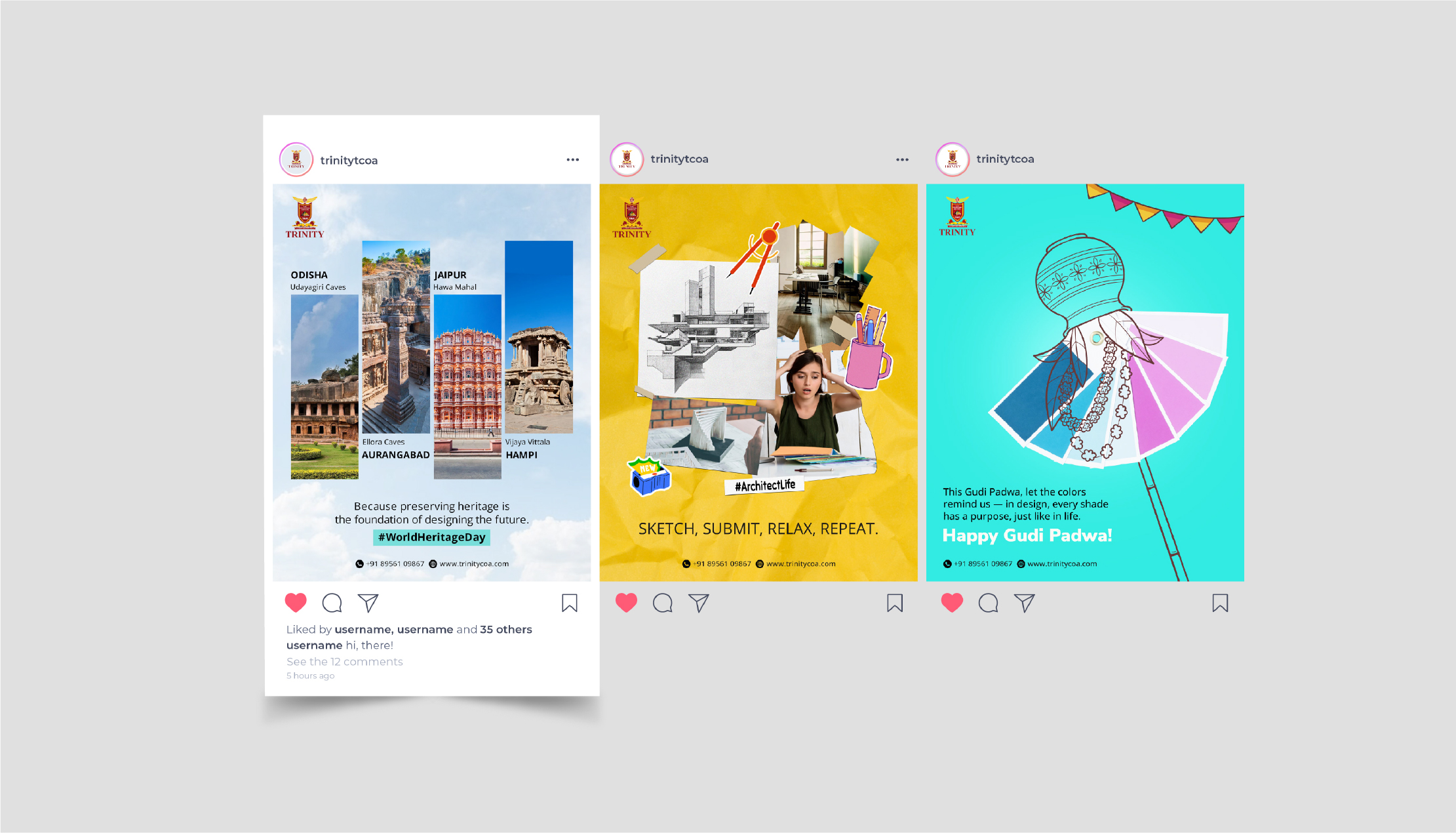
A Pune business school shaping the next generation of leaders — given a brand presence that speaks their language.
Choosing where to do an MBA isn’t a decision anyone takes lightly. It’s two years, a small fortune, and the launchpad for the next decade of a young person’s working life. Trinity has spent years building the kind of campus that earns that decision the hard way — strong faculty, real placements, and an academic culture that quietly turns out professionals the industry actually wants to hire.
What the brand needed was a voice that walked into that conversation early — before the brochure, before the campus visit, while a student is still scrolling Instagram between lectures. So the social media became the front gate. Campus moments, faculty wins, alumni stories, placement updates — all stitched together with the kind of tone that feels human, not administrative. The brochures followed in the same key. Considered enough for a parent to trust. Sharp enough for a student to keep.
A business school that earns the seat in the classroom — and now, the scroll on the phone too.


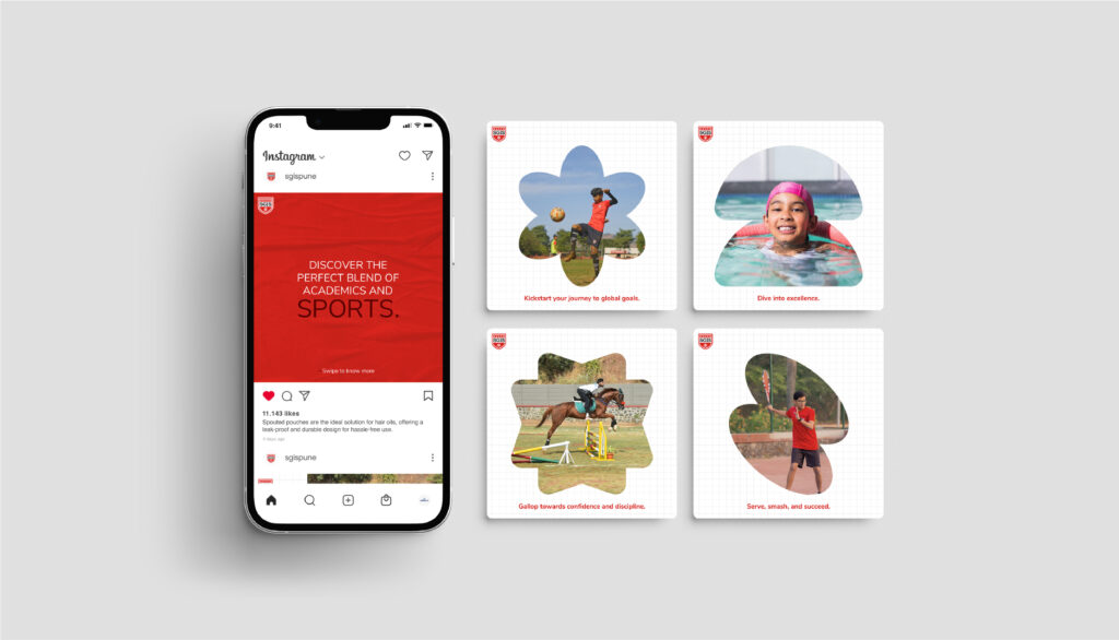
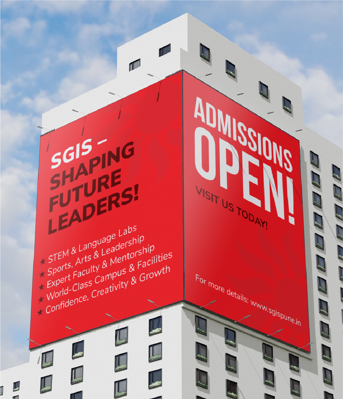
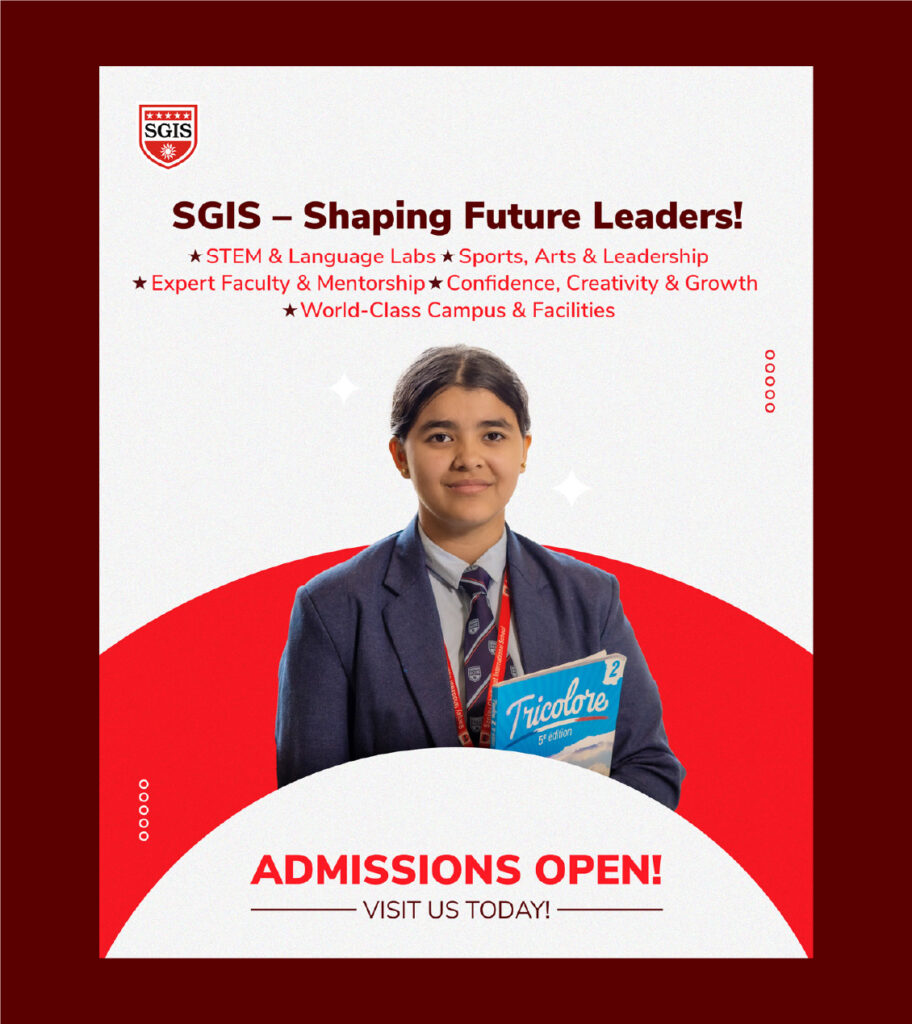
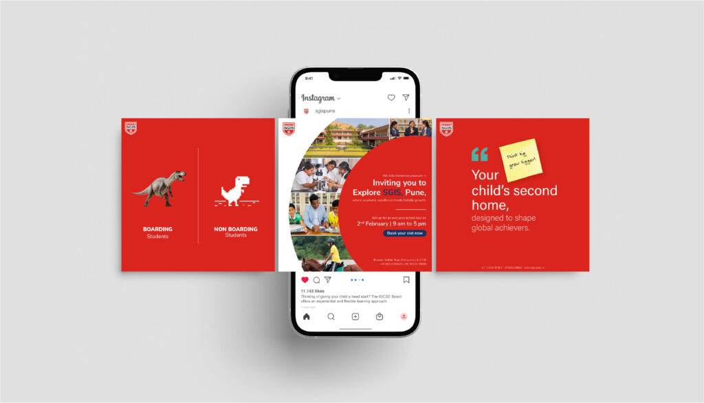
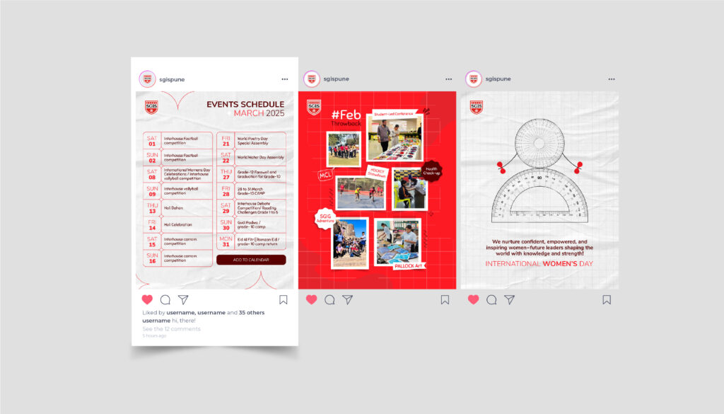
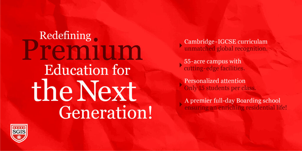
SGIS approached us with a clear goal to establish a strong presence for their new Pune branch and position it as more than just a school. With its full-time hostel setup, expansive campus, international curriculum, and focus on holistic development, the story was already powerful, we just had to make it felt.
Our approach was to bring the “SGIS Campus Experience” alive across social media. Instead of just informing, we focused on helping parents visualize the life their children would step into, structured, enriching, and future-ready. Every piece of content was crafted to build trust, subtly answering the biggest question in a parent’s mind: “Is this the right place for my child?”
Using SGIS’s bold brand language, we created visually striking, scroll-stopping creatives while balancing warmth and credibility. From dynamic reels to engaging content formats, the strategy blended storytelling with visibility, ensuring the brand didn’t just appear, but stayed memorable.
The result? A campaign that didn’t just promote admissions, it positioned SGIS as a place where students grow into confident, real-world-ready individuals.

A Pune school shaping young minds — given a brand presence that grows alongside its students.
Schools used to live entirely on word-of-mouth. Today, they live on every parent’s phone screen first. Gayatri English Medium School has spent years building the kind of campus a parent feels good sending a child to — strong academics, real values, a culture that prepares kids for life and not just exams. What the brand needed was a presence that brought all of that into the everyday feed of every family in the neighbourhood.
So the work spread across the school’s entire experience. A social presence that turned classroom moments, achievements and events into stories parents look forward to seeing. Stationery that gives the school a consistent face across every notebook and circular. Hoardings that show up confidently across the city around admissions season. Event design and invites that make every annual day, sports day and parents’ meet feel like the occasion it actually is.
A school brand that finally feels as warm, considered and present as the campus behind it.
An Orlando concierge healthcare practice led by Dr. Mrunal Patil — given a digital presence as personal as the care itself.
Prerna Health isn’t a clinic. It’s a different way of practising medicine. Concierge primary care, lifestyle medicine, holistic wellness — built around the belief that the body heals when it’s actually listened to. Led by Dr. Mrunal Patil, named Orlando’s Doctor of the Year 2025, the practice has spent years turning patients into people who feel seen long before they feel better.
The work made sure that warmth showed up online too. A social presence built around awareness, education, and gentle reminders to put your health first — written, designed and posted with the same care a doctor brings to a consult. The numbers followed naturally. From around 400 followers to 766, organically — no shortcuts, no inflated metrics, just real people choosing to stick around. Layered alongside it, paid ads and performance marketing built to bring the right patients through the door, and content writing that lets the practice speak in its own voice across every platform.
Marketing run with the same intent the clinic runs on — and the proud first international chapter of Makeovers’ story.


A luxury residential project, given a brochure that walks visitors through it before they ever walk in.
Ekant is the kind of project where the brochure isn’t an afterthought — it’s the first room a buyer steps into. Premium homes, considered architecture, the calm that comes with truly luxurious living. Selling a project like that asks for collateral that doesn’t oversell. It just shows.
So the brochure was crafted with the same patience the project asks of its homeowners. Generous typography, elegant white space, photography that lets the architecture do the talking. Page after page, the document walks a buyer through Ekant the way a good host walks them through a home — unhurried, considered, letting the place speak for itself.
Print collateral that doesn’t introduce the project. It introduces the lifestyle.
Pune’s redevelopment specialists — given a brand built with the same care as the homes they hand over.
Anandee Homes does what every old Pune society quietly hopes for — they walk in, take on the redevelopment, and walk out, leaving behind a home families actually want to live in. It’s a category built almost entirely on trust. And trust, in real estate, is something you can’t fake.
So the brand was built to do the talking before the first meeting. A website that walks visitors through projects, processes, and promises with the calm of a developer who’s done this enough times not to need to oversell. A social presence that brings the work — and the people behind it — into the daily feed of every society chairman thinking about their next move. And hoardings designed to do what hoardings should — earn a second look on a busy Pune flyover and stay in the head long enough to prompt a phone call.
A brand that opens the door long before the keys are ever handed over.
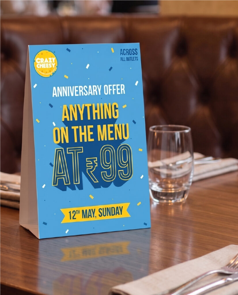
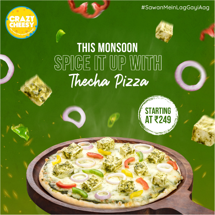
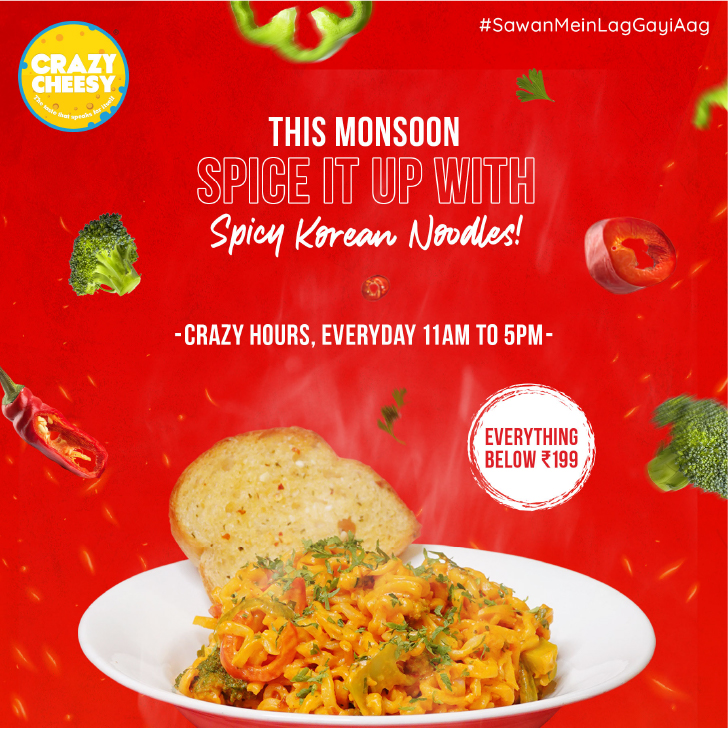
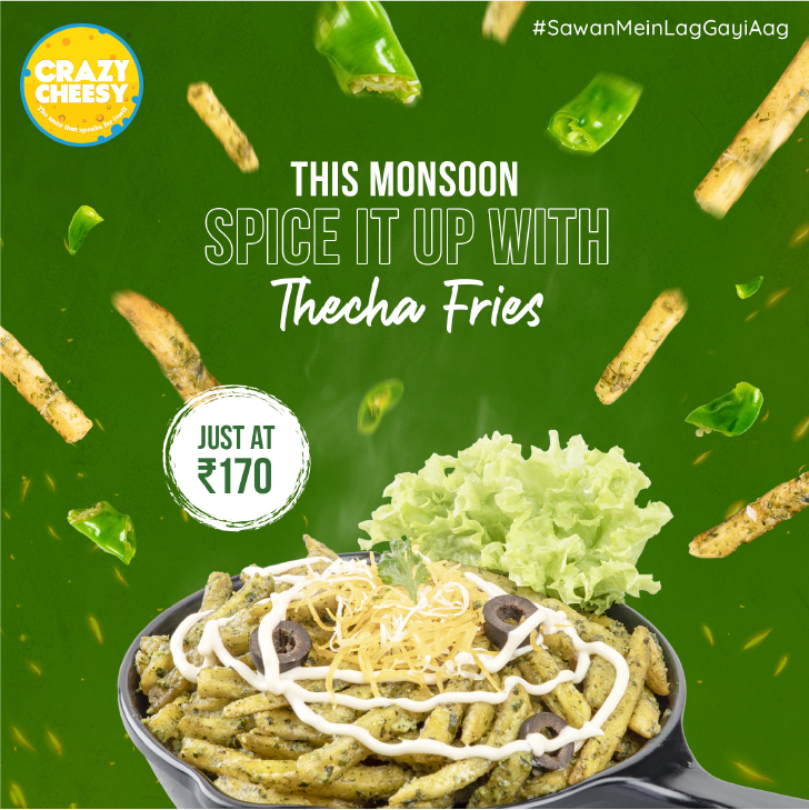
Continental food with a desi tadka, served across Pune — given a brand as crave-worthy as the menu itself.
Crazy Cheesy isn’t a cafe. It’s a craving. The kind that hits at 9 PM on a weekday when nothing but extra cheese on a tandoori paneer pizza will do. Across multiple outlets in Pune, they’ve spent years perfecting the small art of taking a continental classic and giving it just enough Indian attitude to feel like home — burgers with bite, pizzas with tadka, and shakes thick enough to be a meal of their own.
A menu like that needed a brand that could keep up with the appetite. So everything got the full treatment. A logo that walks in already grinning. Packaging built for the photo before the first bite. Social media that doesn’t just sell food — it builds the appetite, frame by frame, with cheeky writing, drool-worthy product shots, and the kind of festive content that turns scrollers into walk-ins. End-to-end marketing, end-to-end mood.
A brand as warm, indulgent, and impossible to resist as the food it’s wrapped around.
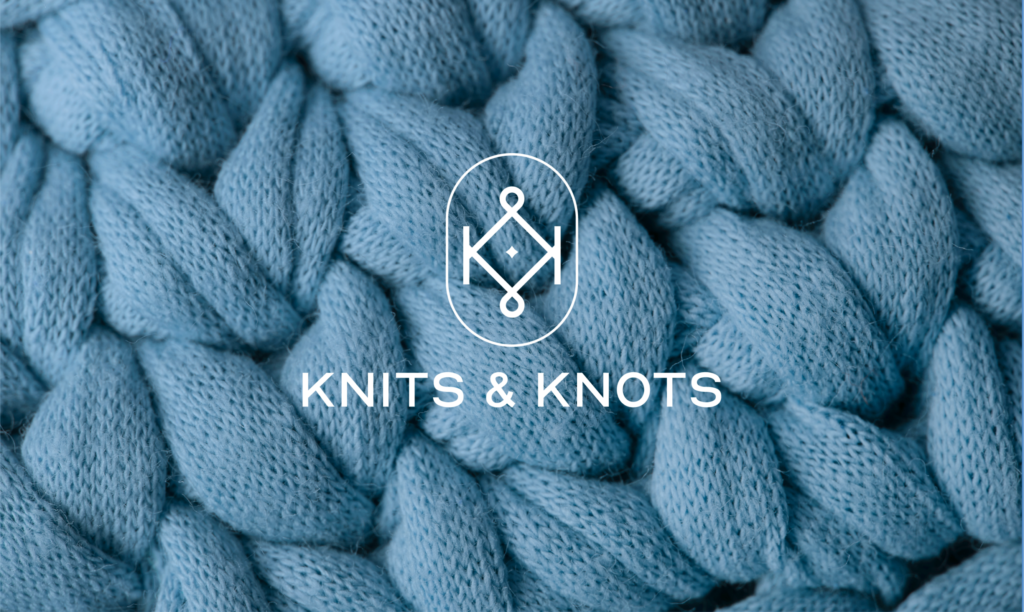
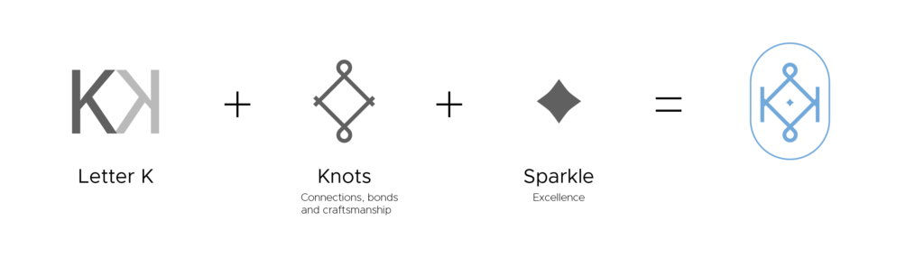
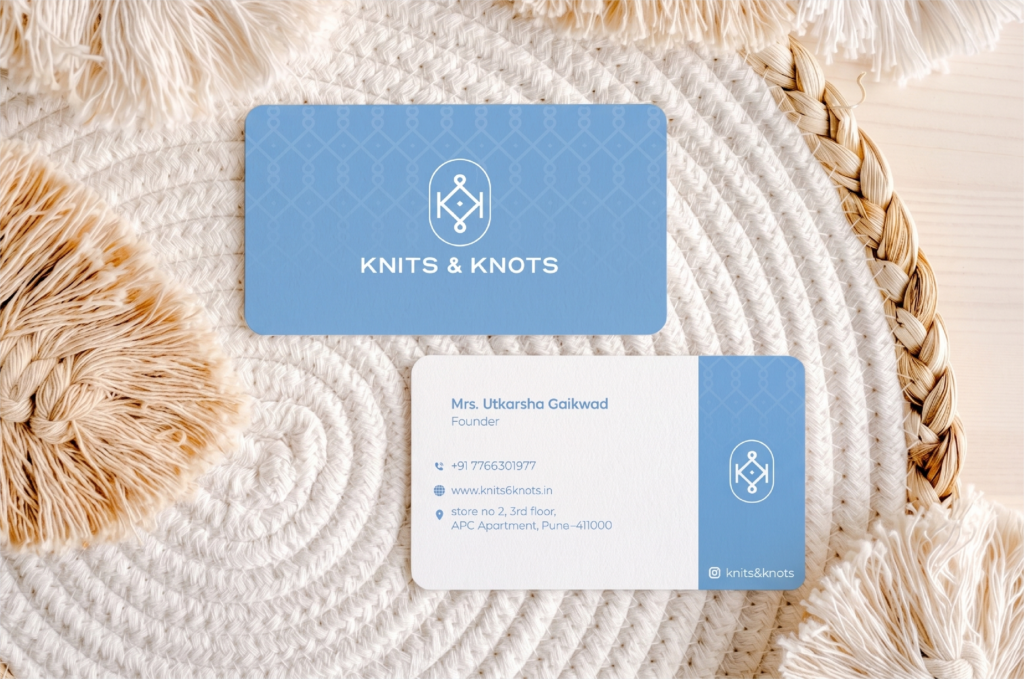
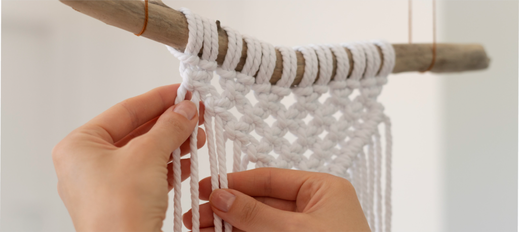
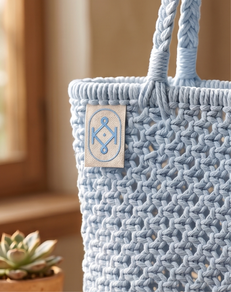
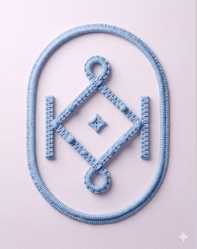
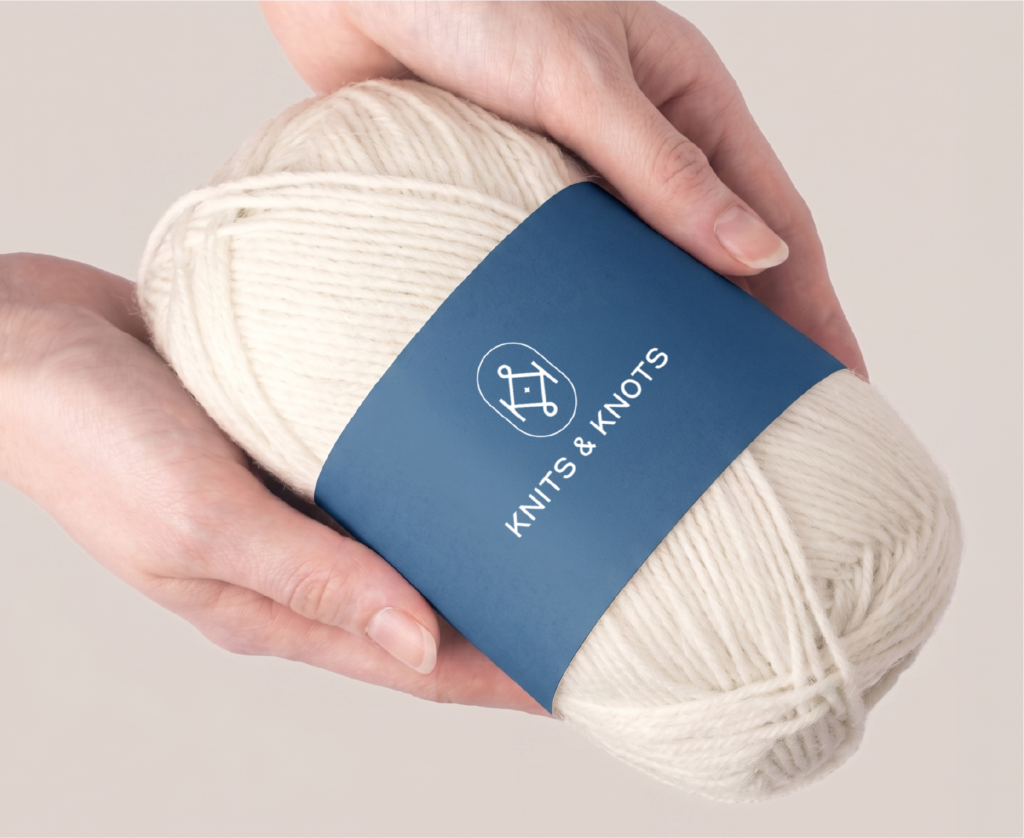
A homegrown label of handmade macramé and crochet — given a logo that holds the same care woven into every product.
Some brands are built in factories. Knits and Knots is built by hand, knot by knot, thread by thread. Each piece comes out of long hours, slow craft, and the kind of attention to detail you can’t automate. A brand like that needs an emblem that earns its place — not louder than the product, but quietly as honest.
So the logo was designed the way every Knits and Knots piece is made. Considered. Patient. Built around the soft, looped, woven character of the craft itself, with just enough warmth to feel handmade. One mark. One personality. The kind that sits on a tag and instantly says this was made for you, by someone who cared.
A logo as gentle and intentional as the craft it carries.


Athleisure built on the philosophy of hustle — made for the ones already moving — packaged into a brand that moves with them.
Bharathon isn’t just selling athleisure. It’s selling a mindset — Hustle Kar, Haasil Kar — to a generation that runs on six AM gym sessions, 9-to-9 grinds, and the quiet belief that the work always pays off. The clothes were ready. What it needed was a world that matched the philosophy.
So the brand was built from the ground up. A logo and identity system that carries the weight of the hustle without ever needing to shout. Packaging that feels less like a parcel and more like a small win every time a customer opens it. And a website built to be the meeting ground — part shop, part community, part rallying point for everyone showing up for themselves every single day.
A label for the ones who don’t just dream the goal — they show up for it.
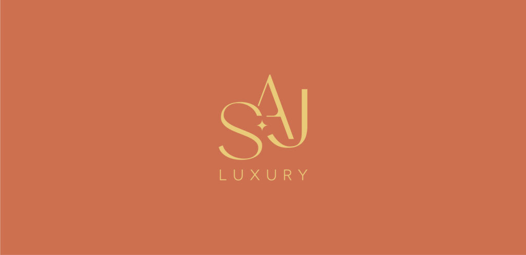
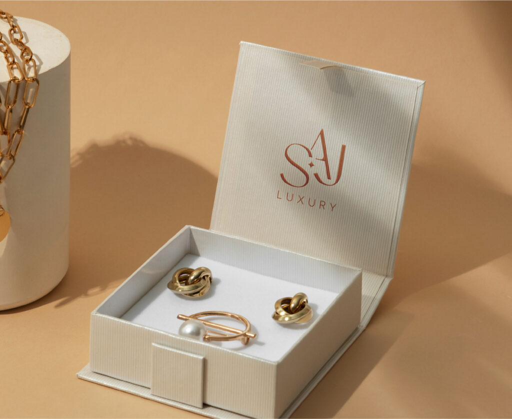
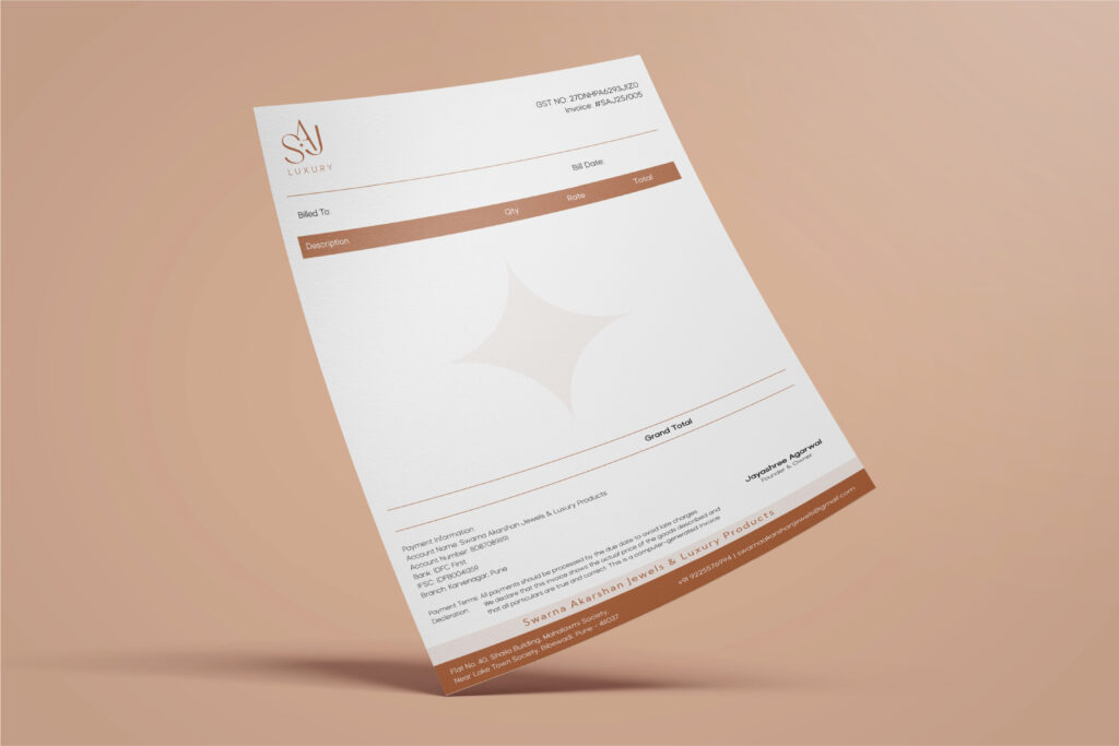
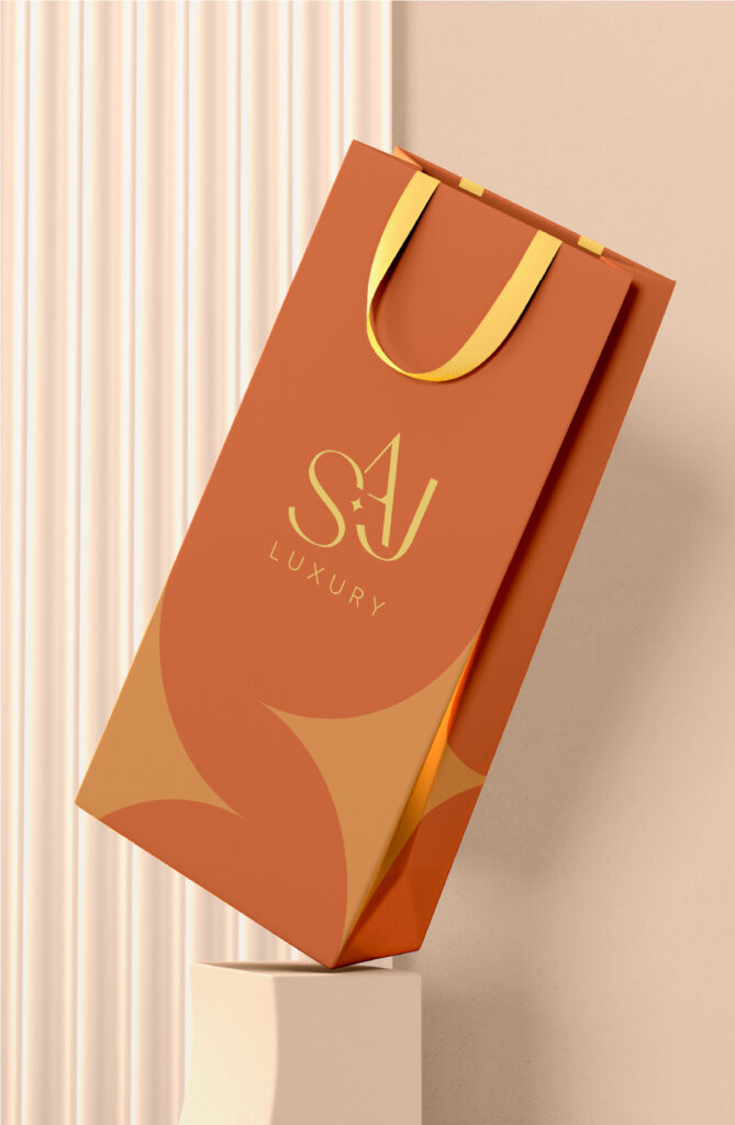
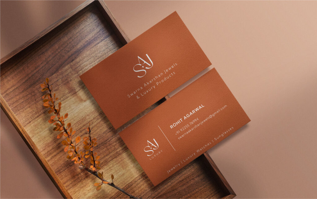
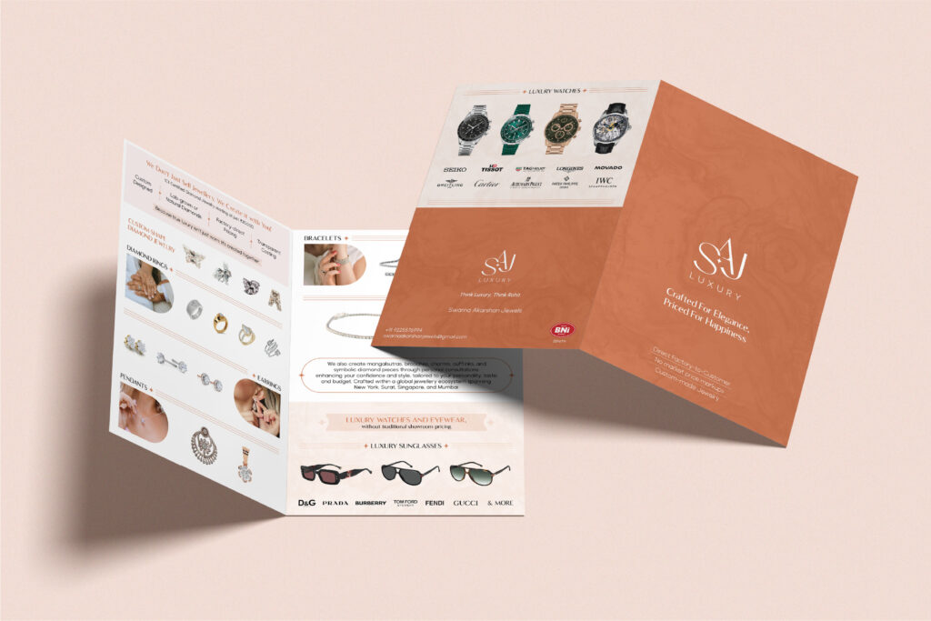
Swarna Akarshan Jewels — a luxury house of jewellery, watches and eyewear, given the brand world to match the things it sells.
SAJ doesn’t sell ordinary things. Fine jewellery, luxury timepieces, premium eyewear — the kind of pieces a customer carries into the most important moments of their life. A category like that doesn’t allow for a half-measure brand. Every touchpoint had to feel like the box you’d save long after the purchase.
So the work began at the foundation. A logo built on quiet confidence, not loud declaration. A product catalogue designed less like a brochure and more like a coffee table book — the kind you flip through slowly. A visiting card that earns its place in a wallet. And a brochure that does what good luxury collateral should — hold attention without ever raising its voice.
A brand finally as carefully crafted as the pieces inside it.


Six decades of trust, distilled into a single emblem.
Sixty years is a long time to build a name on word-of-mouth alone. But that’s exactly how Gayatri Corporation got here — Pune’s go-to for tile adhesives, waterproofing chemicals, AAC blocks, hardware, laminates and construction chemicals, passed from one builder to the next through nothing but reputation. What was missing was An emblem to carry it forward was the missing piece.
So the logo was built from the ground up. The “G” became a load-bearing pillar — strength, structure, six decades of standing tall. And tucked inside it, the silhouette of Lord Ganesha — the family’s blessing, the auspicious nod every Indian construction begins with. One emblem. Three layers of meaning. Rolled out across a stationery suite that finally lets sixty years of legacy show up in the room before the conversation does.
A name that’s always been trusted, now with a mark that says it out loud.
The quiet force behind heavy commercial vehicles across 11 countries — given the brand voice to finally be heard.
If you’ve ever wondered why a 40-tonne truck doesn’t feel like a 40-tonne truck — that’s engineering like Accurub’s at work. Their rubber and rubber-to-metal bonded components are the bit between the road and the driver, soaking up every bump and jolt the highway can throw. Eleven countries depend on it. Most of them have no idea who to thank.
Which made the brief a fun one — give a brand that lives behind the scenes a presence worth showing up for. The social feed found a voice that B2B usually forgets it’s allowed to have. The Automechanika stall pulled buyers in mid-stride and gave them a reason to stay. The brochure carried the conversation long after the handshake had moved on.
Same engineering standard. Just translated into design.
Engineering sheet metal for the world’s industries since 1992 — now with the visual presence of the global manufacturer, it has always been.
There’s a good chance you’ve ridden in something HPPL helped build.
A car, a lift, a train, maybe a solar panel mount you walked past this morning. Since 1992, they’ve been pressing, cutting, and welding sheet metal into the parts that hold modern industry together — three IATF-certified plants quietly shipping to the US, Germany, Italy, Finland, and Australia.
So the work was about turning the volume up — without ever turning the integrity down. A social media presence that finally looks the part of a global manufacturer. Brochures that feel less like leaflets and more like showroom collateral. Visiting cards engineered to open the right rooms. And a stall built to do what HPPL’s components have always done — earn attention, then hold it.
A brand finally as well-engineered as everything that rolls out of its plants.
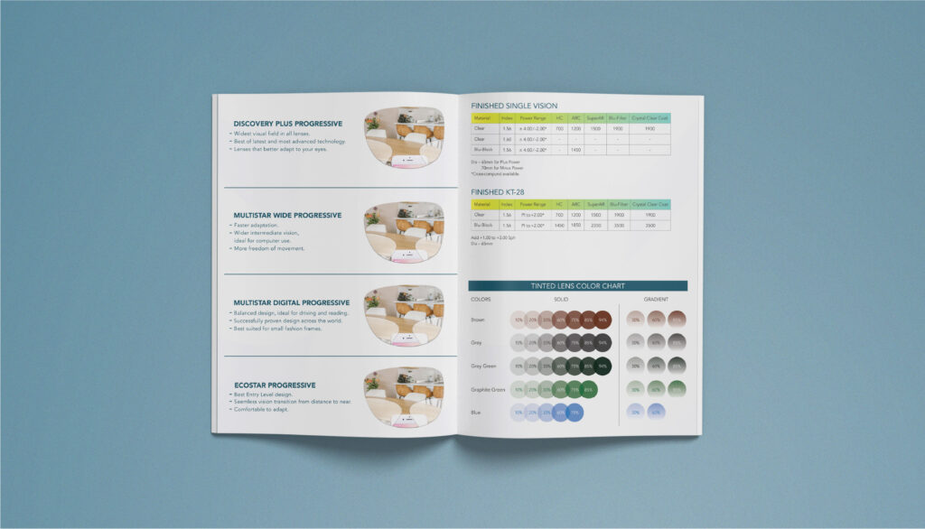
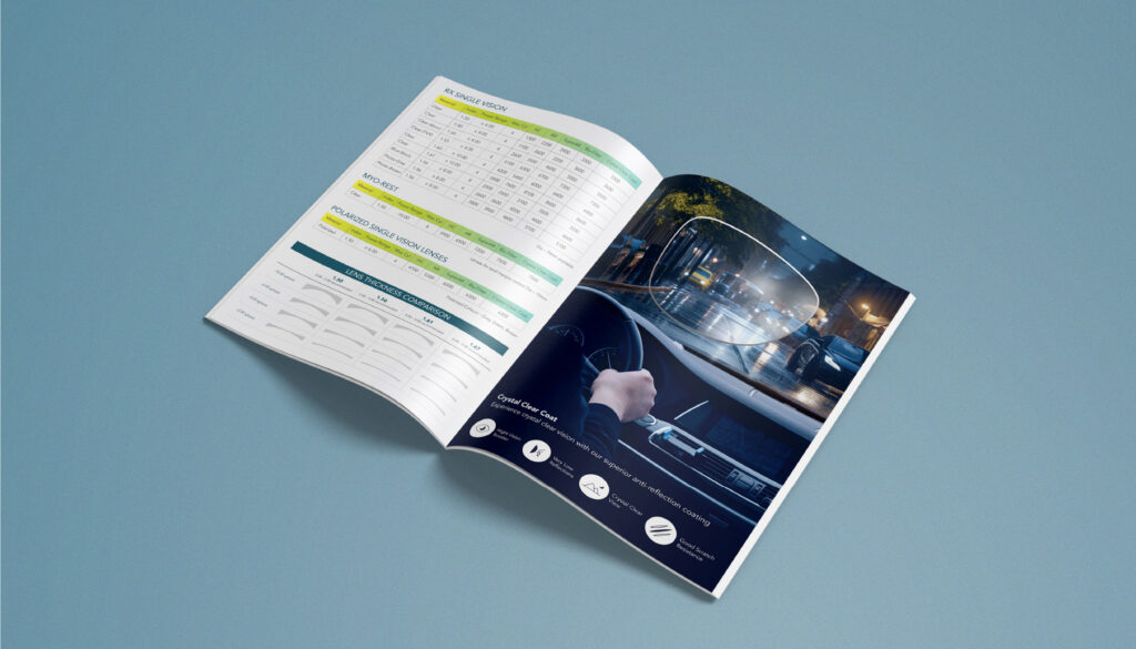
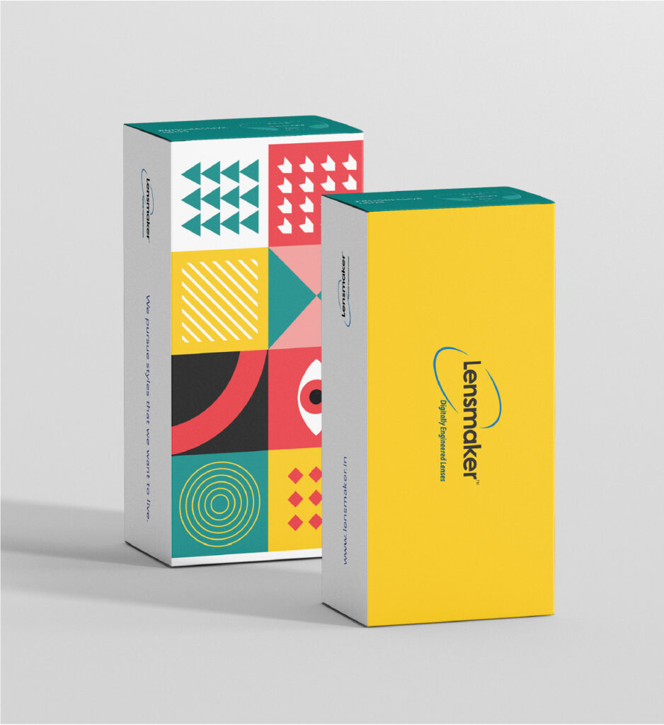
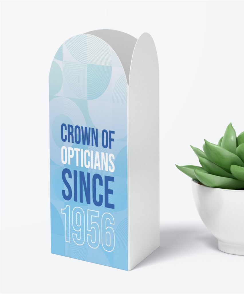
Digitally engineered lenses from a house Pune has trusted since 1956 — given the packaging and print to match the precision inside.
Lensmaker is the digitally engineered lens label born out of Paranjpe Opticians — a Pune optical institution since 1956, now in its fourth generation. The product runs on tight tolerances. The brand had to carry the same discipline.
A product this precise can’t be wrapped in anything ordinary. So the packaging was built to do the introductions on the shelf — clean hierarchy, a palette that knows when to stop, structural details that hint at the engineering tucked inside. The brochure picked up the same tone. Technical, but never clinical. The kind of print an optician keeps on their counter, not in a drawer.
A 70-year legacy, finally with the look of something built for the next 70.
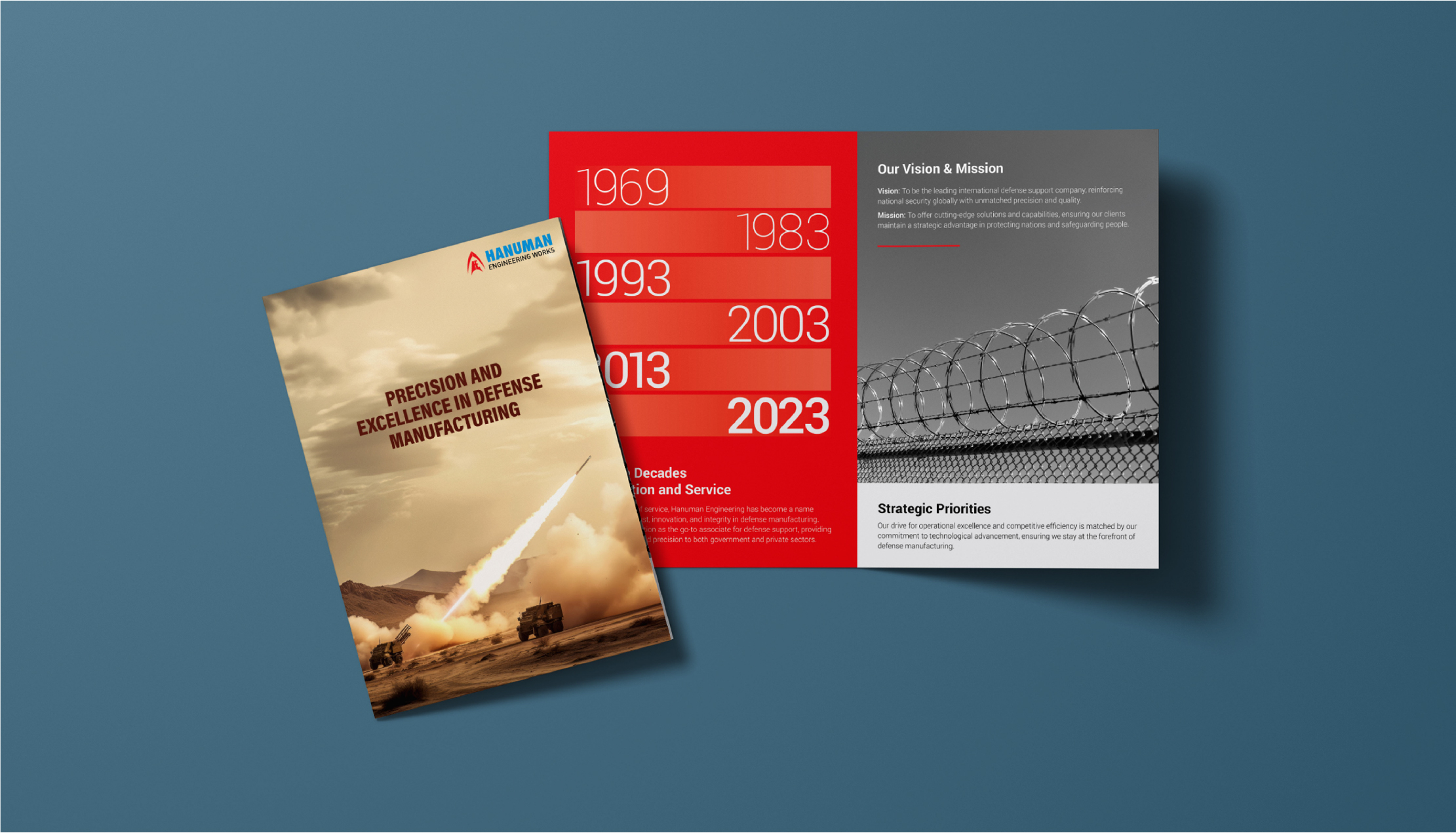
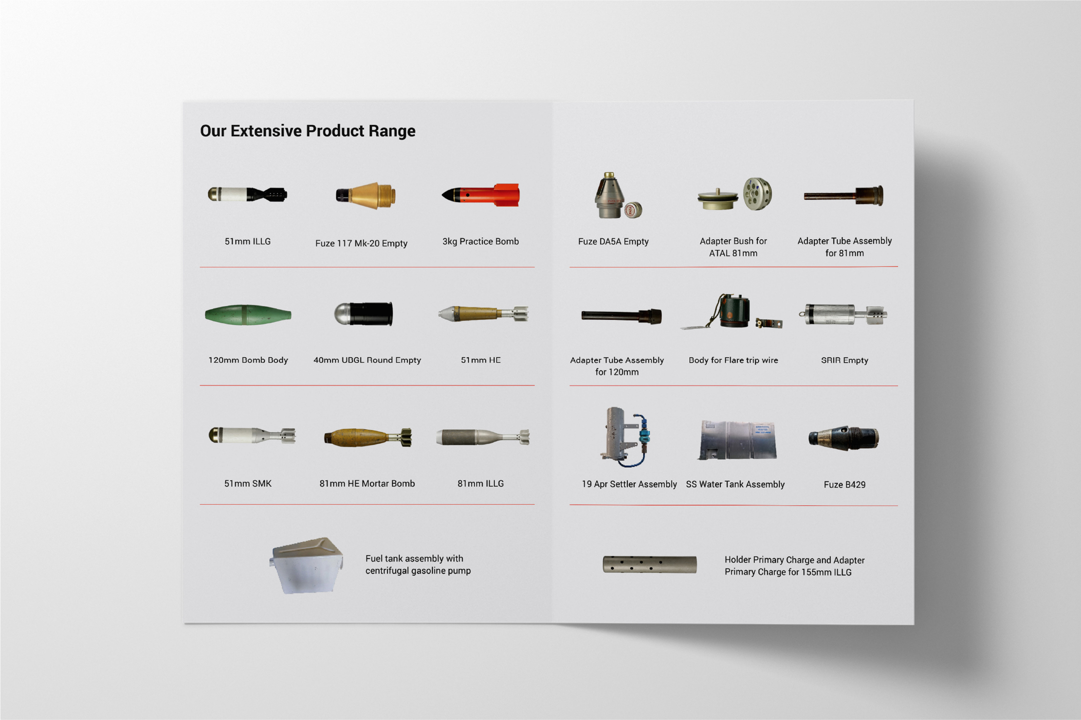
Defending the nation since 1964. A digital presence built with the same precision.
There’s a category of company you’ll never see advertised on a billboard — and Hanuman Engineering is one of them. Since 1964, they’ve been making armour fighting vehicle spares, bomb shells ranging from 51mm to 155mm, PINAKA rocket components, and tank spares for the Indian Ordnance Factories, Aerospace, and Indian Railways. The kind of work that doesn’t ask for applause. It just asks to keep going.
The job was to bring that gravity online without dressing it up. A website that walks visitors through products, infrastructure and clientele with the calm of someone who has nothing to prove. A social presence that finally let a 60 year legacy be seen. And a brochure system sharp enough to sit on any government or OEM table without flinching.
Built for a brand that has spent six decades being depended on — and never once needing to brag about it.
A Pune business school shaping the next generation of leaders — given a brand presence that speaks their language.
Choosing where to do an MBA isn’t a decision anyone takes lightly. It’s two years, a small fortune, and the launchpad for the next decade of a young person’s working life. Trinity has spent years building the kind of campus that earns that decision the hard way — strong faculty, real placements, and an academic culture that quietly turns out professionals the industry actually wants to hire.
What the brand needed was a voice that walked into that conversation early — before the brochure, before the campus visit, while a student is still scrolling Instagram between lectures. So the social media became the front gate. Campus moments, faculty wins, alumni stories, placement updates — all stitched together with the kind of tone that feels human, not administrative. The brochures followed in the same key. Considered enough for a parent to trust. Sharp enough for a student to keep.
A business school that earns the seat in the classroom — and now, the scroll on the phone too.
SGIS approached us with a clear goal to establish a strong presence for their new Pune branch and position it as more than just a school. With its full-time hostel setup, expansive campus, international curriculum, and focus on holistic development, the story was already powerful, we just had to make it felt.
Our approach was to bring the “SGIS Campus Experience” alive across social media. Instead of just informing, we focused on helping parents visualize the life their children would step into, structured, enriching, and future-ready. Every piece of content was crafted to build trust, subtly answering the biggest question in a parent’s mind: “Is this the right place for my child?”
Using SGIS’s bold brand language, we created visually striking, scroll-stopping creatives while balancing warmth and credibility. From dynamic reels to engaging content formats, the strategy blended storytelling with visibility, ensuring the brand didn’t just appear, but stayed memorable.
The result? A campaign that didn’t just promote admissions, it positioned SGIS as a place where students grow into confident, real-world-ready individuals.
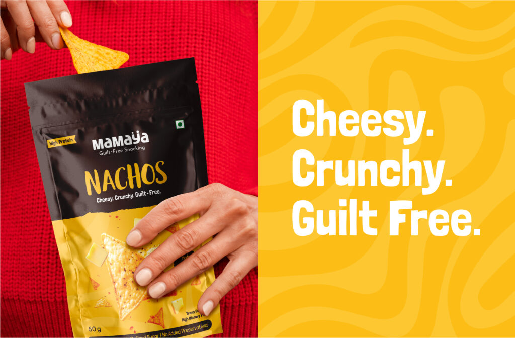
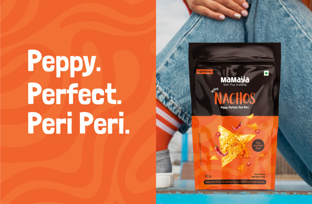
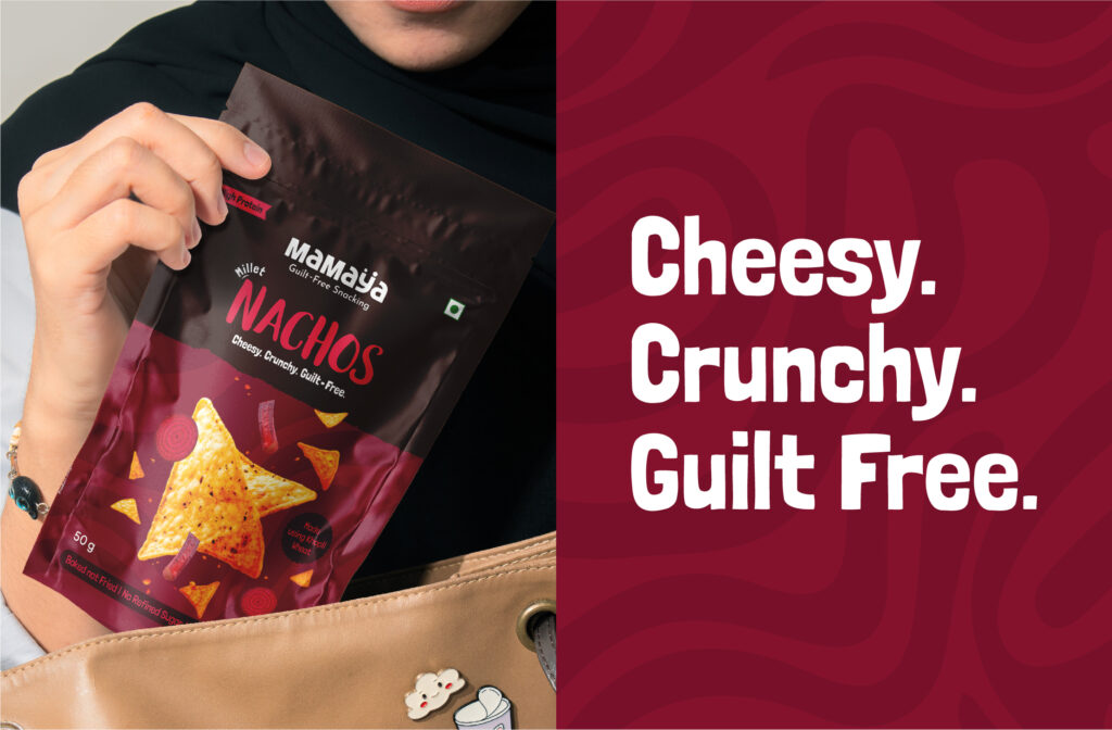
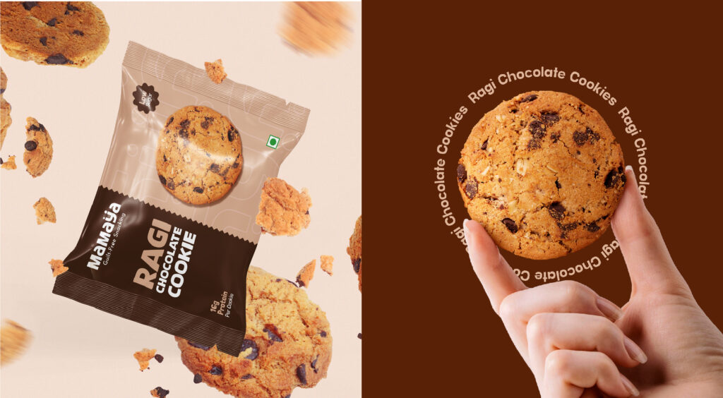
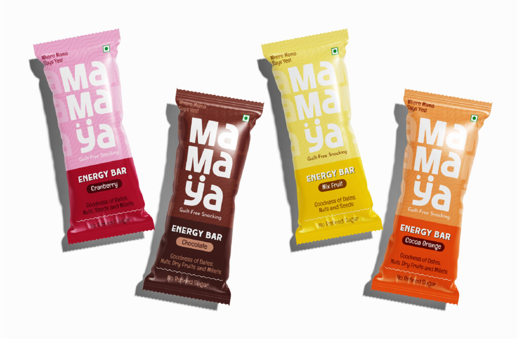
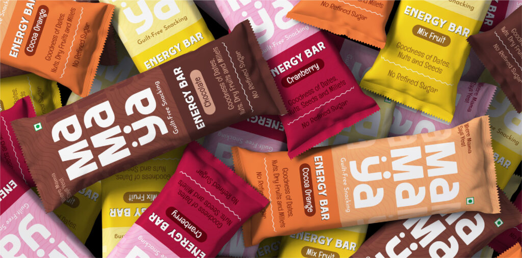
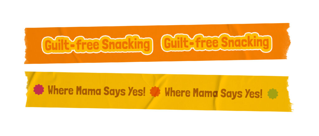
Mamaya is not just a snack, it is a mindful indulgence. When they approached us, they needed more than just visibility. They needed a brand that could balance health with a crave worthy appeal.
We built a vibrant and modern identity across every touchpoint including packaging, digital presence, and campaign communication. Every element was designed to reflect a fresh and feel good snacking experience.
Digitally, we made every bite look irresistible. Through bold visuals and engaging storytelling, we highlighted flavor, convenience, and the guilt free promise that makes Mamaya stand out.
The result is a snack brand people trust, enjoy, and come back to. A brand where every bite feels right and every choice feels good.


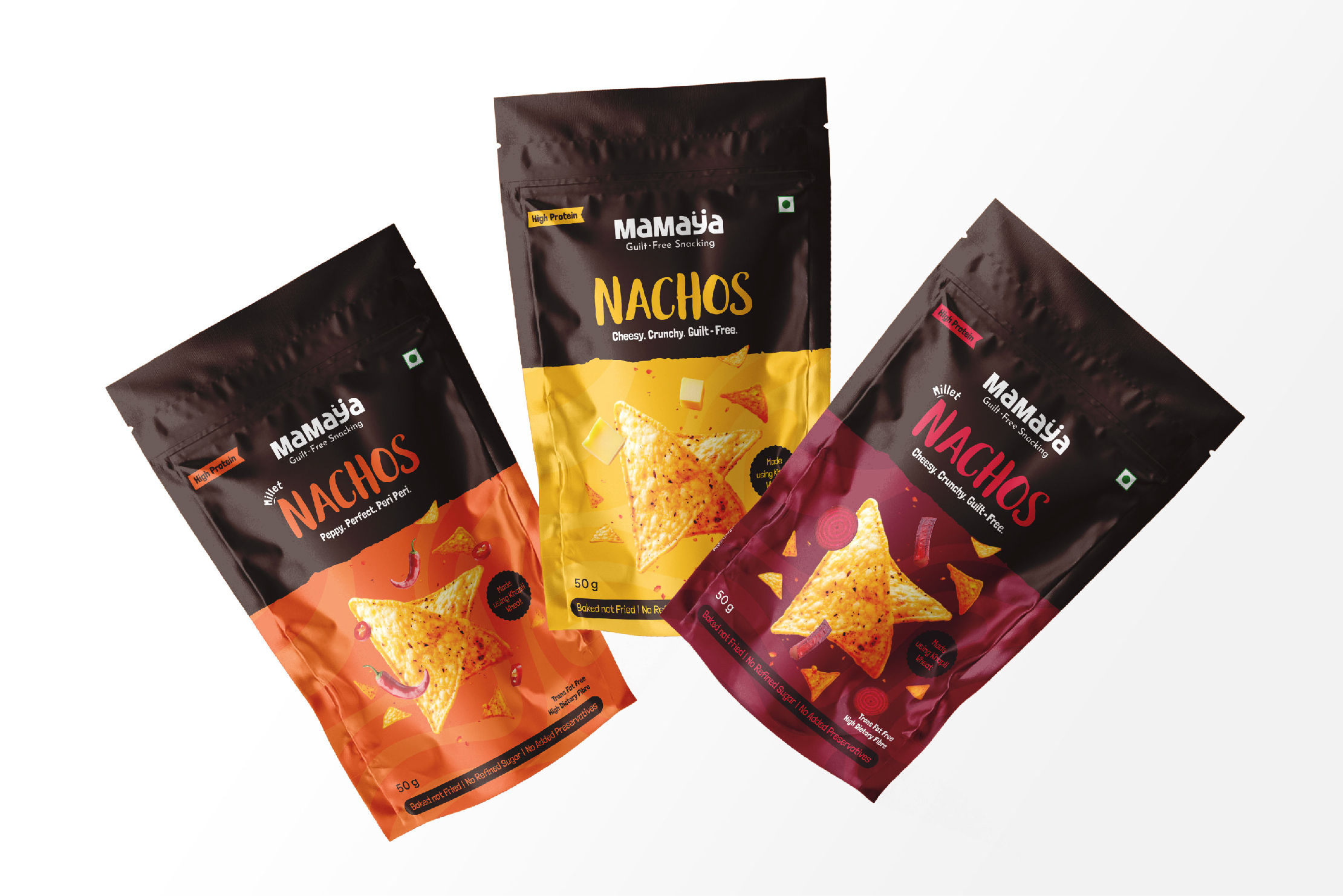


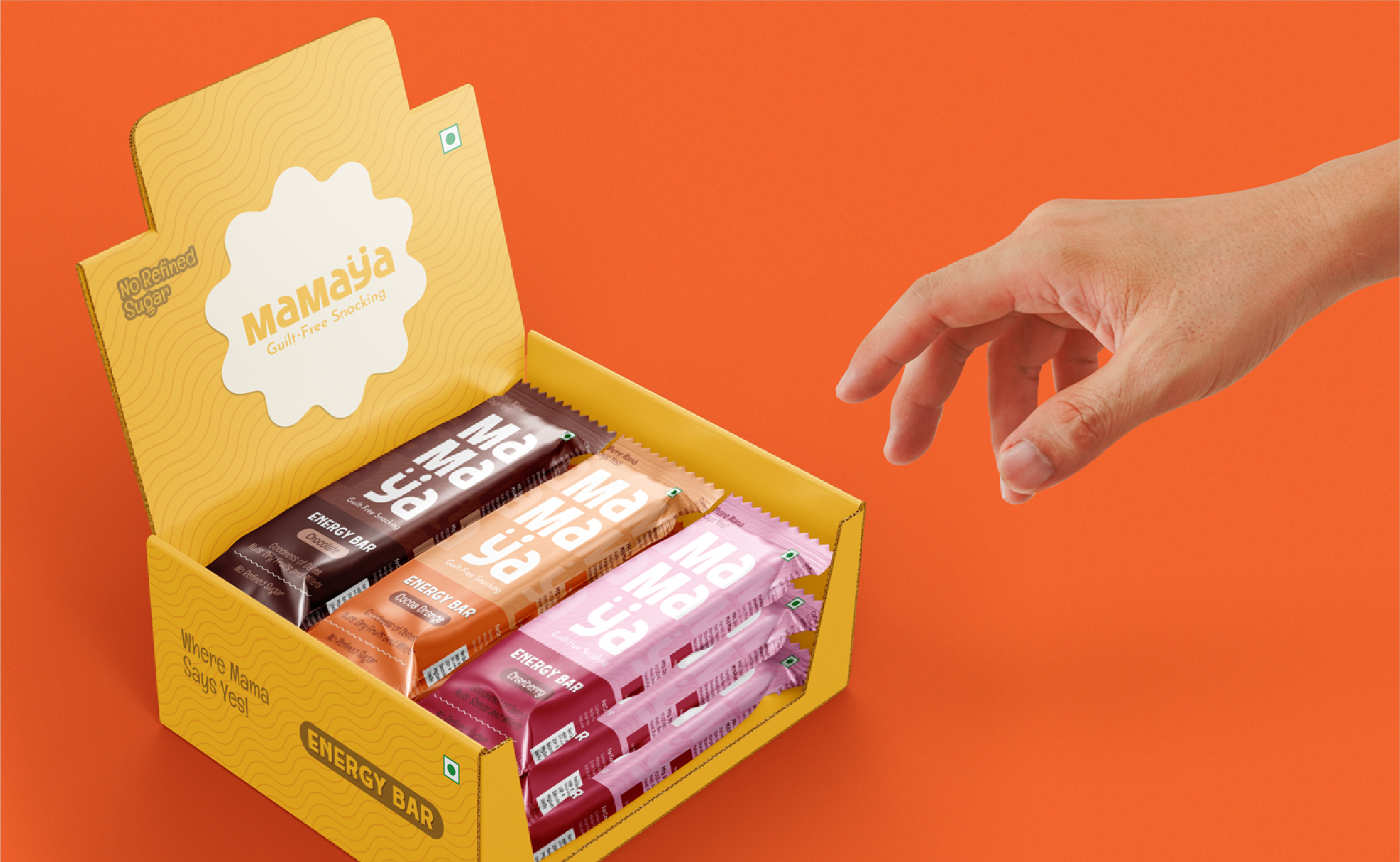

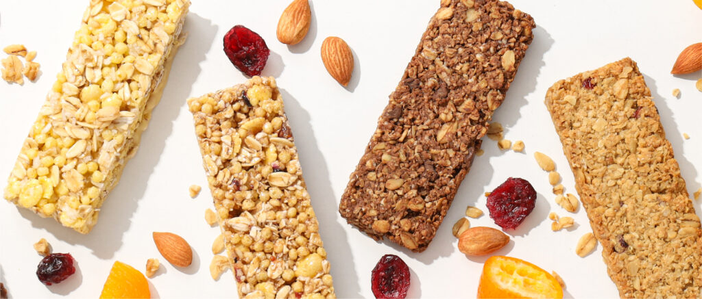
Mamaya is a brand born from a mother’s instinct—founded by Priyamvada, who understood the everyday struggle of finding snacks that are both healthy and loved by kids. In the chaos of daily life, mothers often put themselves last and second-guess what’s truly good for their children. Mamaya steps in as a trusted choice—offering snacks that moms can confidently say “yes” to.
Built around this core idea, the brand speaks to both children and their mothers. With playful, poppy, and eye-catching packaging, Mamaya instantly attracts young attention while creating a sense of warmth and reassurance for moms. The design language is fun, crunchy, and indulgent in feel—making healthy snacking exciting, accessible, and something families can enjoy every day.


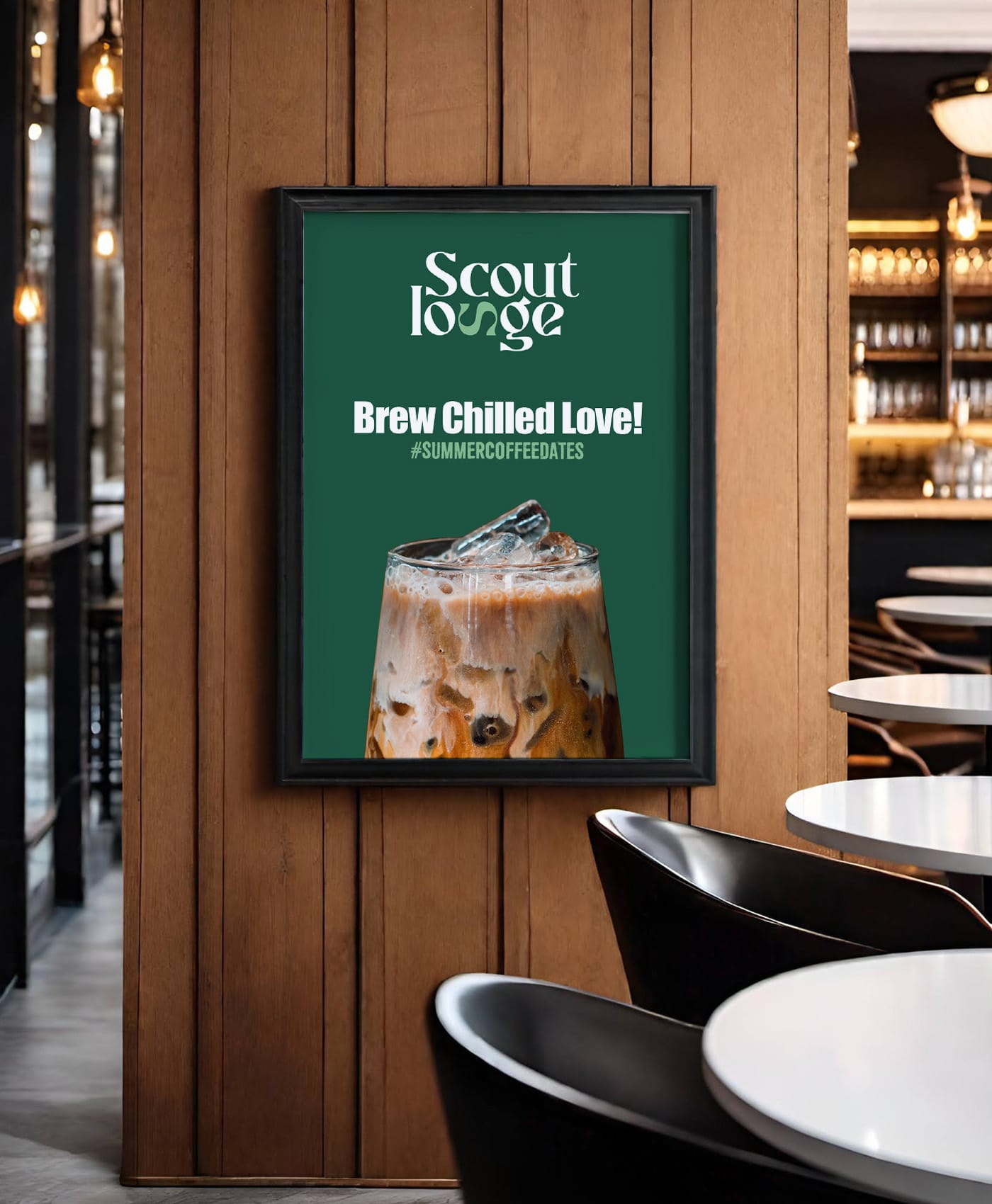
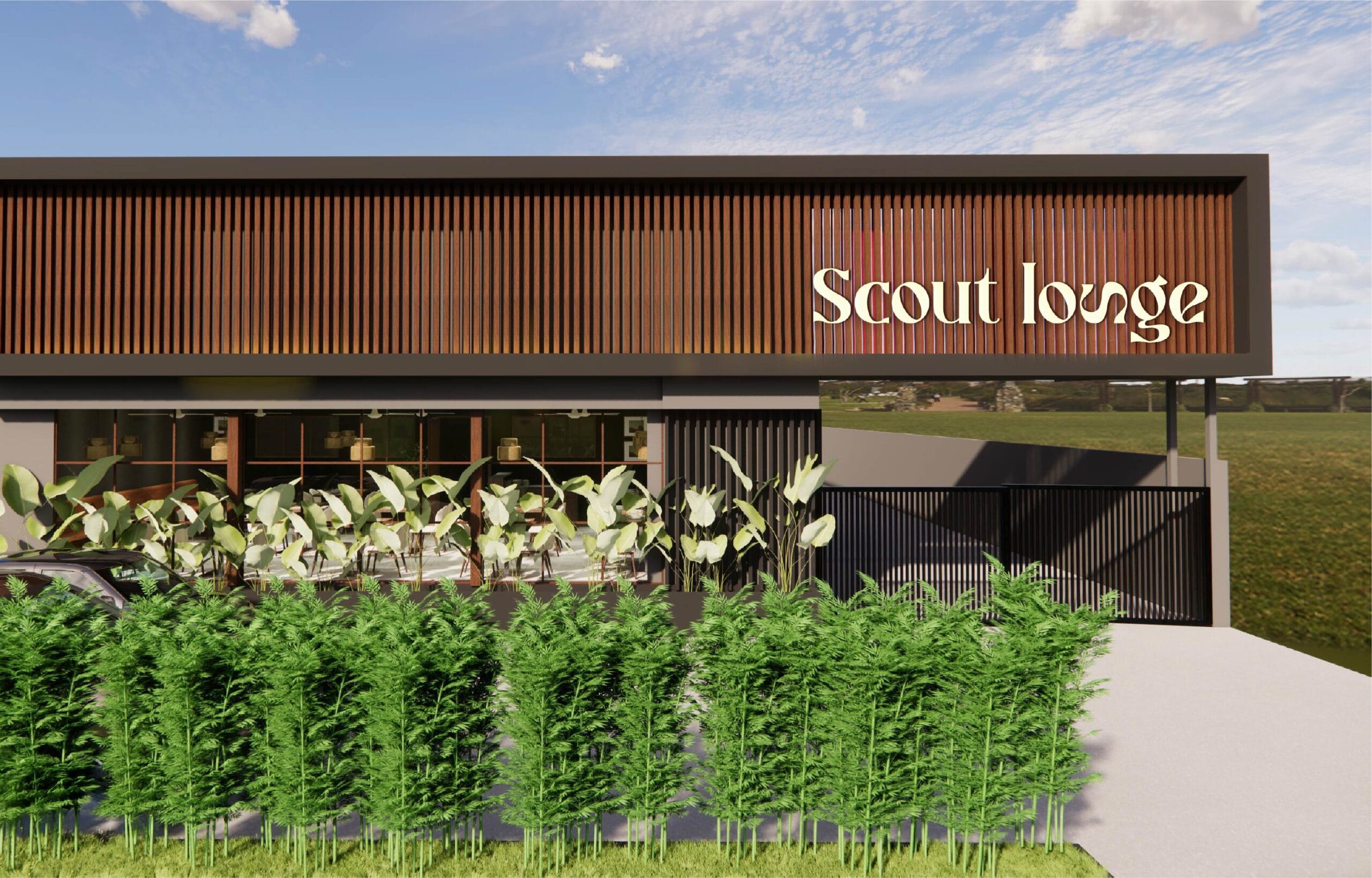
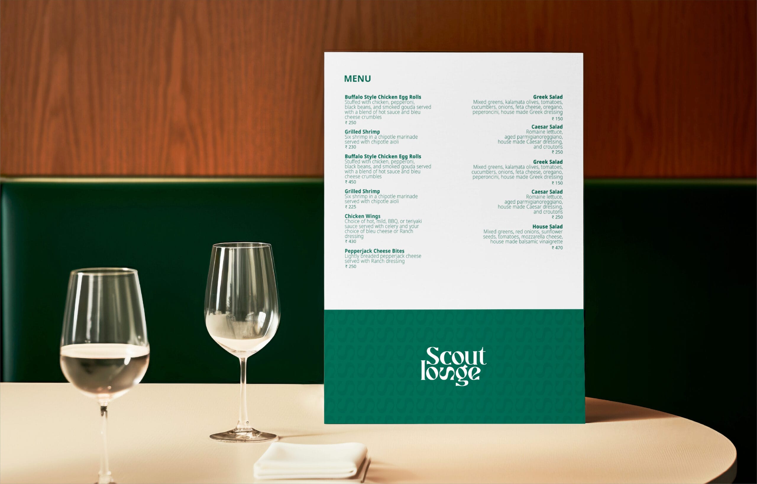
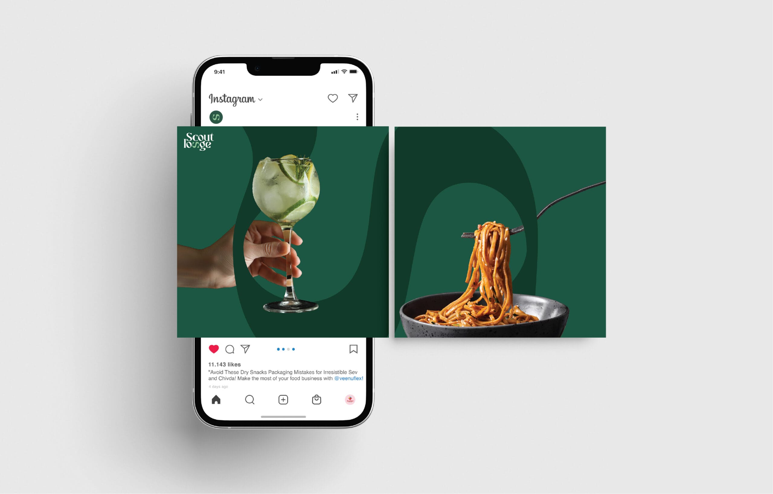
Some places serve food. Scout Lounge serves an experience. A space where elegance meets energy, where every sip is crafted, and where branding lingers long after the last drink. We built that brand.
Beyond the Basics
At Makeovers Digital, we didn’t just design a logo. we built Scout Lounge’s identity from scratch. A name that resonates, a logo that speaks, and branding that’s seen, felt, and experienced. Every detail, from menus to coasters and signage to uniforms, was curated for premium appeal.
Strategic Market Segmentation
Who’s walking in? What makes them stay? We mapped the audience and positioned Scout Lounge as a mix of elegance, exclusivity, and energy.
Designing the Experience
Branding isn’t just about a logo; it’s about how a space feels. Every touchpoint, from tablecloths and T-shirts to caps, interiors, posters, and social media, was crafted to exude luxury with a twist of fun.
Aesthetic Meets Functionality
The Impact? Unmissable.
We didn’t just design a brand; we built an atmosphere. One where every detail plays a role in the story. And trust us, this is a story worth experiencing.


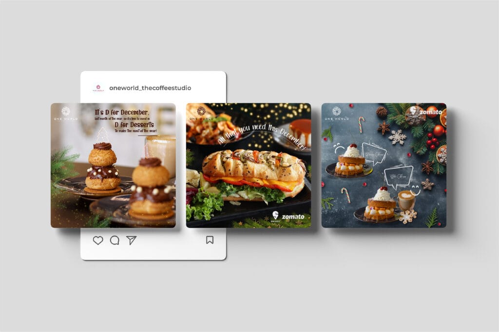
Brewing Digital Success
Client Overview
One World Café is a premium coffee house known for its exquisite brews and artisanal bakery delights. The café aimed to establish itself as a go-to spot for coffee enthusiasts while maintaining a sense of exclusivity and sophistication.
Pouring in the Personality
We didn’t just manage One World Café’s social media; we brewed it to perfection. The vibe was premium yet playful, relatable yet exclusive. From witty one-liners to trendy formats, we made sure their feed smelled like fresh coffee: irresistible.
Key Campaigns & Highlights
Impact & Results
🔸 Increased engagement & brand awareness through trend-based content
🔸 Higher footfall driven by IPL and festive campaigns
🔸 Strengthened brand positioning as a premium coffee experience
🔸 Successful influencer collaborations that brought in a loyal audience
With One World Café,We didn’t just manage social media; we brewed a brand identity that’s as rich and bold as their coffee.


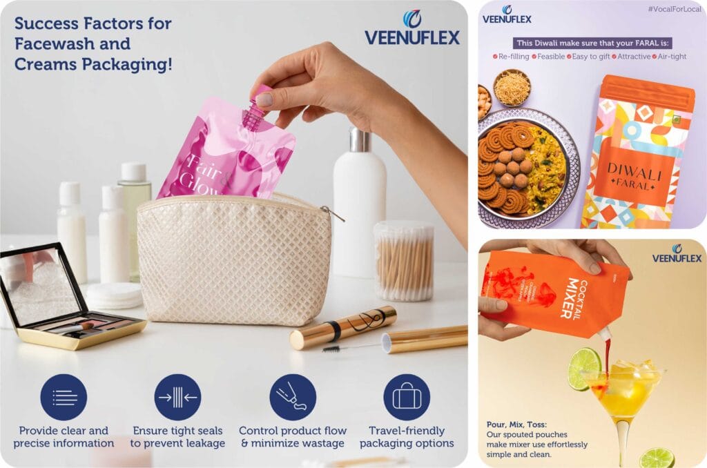
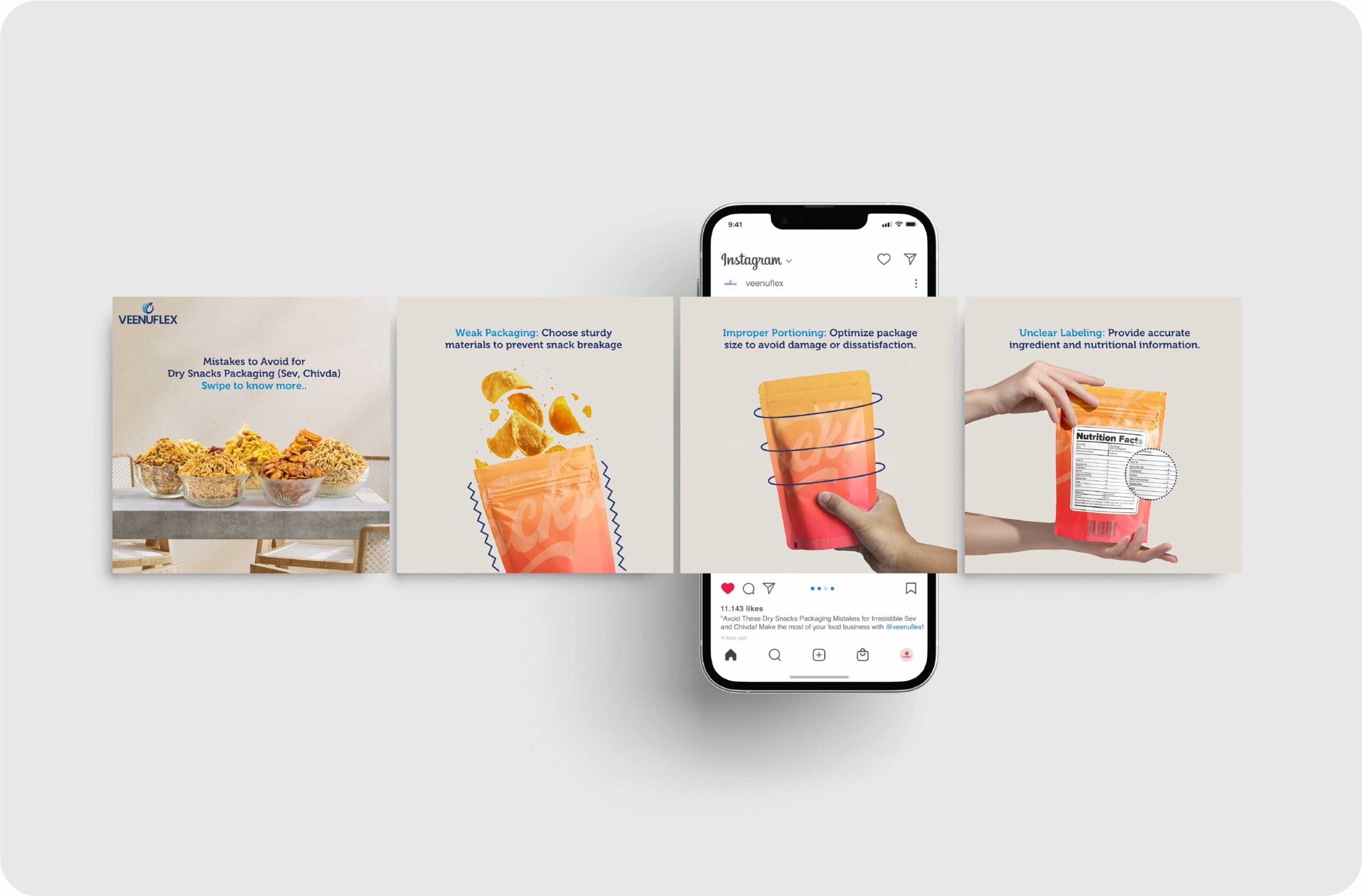
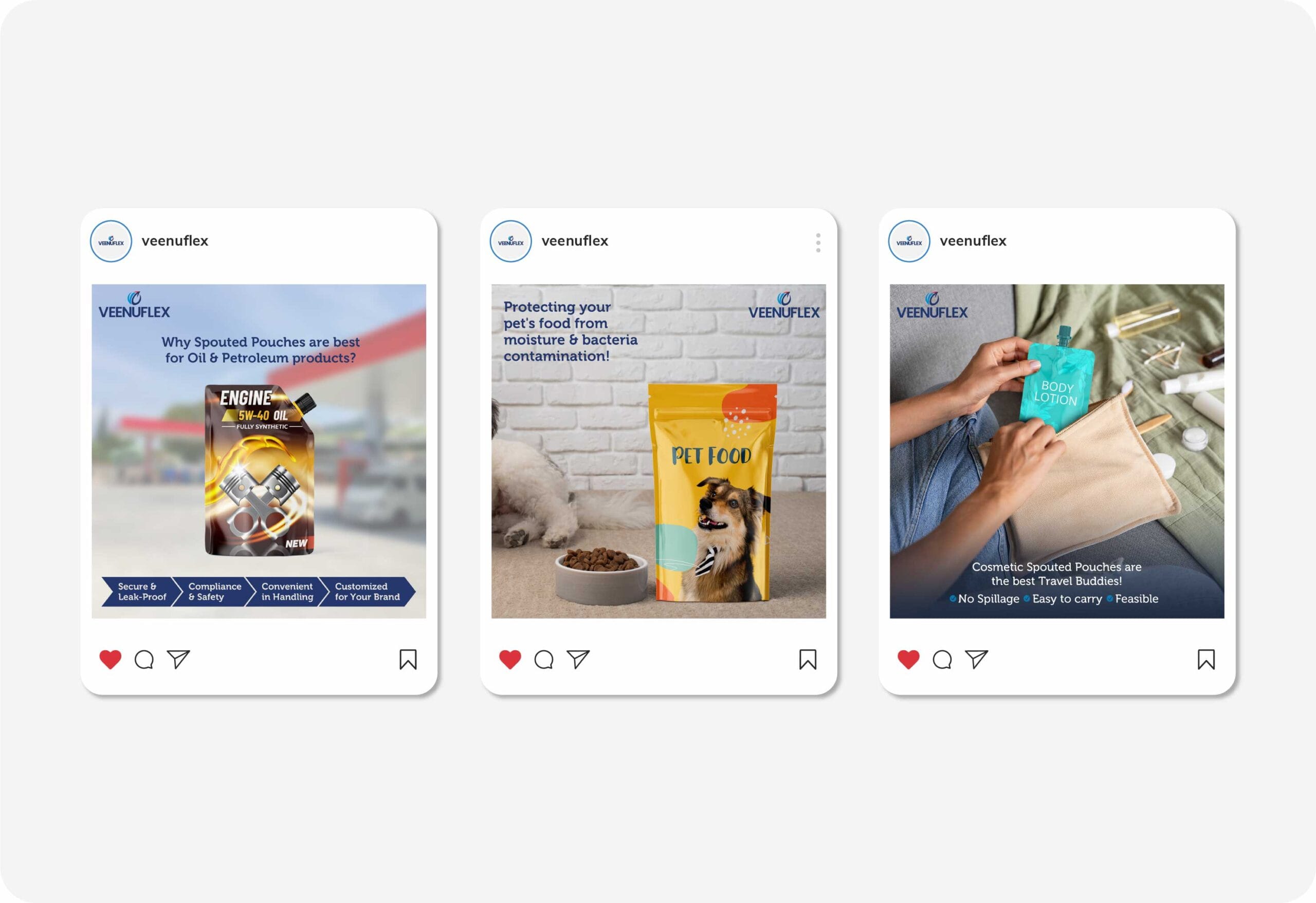
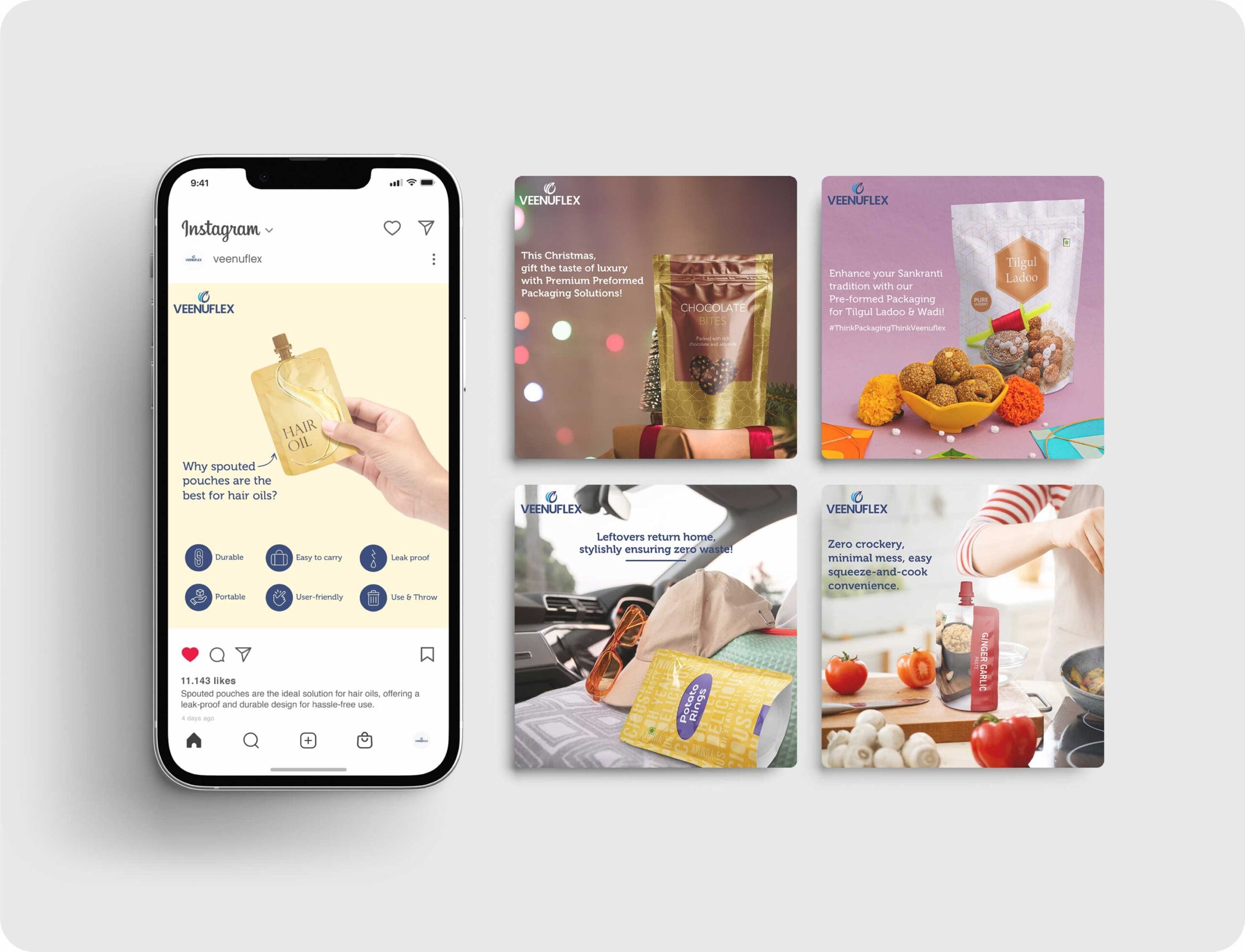
INNOVATIVE PACKAGING SOLUTIONS
Veenuflex specializes in spouted and pre-formed packaging solutions, and we helped them translate their innovative approach into a strong social media presence.
How We Enhanced Their Brand:
The result? A brand that stands out as a leader in smart, functional packaging solutions.


GIFTING JOY, ONE HAMPER AT A TIME
Gifting is an art, and Kaur’s does it best. Founded by the visionary Mrs. Daman Kaur, this brand needed an identity that reflected joy, creativity, and warmth.
How We Crafted It:
The result? A brand that makes gifting as delightful as receiving.


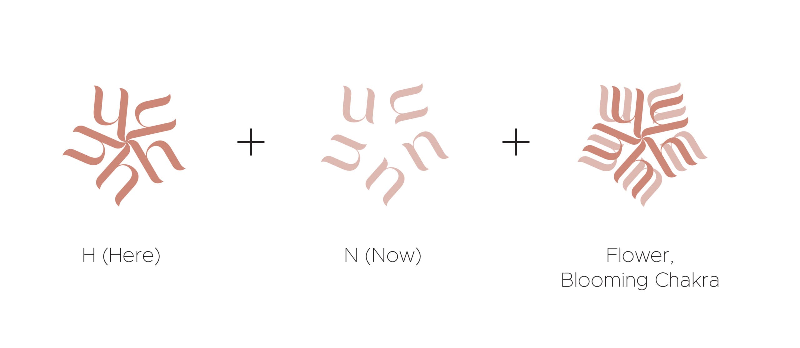
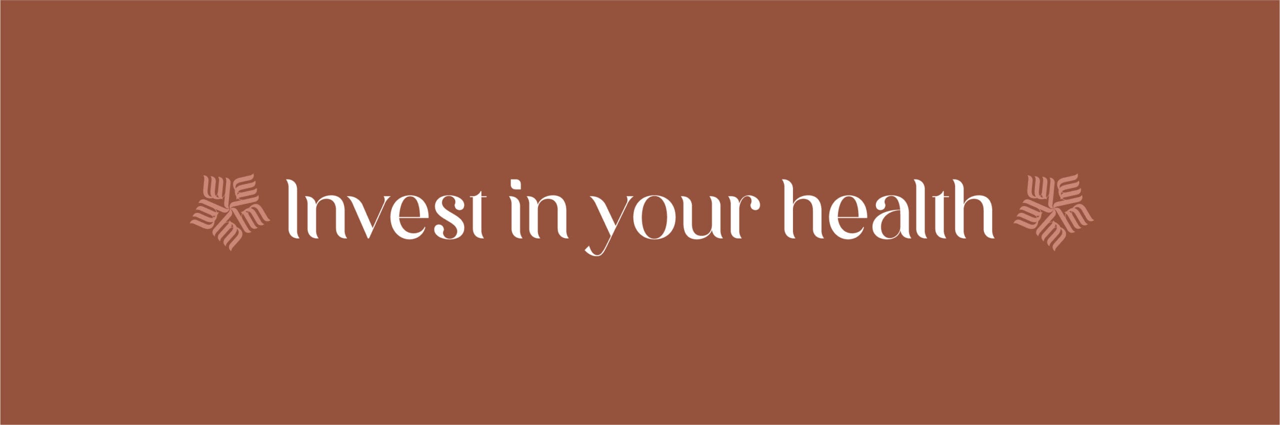
In creating the brand identity for Aleena Balsara’s Here N Now, we focused on encapsulating the essence of yoga and wellness.
The logo we designed is a testament to this, embodying elegance, calmness, and flexibility, key attributes of Aleena’s practice. This serene and thoughtful design set the foundation for a cohesive brand language across all platforms.
Our holistic approach extended to developing a user-centric website and formulating effective social media strategies. These efforts not only enhanced Here N Now’s online presence but also significantly increased its reach, growing from 900 to 9000 followers. This growth underscores the impact of our integrated branding and digital marketing strategy in connecting and resonating with the target audience.


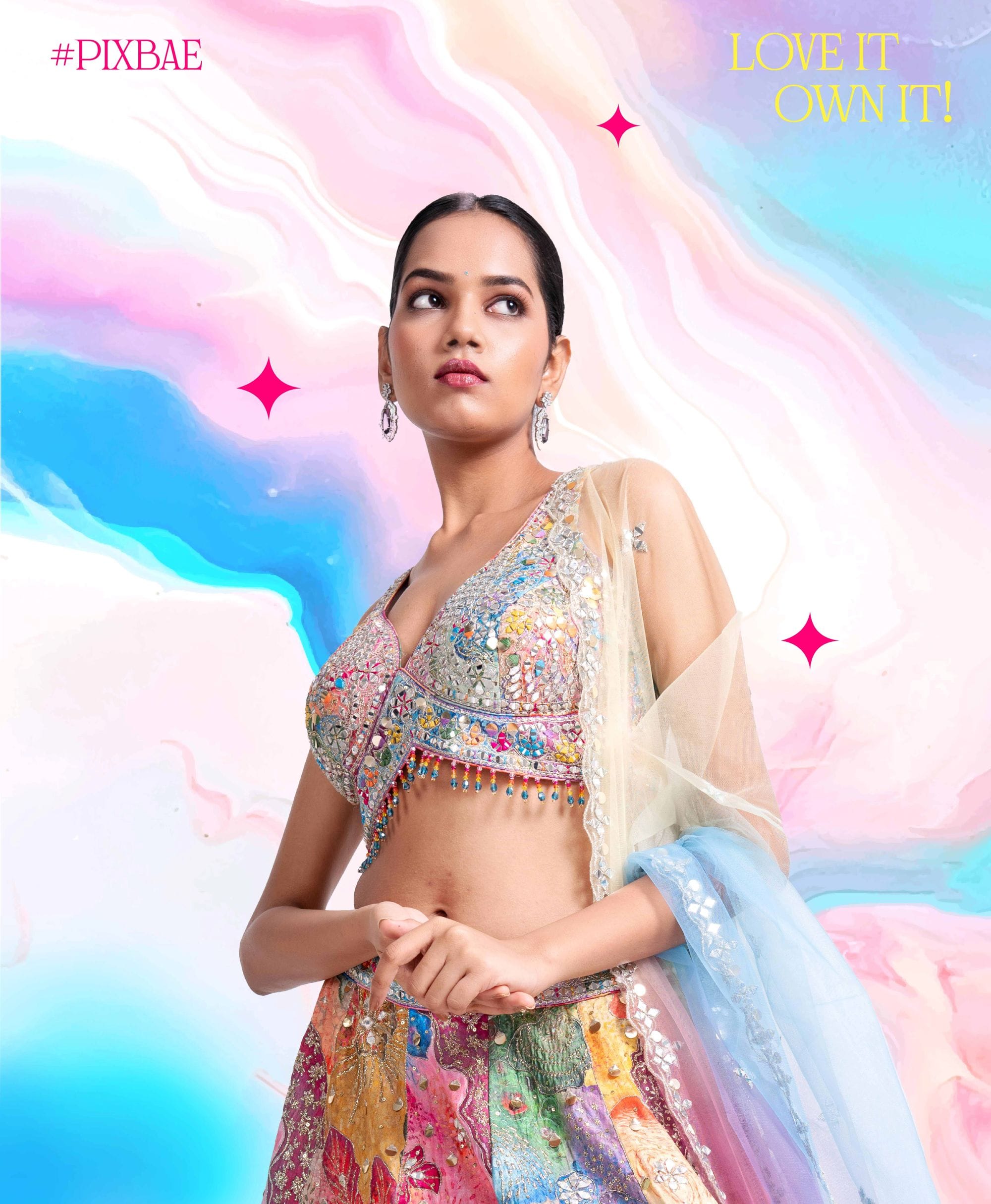
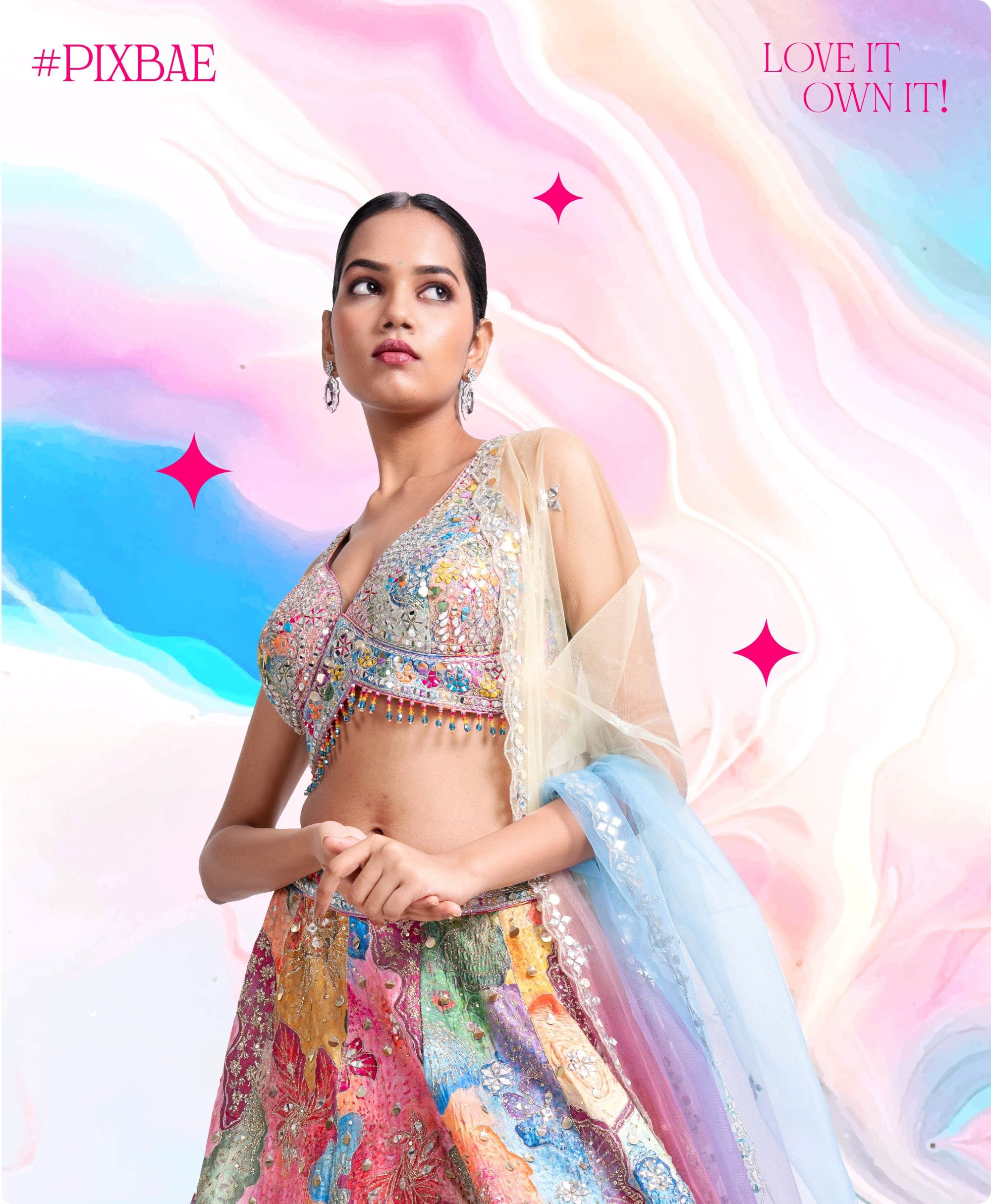
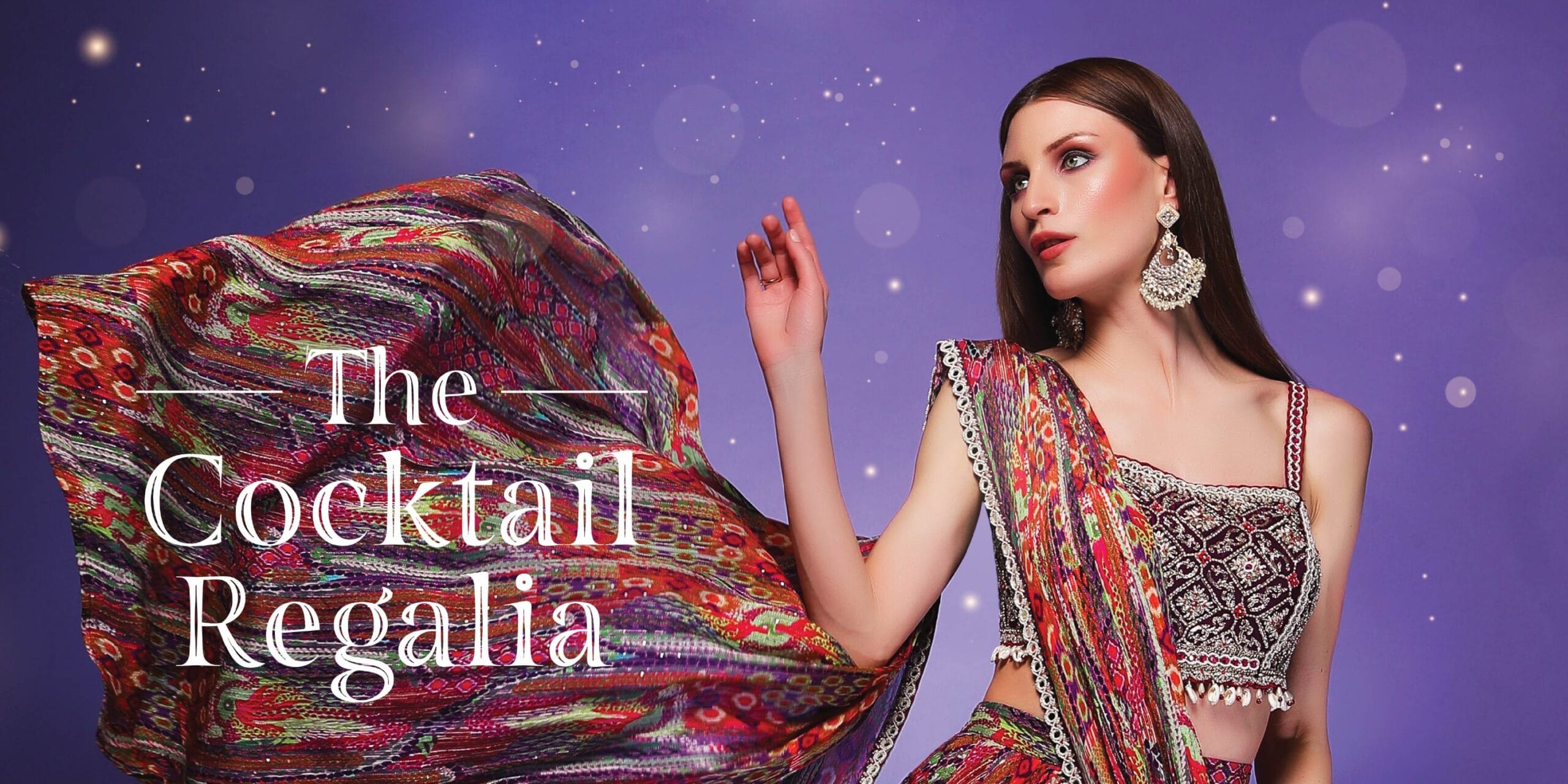
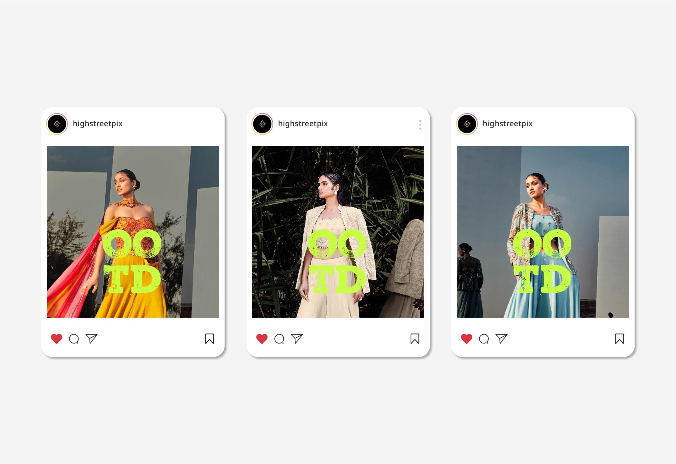
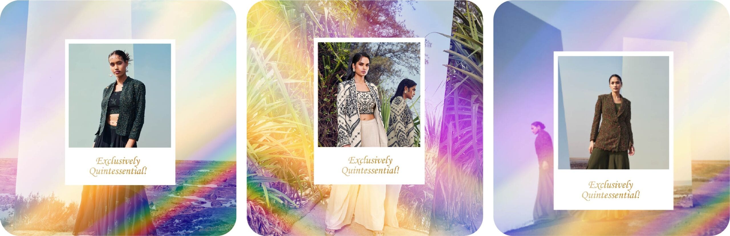
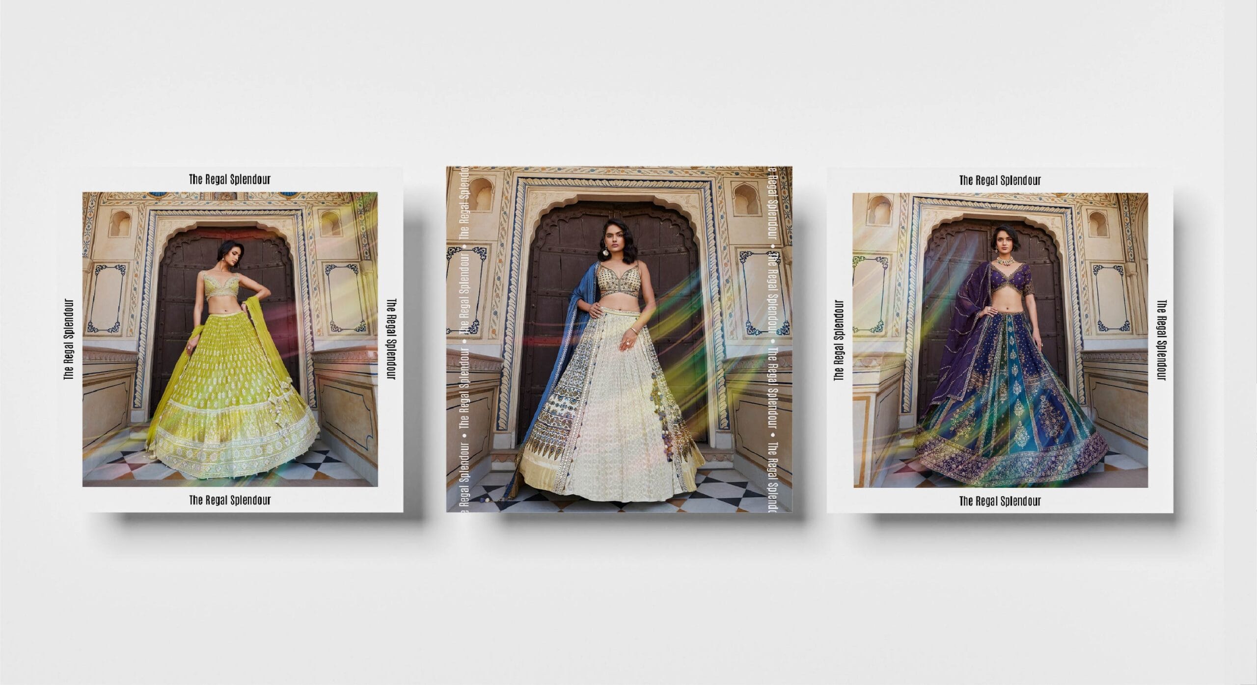
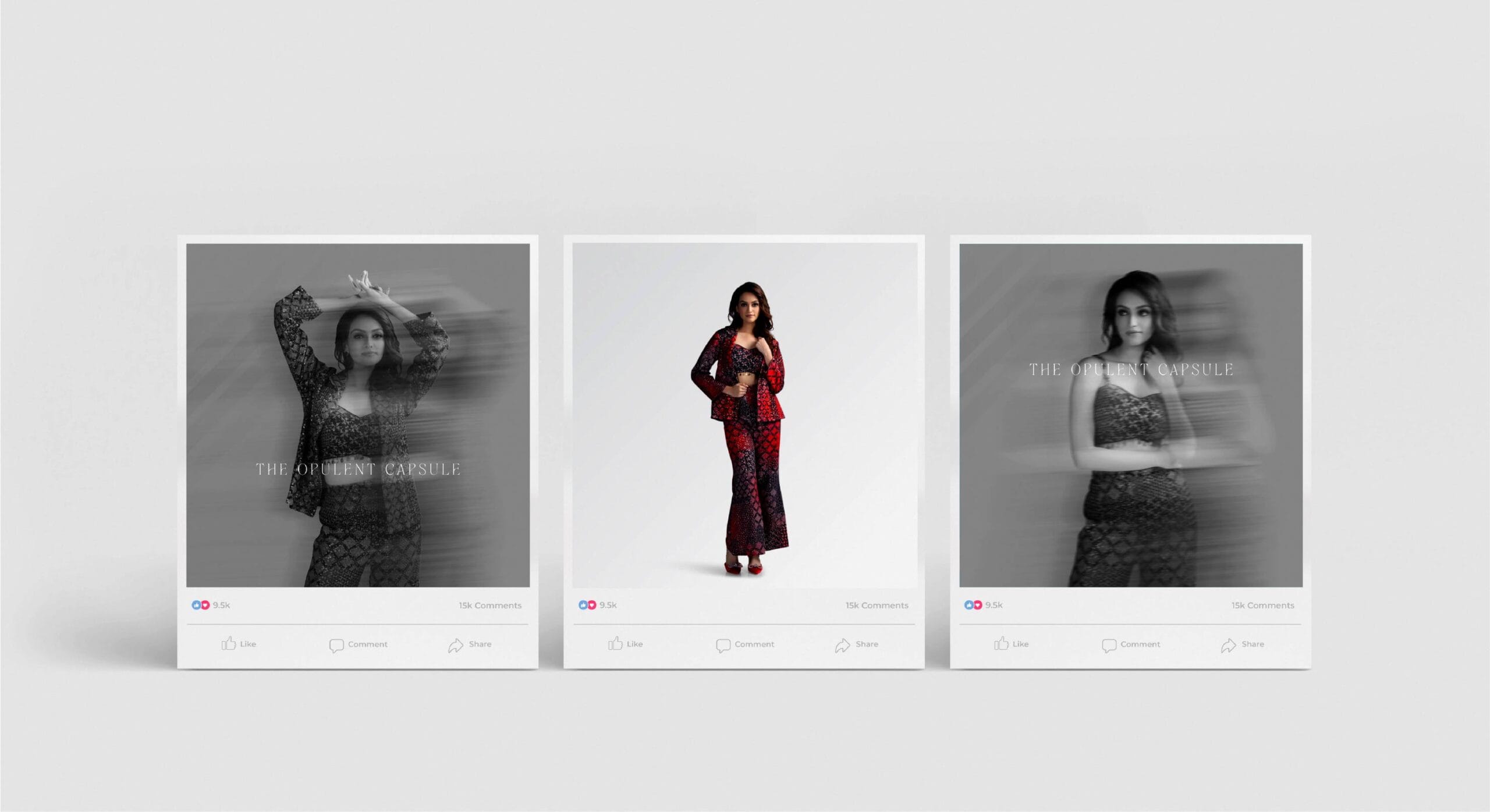
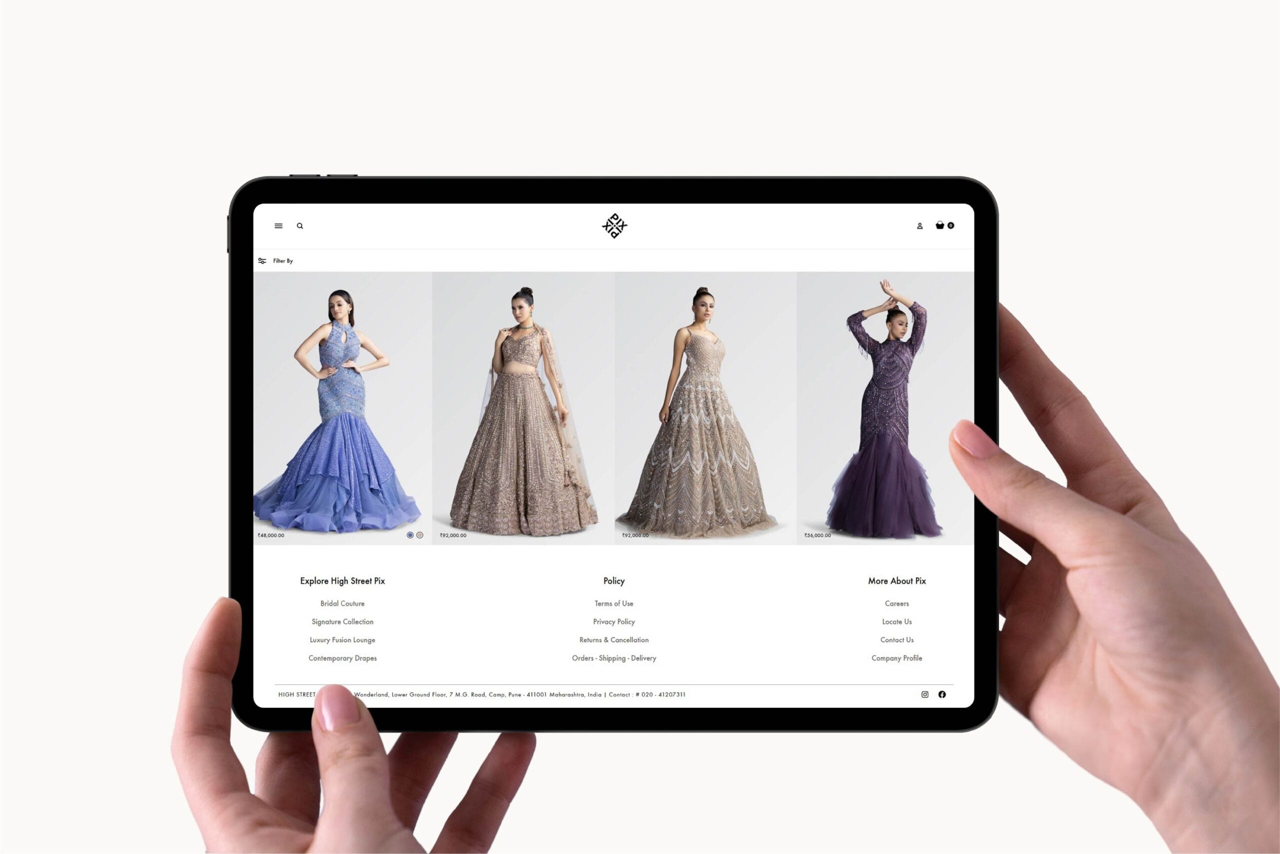
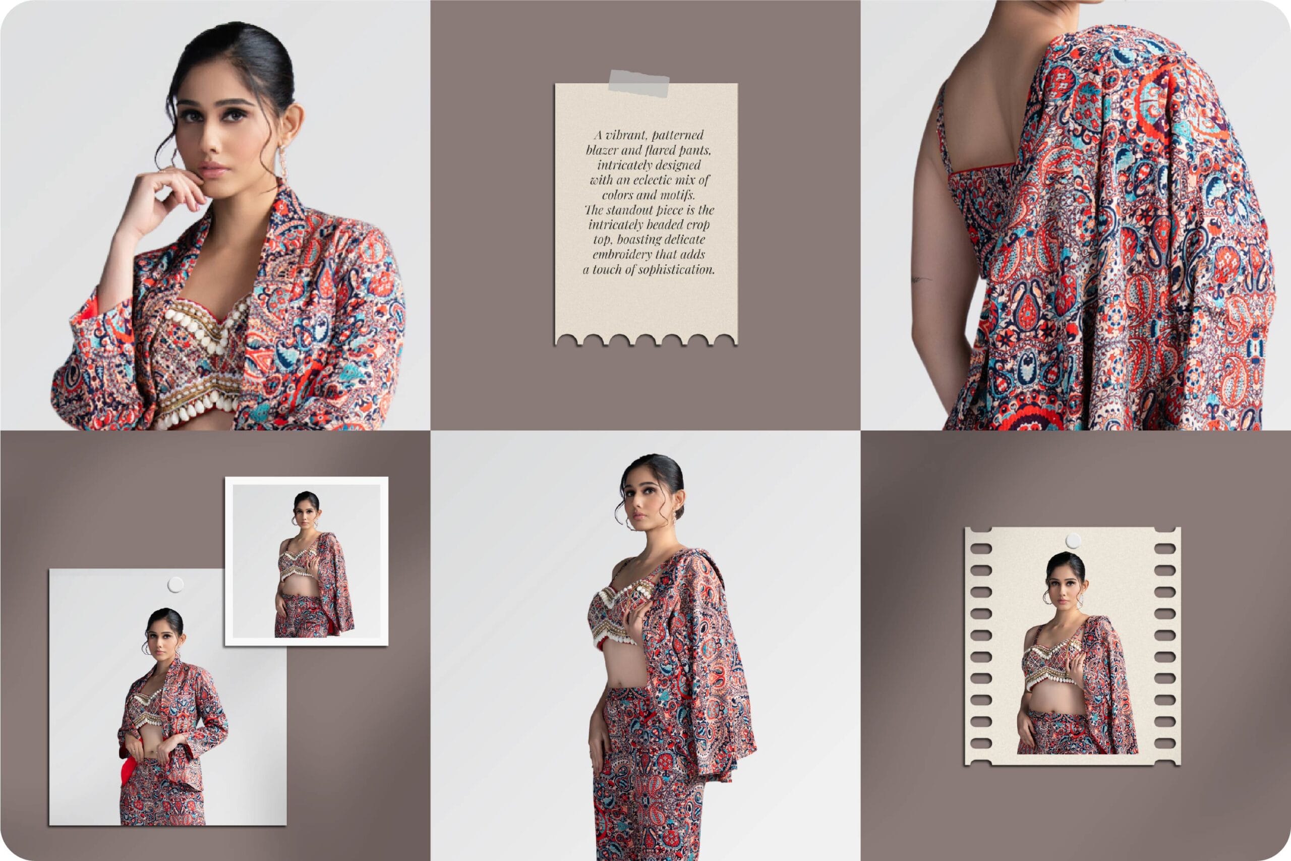
Giving Fashion a Digital Life!
When Anand Sir, the perfectionist behind Pix, came to us, Pix had no digital presence, but a vision for high fashion. At Makeovers Digital, we brought that vision to life with a sleek website and trend-driven social media.
Every day, we match his eye for detail, curating stylish, relatable content that makes fashion feel effortless online. From the perfect color tones to seamless reels, we craft digital elegance with a touch of fun.
Working with Anand Sir isn’t just marketing,it’s the art of fashion storytelling, and we love every moment of it!


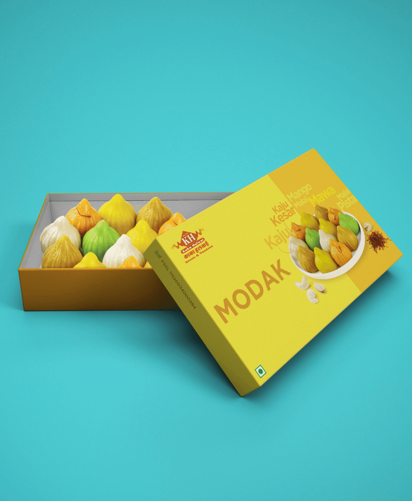
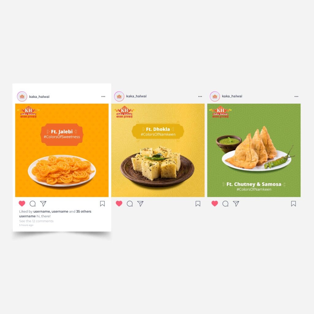
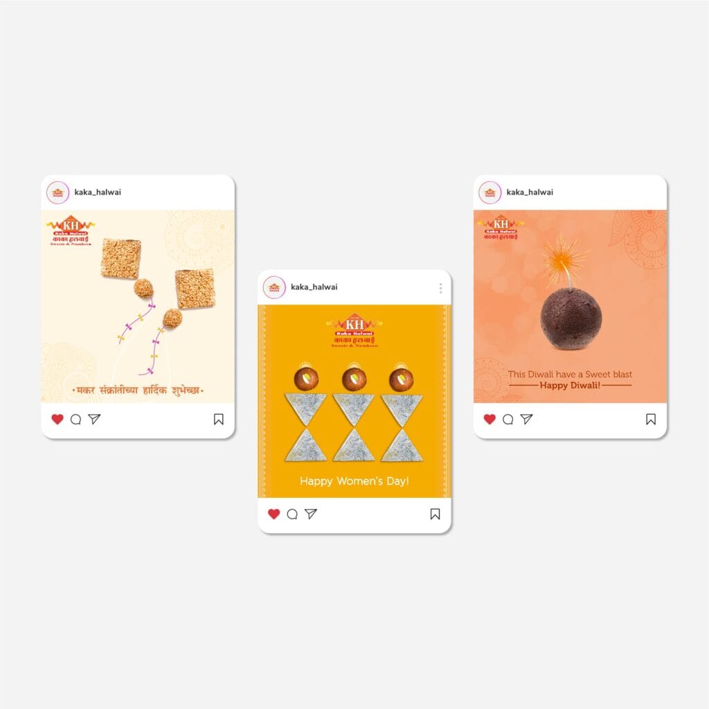
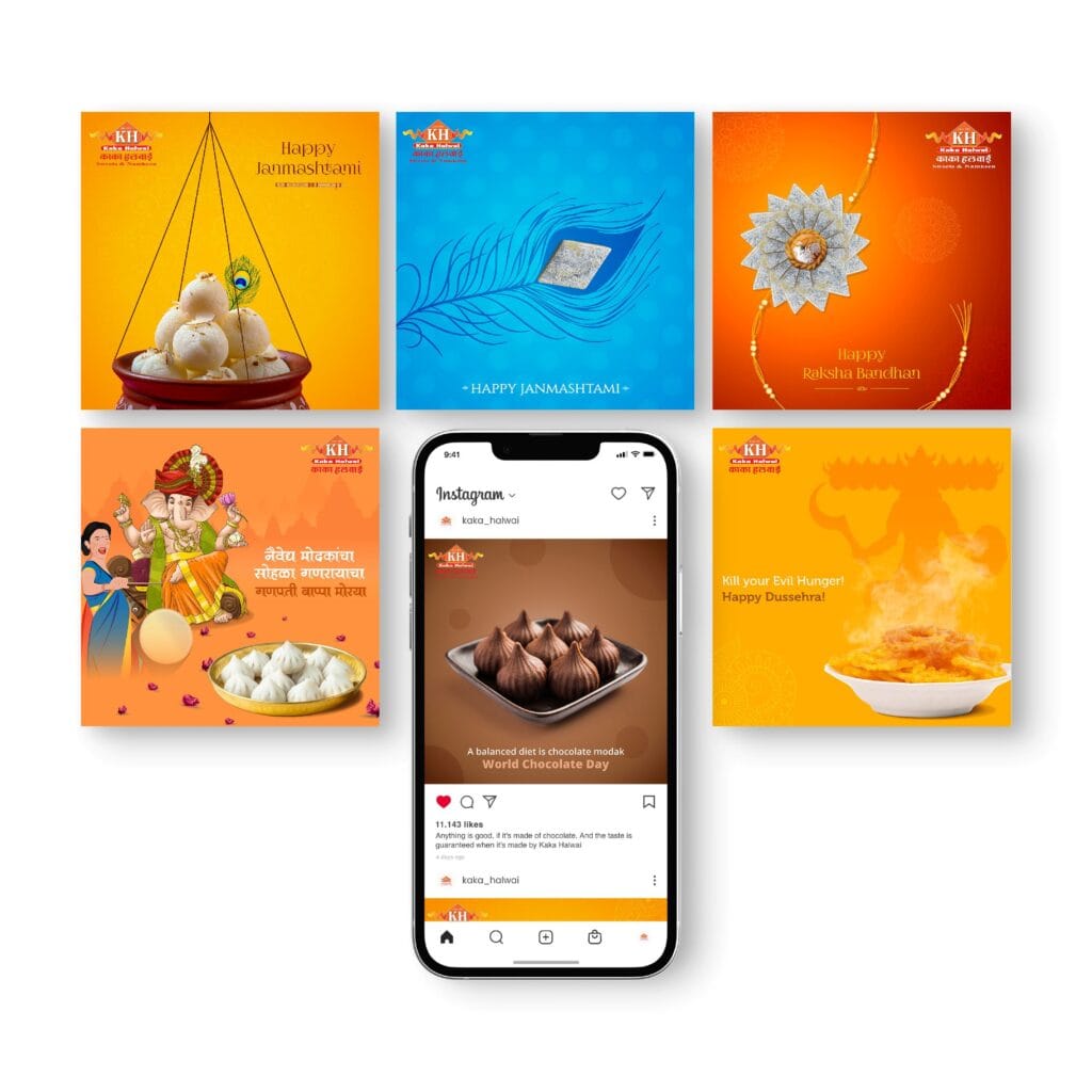
CRAFTING A DIGITAL LEGACY
For generations, Kaka Halwai Sweets has been a beloved name in Pune, known for their rich, authentic Indian sweets. Our mission? To bring that legacy into the digital world.
What We Did:
The result? A digital experience as sweet and memorable as their finest mithai.


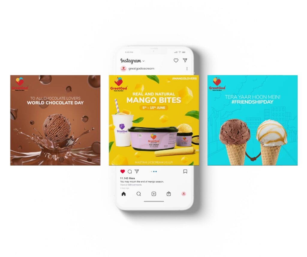
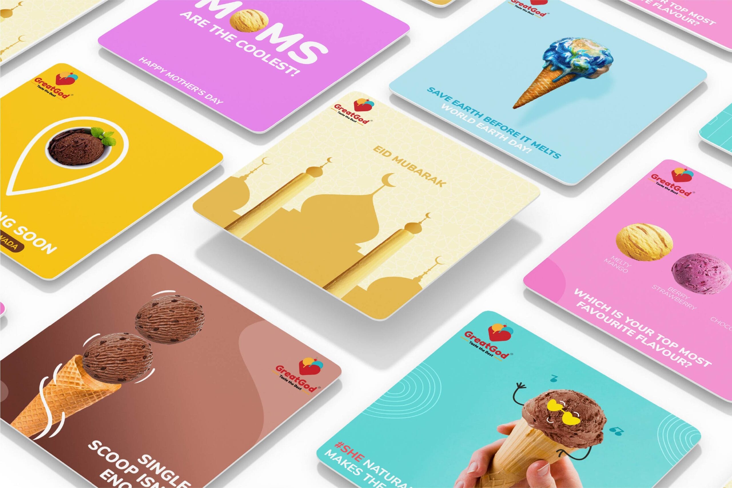
SCOOPING UP A DIVINE BRAND EXPERIENCE
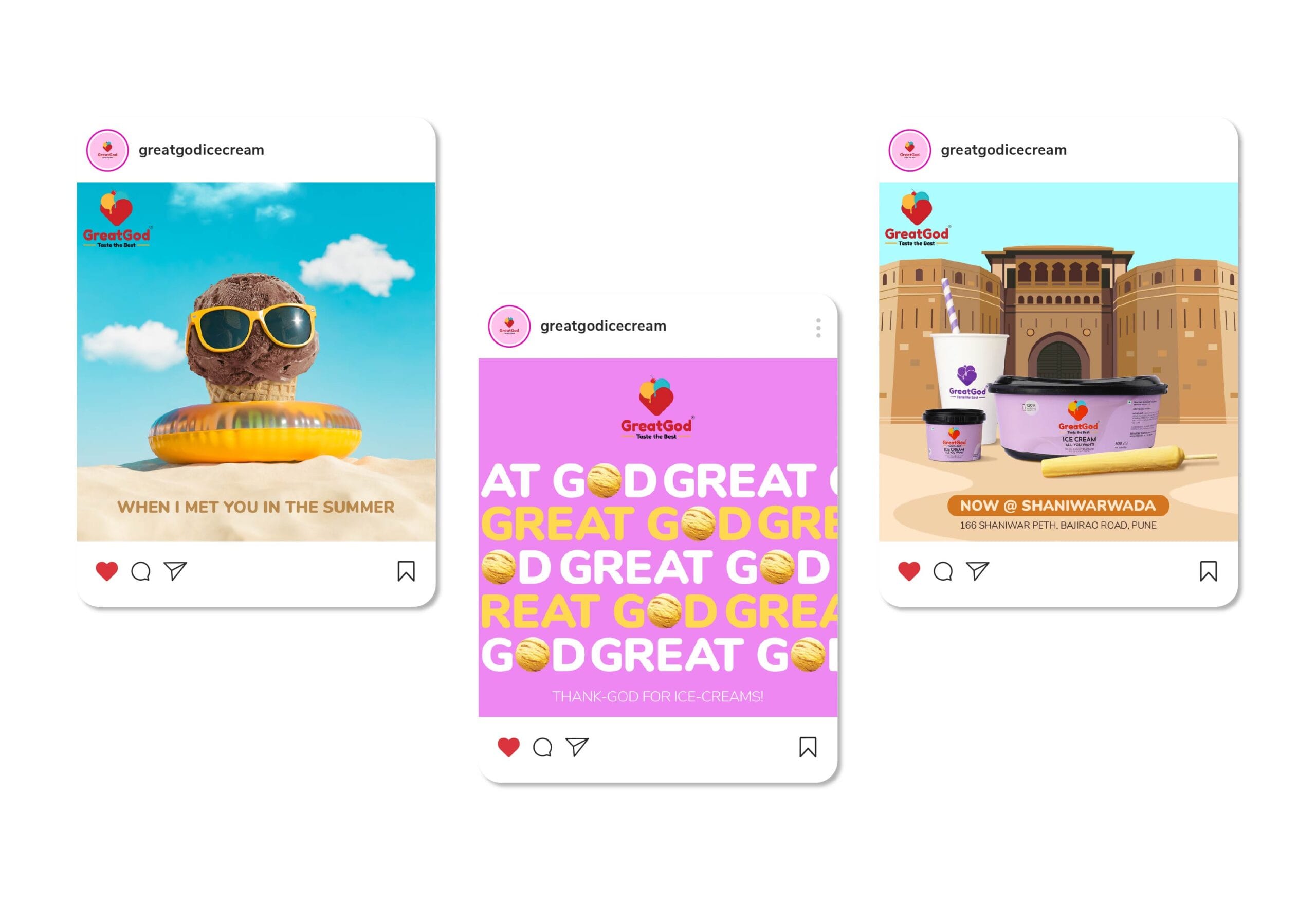
Some ice creams are just desserts. Great God Ice Cream? It’s an experience. A brand that doesn’t just serve flavors, it crafts indulgence. When they approached us, they needed more than just branding; they needed a story. A visual, digital, and sensory identity that made every scoop feel like a bite of heaven.
At Makeovers Digital, we didn’t just design a logo. we created an identity as rich as their flavors. From the hoardings to the spoons, from the standees to the menu, even down to the tissues and cups, every touchpoint was designed to reflect the premium, natural, and handcrafted goodness that sets Great God Ice Cream apart.
For Great God Ice Cream, we didn’t just create a brand. We built a sensory experience. one that melts in your heart just as smoothly as it melts in your mouth.


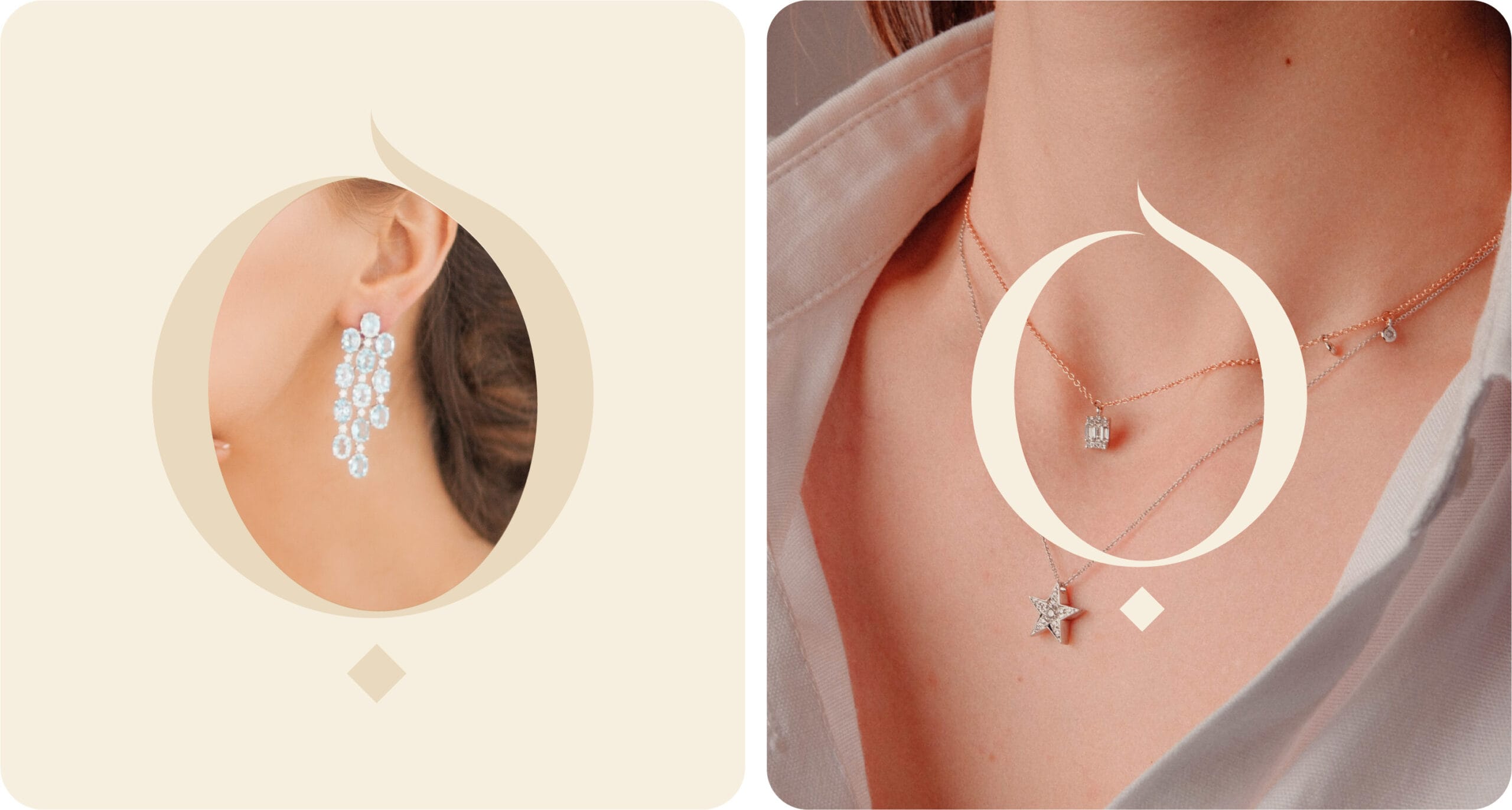
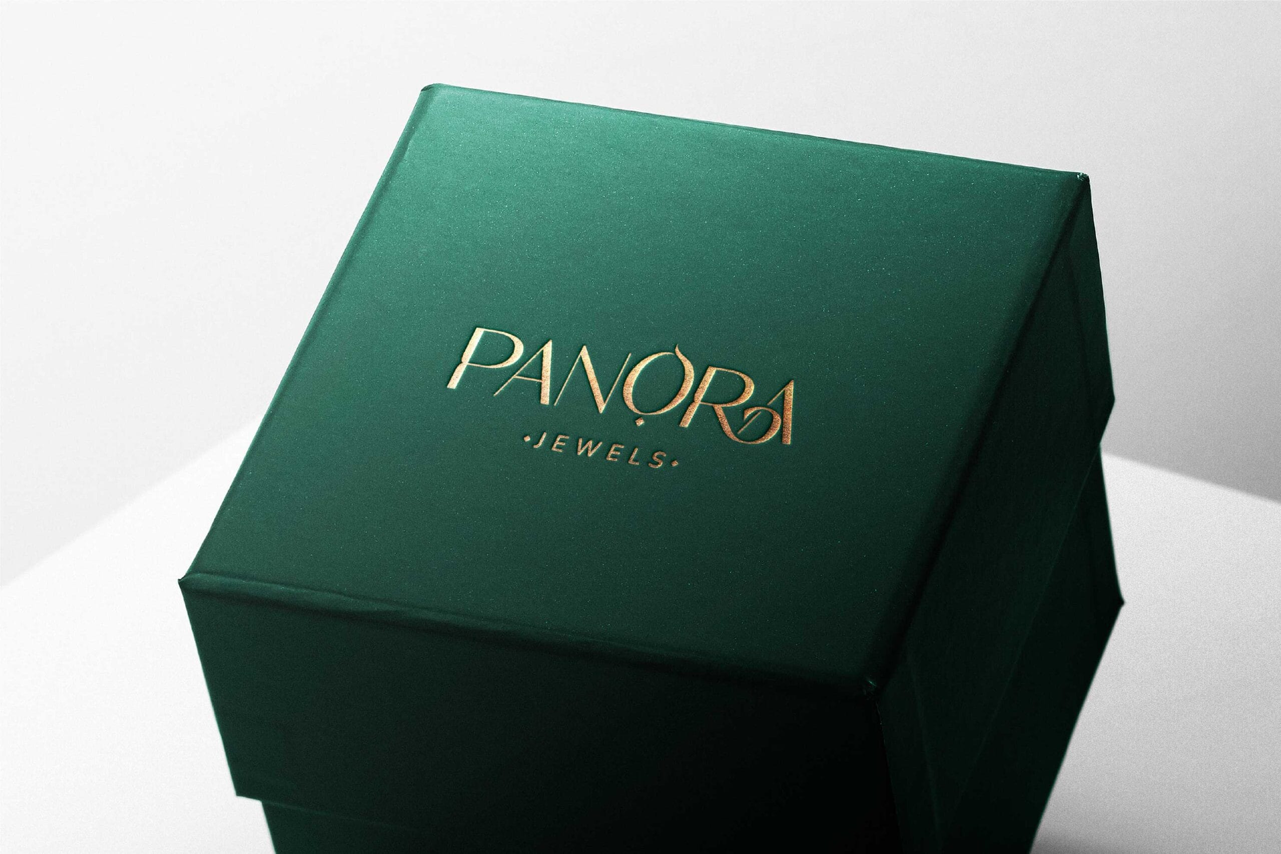
WHERE LOVE MEETS LUXURY
Some gifts are thoughtful. Diamonds? They’re unforgettable. That’s exactly what Panora stands for, a brand where gifting is effortless and every piece of jewellery tells a story. But how do you craft a name and identity that reflects elegance, emotion and exclusivity? That’s where we stepped in.
Naming the Sparkle
When Tithal Shah envisioned Panora, he wanted more than a jewellery brand. He wanted a go-to destination for timeless gifting. No second-guessing, no last-minute scrambling, only the perfect piece for the perfect moment. That’s how the name Panora was born.
“Panora” means ‘all gifted’—a name that embodies the essence of diamonds and the emotions they carry. Fragile yet everlasting, pure yet powerful, just like love itself.
Designing Elegance
A name is just the beginning. The logo had to match the brilliance of the brand: refined, sophisticated and infused with the sparkle of Panora’s exquisite jewellery. Every curve and every detail was meticulously crafted to mirror the way diamonds catch the light and hearts at the same time.
More Than Jewellery, A Symbol of Love
For men looking for the perfect gift and for women who deserve only the best, Panora makes luxury effortless. And when in doubt, diamonds always speak the right language.


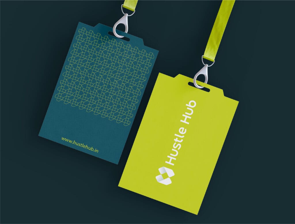
WHERE WORK MEETS ENERGY .
Coworking spaces should be dynamic, fresh and inspiring, and that’s exactly how we built Hustle Hub. From conceptualizing the name to designing a bold and lively brand identity, we ensured every detail reflected the energy of modern professionals.
What We Delivered:
Created an engaging, high-energy brand name and logo.
Developed custom stationery, website design, and a strong social media presence.
Infused branding with a sense of freshness and innovation.
The result? A brand that redefines coworking, making every workday feel like a hustle worth enjoying.


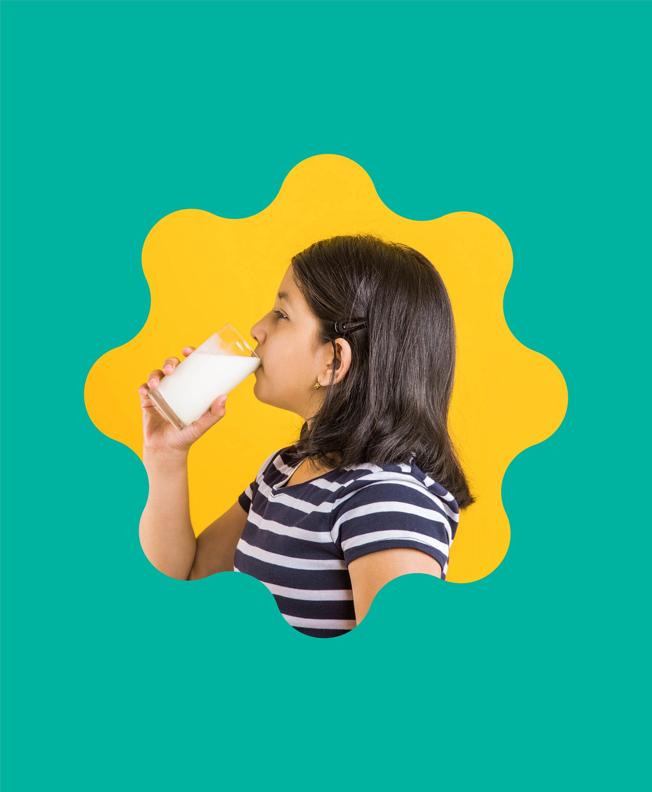
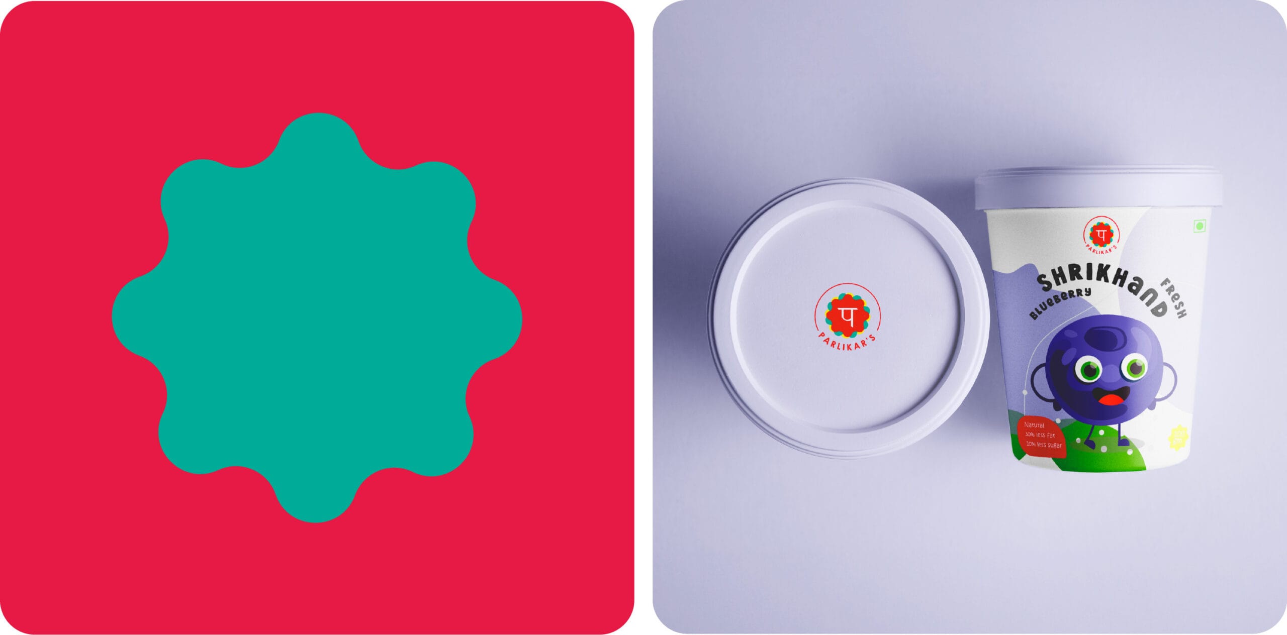
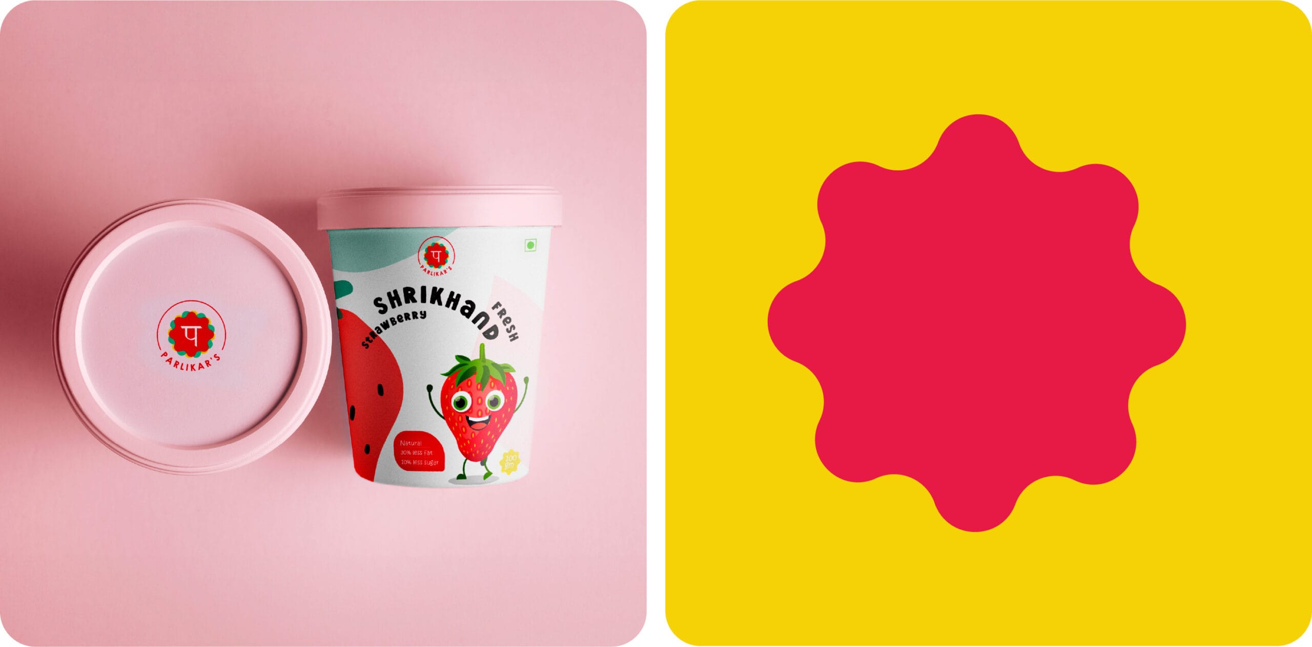
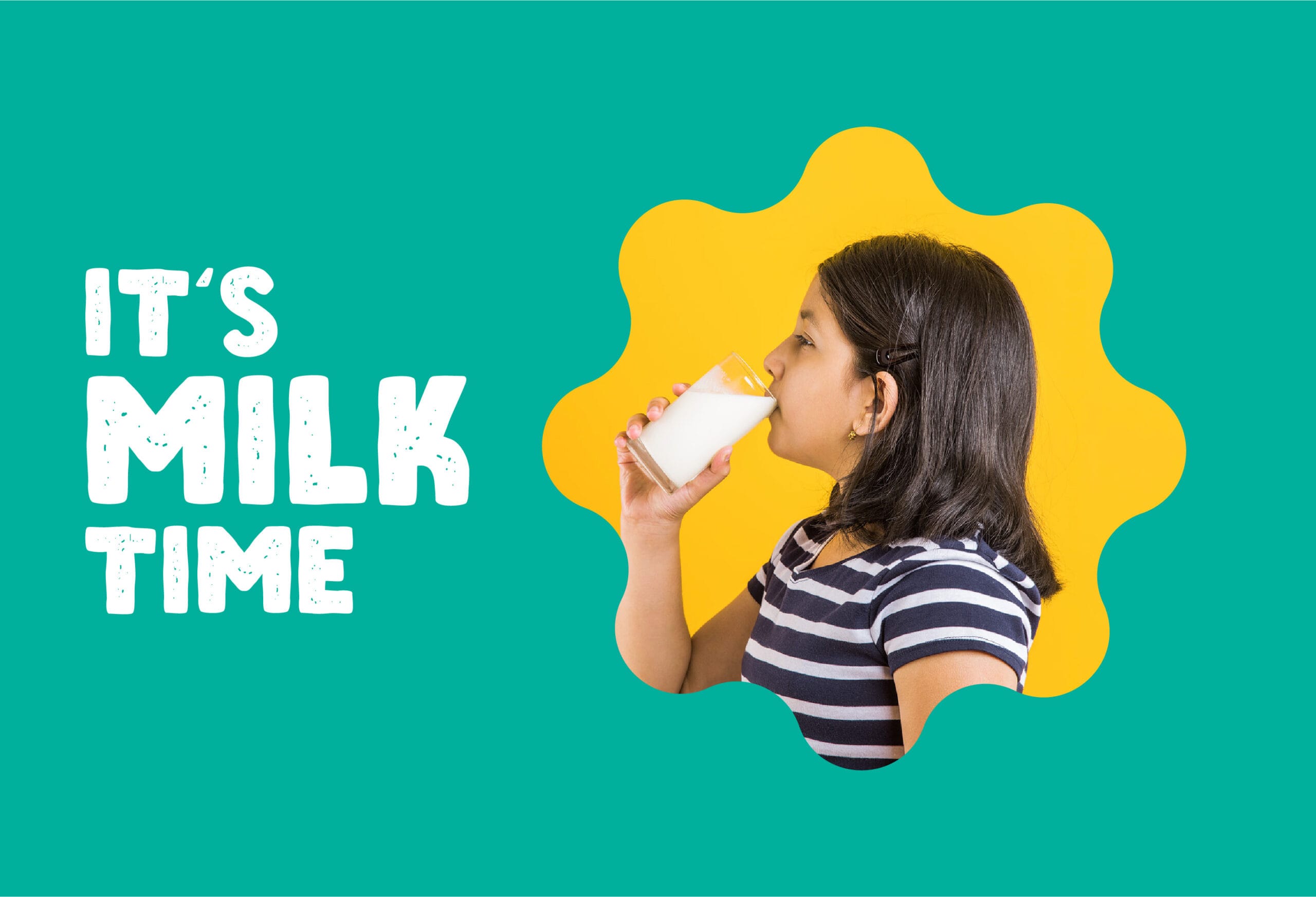
AUTHENTICITY IN EVERY DROP
Paralikar is a brand built on purity and trust, delivering quality dairy products while empowering rural farmers. They needed a brand identity that reflected their authenticity and commitment to nutrition.
Our Strategy:
The result? A brand that fosters authenticity while celebrating India’s love for dairy.


WHERE TRADITION MEETS ELEGANCE
Vaisha is more than just a fashion brand; it’s an expression of empowerment and elegance. Founded by a visionary young woman, Vaisha redefines traditional wear with chic block patterns and a contemporary twist. When they approached us, they had their brand identity in place, but they needed their packaging to reflect their vision..
Our Approach:
Designed dynamic packaging visuals that extended the brand’s personality.
Created a look that evoked calm, peace, and vibrancy, perfectly aligned with Vaisha’s ethos.
Ensured that the branding brought out the elegance and sophistication of traditional wear.
The result? A packaging identity that is as graceful and timeless as the brand itself.
GIFTING JOY, ONE HAMPER AT A TIME
Gifting is an art, and Kaur’s does it best. Founded by the visionary Mrs. Daman Kaur, this brand needed an identity that reflected joy, creativity, and warmth.
How We Crafted It:
The result? A brand that makes gifting as delightful as receiving
WHERE LOVE MEETS LUXURY
Some gifts are thoughtful. Diamonds? Unforgettable. That’s the heart of Panora—a brand where every piece of jewellery tells a story and gifting feels effortless.
When Tithal Shah envisioned Panora, he wanted more than a jewellery line—he wanted a symbol of love, beauty, and emotion. “Panora,” meaning ‘all gifted,’ reflects the essence of diamonds—fragile yet everlasting, powerful yet pure.
We brought that vision to life with a name that speaks elegance and a logo that shines with refined brilliance. For moments that matter, Panora makes luxury simple—and unforgettable.
SCOOPING UP A DIVINE BRAND EXPERIENCE
Great God isn’t just ice cream, it’s indulgence. When they approached us, they needed more than branding; they needed a story. We created a rich identity across every touchpoint: logo, packaging, hoardings, menus, all echoing their premium, handcrafted vibe.
Digitally, we made every scoop crave-worthy. With stunning visuals and engaging content, we spotlighted real ingredients and seasonal flavors that made people stop, stare, and crave.
The result? A brand that people remember, talk about, and come back to, one irresistible scoop at a time.
Giving Fashion a Digital Life!
When Anand Sir, the perfectionist behind Pix, came to us, Pix had no digital presence but a vision for high fashion. At Makeovers Digital, we brought that vision to life with a sleek website and trend-driven social media.
Every day, we match his eye for detail, curating stylish, relatable content that makes fashion feel effortless online. From the perfect color tones to seamless reels, we craft digital elegance with a touch of fun.
Working with Anand Sir isn’t just marketing, it’s the art of fashion storytelling, and we love every moment of it!
AUTHENTICITY IN EVERY DROP
Paralikar is a brand built on purity and trust, delivering quality dairy products while empowering rural farmers. They needed a brand identity that reflected their authenticity and commitment to nutrition.
Our Strategy:
• Designed a logo and brand language that conveys trust, purity, and freshness.
• Infused vibrant colors to reflect the joy and richness of dairy culture in India.
• Created visual elements that emphasize tradition and natural goodness.
The result? A brand that fosters authenticity while celebrating India’s love for dairy.
In creating the brand identity for Aleena Balsara’s Here N Now, we focused on encapsulating the essence of yoga and wellness. The logo we designed is a testament to this, embodying elegance, calmness, and flexibility, key attributes of Aleena’s practice. This serene and thoughtful design set the foundation for a cohesive brand language across all platforms.
Our holistic approach extended to developing a user-centric website and formulating effective social media strategies. These efforts not only enhanced Here N Now’s online presence but also significantly increased its reach, growing from 900 to 9000 followers. This growth underscores the impact of our integrated branding and digital marketing strategy in connecting and resonating with the target audience.
INNOVATIVE PACKAGING SOLUTIONS
Veenuflex specializes in spouted and pre-formed packaging solutions, and we helped them translate their innovative approach into a strong social media presence.
How We Enhanced Their Brand:
Created campaigns showcasing the versatility of their packaging across different industries. Highlighted key USP’s like baby food safety, festive Diwali packaging, and seasonal beverage pouches.Ensured their branding communicated innovation, practicality, and tradition.
The result? A brand that stands out as a leader in smart, functional packaging solutions.
WHERE BRANDING MEETS AMBIENCE
Some places serve food. Scout Lounge serves an experience: crafted sips, luxe vibes, and branding that lingers. And we built that brand.
At Makeovers Digital, we shaped Scout Lounge from the ground up: name, logo, interiors, menus, signage, uniforms, every detail curated for premium appeal.
We mapped the audience and positioned the brand as a blend of elegance, exclusivity, and high energy. From Instagrammable interiors to cohesive branding, every touchpoint was designed to feel luxe yet fun.
The Result:
A bold identity. A seamless experience.
A space that doesn’t just look good, it feels unforgettable..
With premium brews and artisanal delights, One World Café set out to be the go-to spot for coffee lovers seeking quality and charm. We brought that vision to life by crafting campaigns that built a strong, relatable brand
Key Campaigns:
CelebrateWithBrews (IPL Special)-Blended cricket fever with café vibes, encouraging fans to enjoy matches with their favorite brews—boosting engagement and in-store visits.
Festive Moments-From “Brew & Drive” on New Year’s to “Love is Brewing” for Valentine’s, every celebration came with a meaningful message and a cup of comfort.
Zodiac x Coffee Pairings-We personalized the experience with fun sun sign-based coffee matches—driving interaction and shares.
Influencer Collaborations-Curated tie-ups with lifestyle influencers helped position the café as premium yet approachable.
Together, we brewed a brand identity that felt as rich and satisfying as their coffee.
CRAFTING A DIGITAL LEGACY
For generations, Kaka Halwai Sweets has been a beloved name in Pune, known for their rich, authentic Indian sweets. Our mission? To bring that legacy into the digital world.
What We Did:
• Created a compelling social media strategy infused with nostalgia and storytelling.
• Designed captivating visuals and engaging content that resonated with both loyal customers and new audiences.
• Developed a brand language that felt as rich as their sweets.
The result? A digital experience as sweet and memorable as their finest mithai.
WHERE WORK MEETS ENERGY .
Coworking spaces should be dynamic, fresh, and inspiring—so that’s exactly how we built Hustle Hub. From conceptualizing the name to designing a bold and lively brand identity, we ensured every detail reflected the energy of modern professionals.
What We Delivered:
Created an engaging, high-energy brand name and logo.
Developed custom stationery, website design, and a strong social media presence.
Infused branding with a sense of freshness and innovation.
The result? A brand that redefines coworking, making every workday feel like a hustle worth enjoying.